Wayfinder AR Navigation App Design
Designing an artificial reality navigation app to help guide patients and visitors throughout a hospital
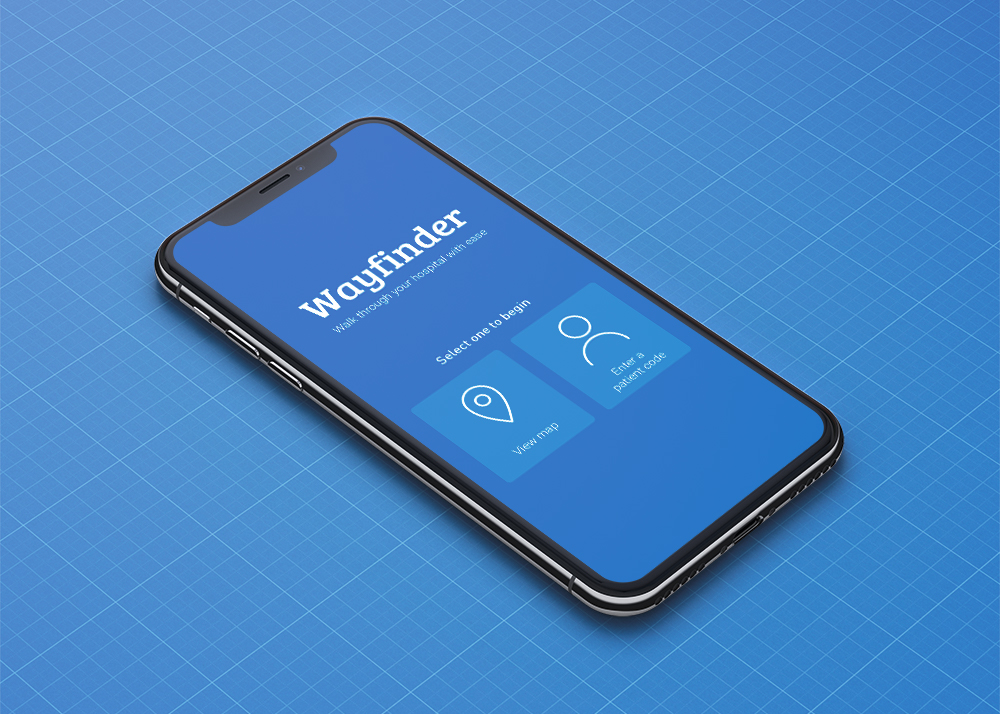
TASK
Working with Rochester Regional Health to design an artificial reality navigation app to help guide patients and visitors throughout a hospital. Designed with Erika Kallio.
DURATION
September - November 2018
ROLE
UI/UX, Motion

Rochester Regional Health + Rochester Institute of Technology
Problem
NEW PLACES
Navigating new spaces can be a struggle and adding in the stress of being in a hospital setting, it's easy to get lost in an unfamiliar place.
BIG SPACES
Large buildings can be overwhelming so visitors have a hard time figuring out what the hospital has to offer.
FINDING OASES
It can be difficult to stumble across a quiet space to relax when in need of a break.
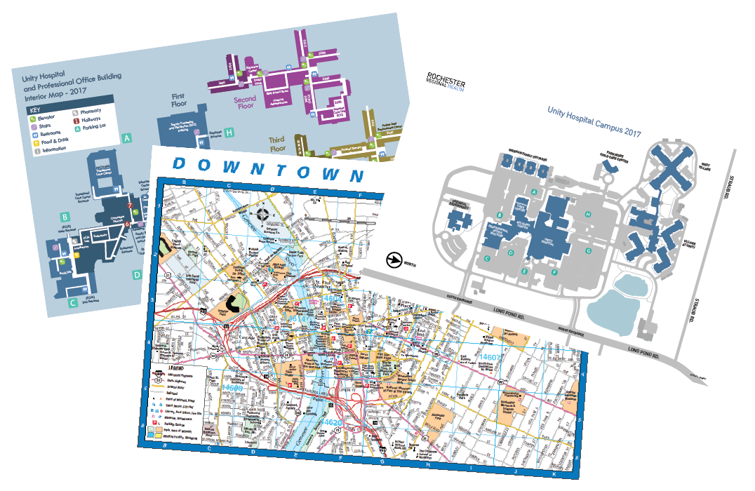
Maps of Rochester
Potential Users and Goals
THE PARENT
"As a parent whose son was just taken to the hospital while I was away at work, I need to be able to figure out what room he is in and find him as soon as I possibly can."
arrow_downward
Help visitors find their loved ones with ease.
THE PATIENT
"As a patient staying in the hospital for several days while doctors monitor my health, I want to be able to find cool and interesting places where I can spend my time here."
arrow_downward
Promote visitors to learn more about what RRH has to offer.
THE FRIEND
"As a friend of a patient who is currently in surgery, I want to be able to find a space in the hospital to clear my head and relax while I wait to hear from the doctors about how the operation went."
arrow_downward
Guide patients and visitors to peaceful oases when in need of a break.
Competitive Analysis
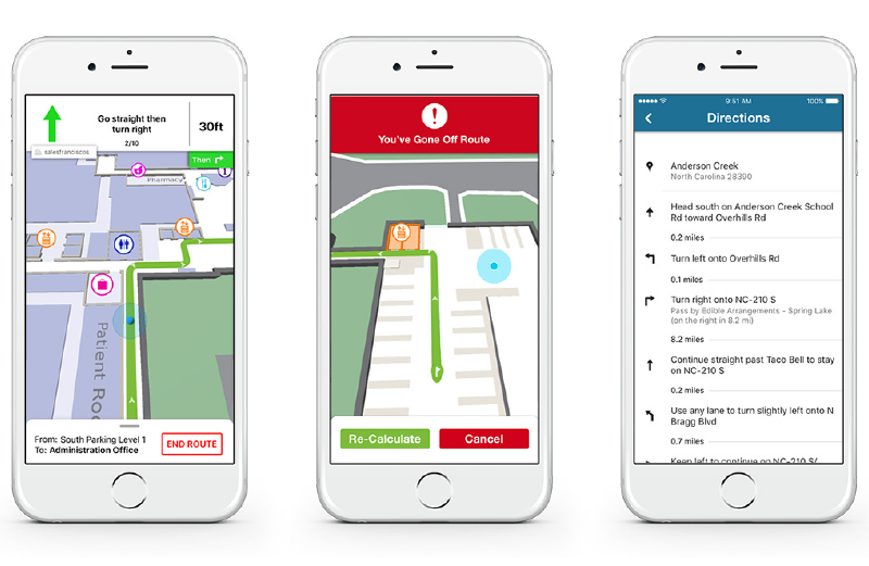
MediNav
Connexient's MediNav
Provides turn-by-turn navigation throughout an indoor and outdoor campus, however is only available in a small handful of hospitals.
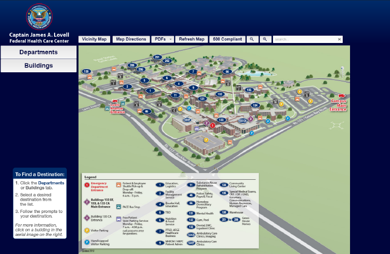
Med Maps
Med Maps
Provides users with a static 3D map of the campus, but does not allow for much interactivity and does not detect the user's location within the campus.
Information Architecture
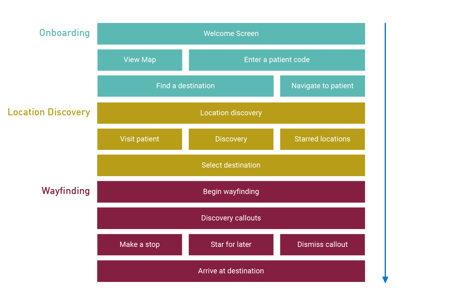
Information Architecture
ONBOARDING
The onboarding section of the application will serve as a way to get the user to their desired location as quickly as possible. They are able to get directly to a map for quick navigation or may enter a Patient ID Code obtained from administration that will start navigation to that patient.
LOCATION DISCOVERY
The user may also select a location within the hospital with the location discovery section of the app. They are able to visit a patient (if a patient code has been entered), discover what the campus has to offer, and also save locations they would like to return to.
WAYFINDING
Finally, the user can begin wayfinding and the app can open either a 2D view or an artificial reality view using their smartphone's camera. This will overlay information on top of the image to assist in getting to their destination as well as giving the user information about the rooms that they pass along the way.
Moodboard
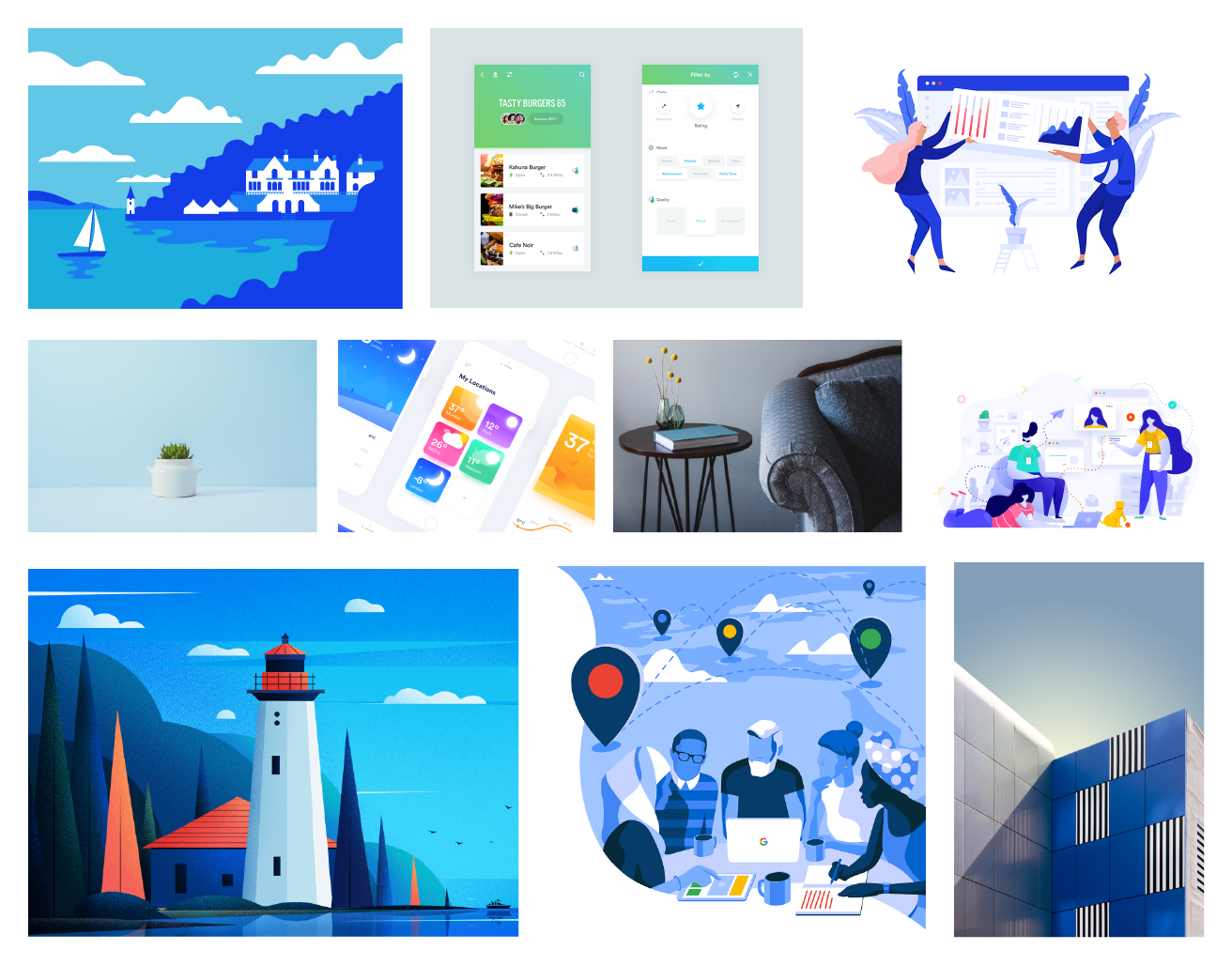
Moodboard
CLEAN COMFORT
By using cool tones in our color palette, we're attempting to comfort the user and make the app inviting to look at. A hospital is already overwhelming enough as it is so any way to calm the user is worth looking into.
Sketches and Wireframes
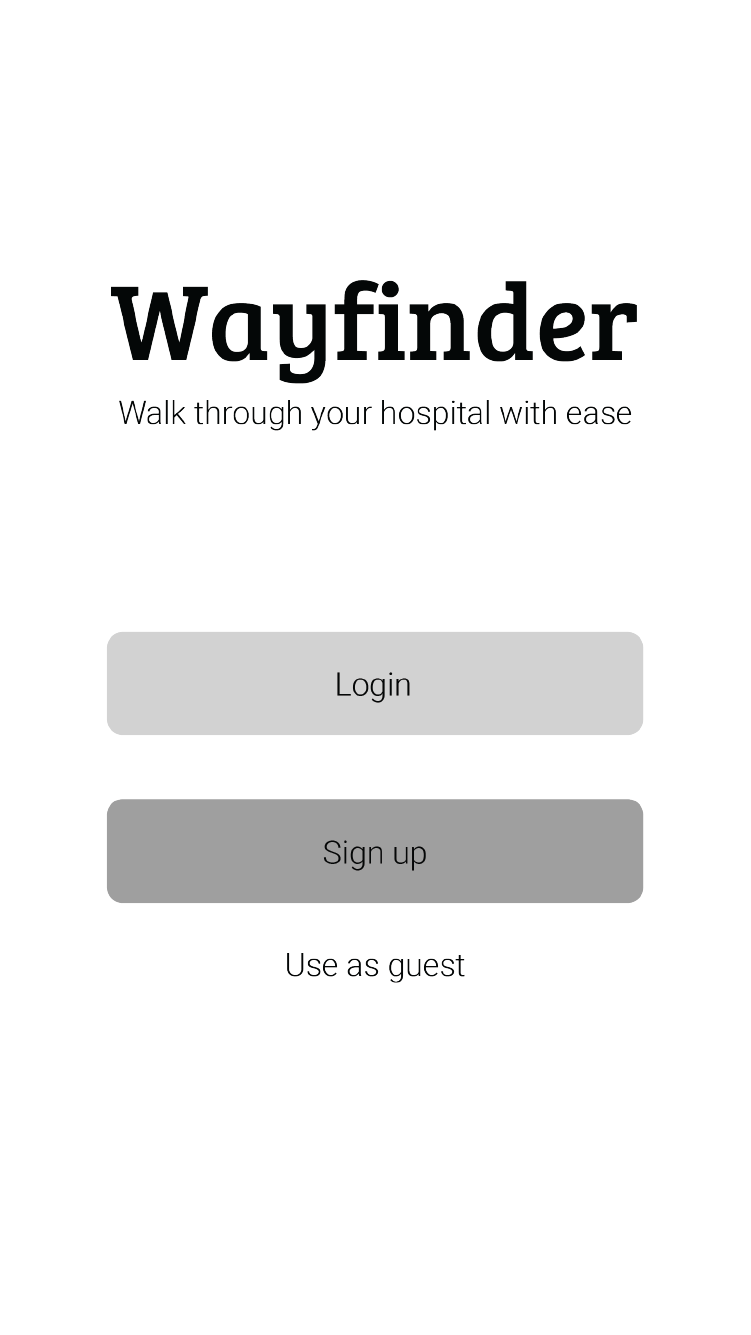
Login Screen
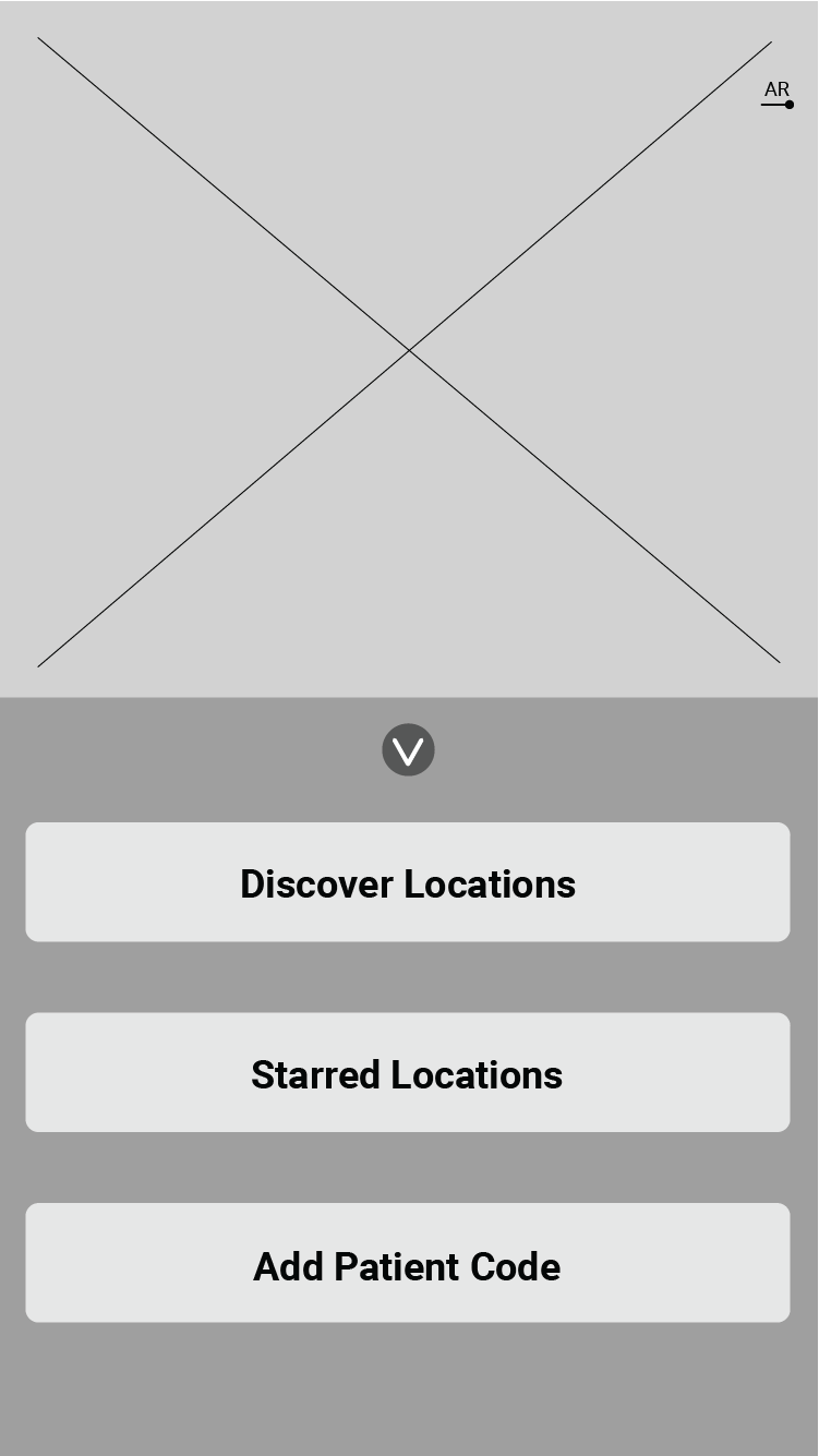
AR Navigation Menu
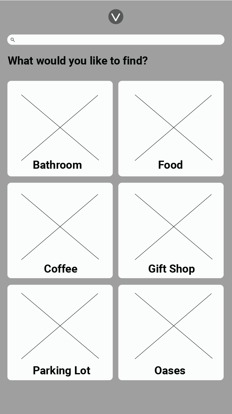
Location Categories
LOCATION SELECTION
Our initial wireframes had a registration concept where users would need to make an account or see the map as a guest but we found this created a barrier of entry that we didn't want. Instead, we opted for the Patient Code concept where administration could give a visitor a temporary code that could be used to find a patient for a limited amount of time as to not violate their privacy.
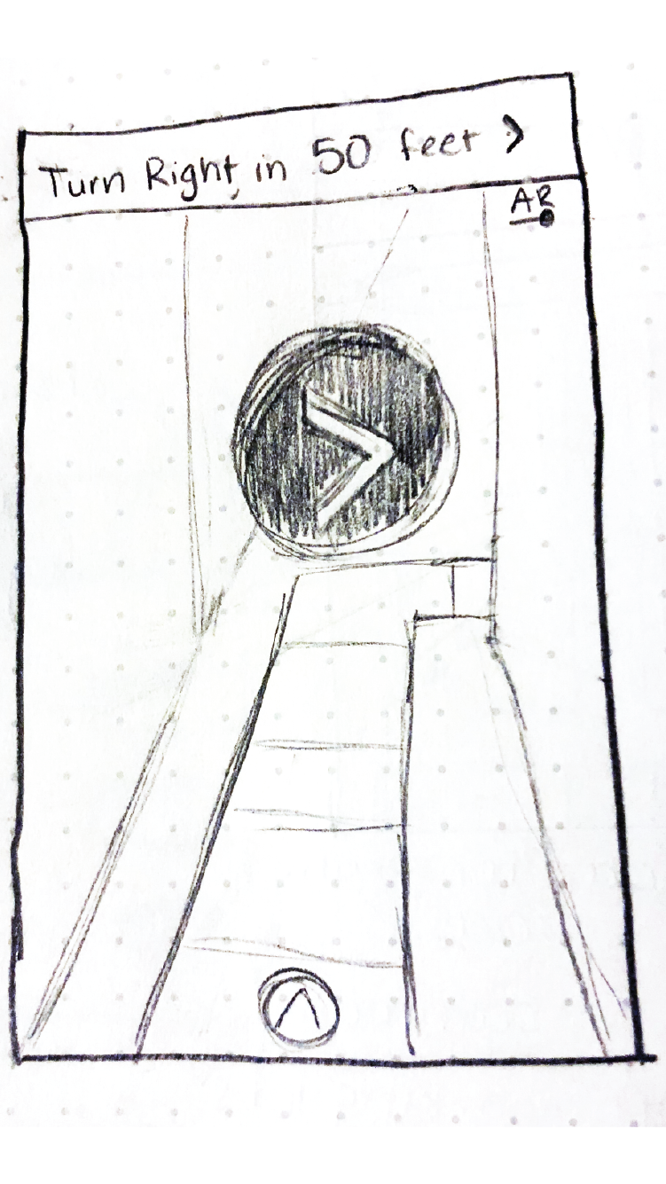
AR Navigation View
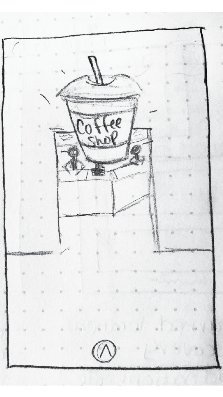
Arrived at Location
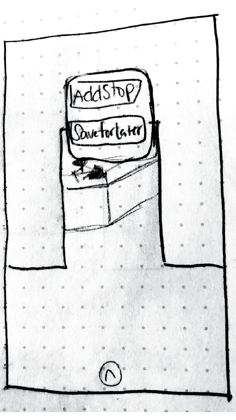
Location Options
SAVE FOR LATER
We also wanted users to have the ability to see what the hospital has to offer as they're navigating through the campus to find their loved ones. This could come in handy later as users are able to favorite things such as food locations and oases as they pass by them.
Visual Design
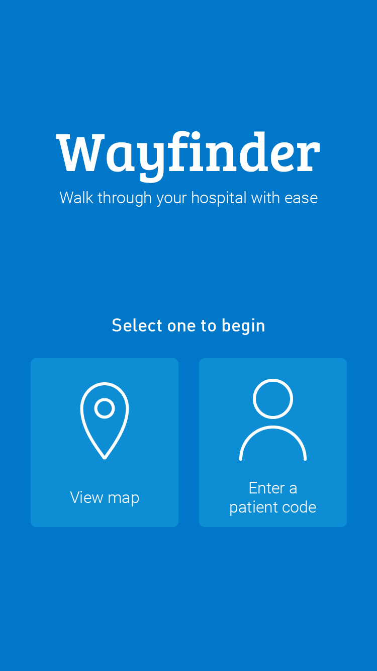
Onboarding Screen
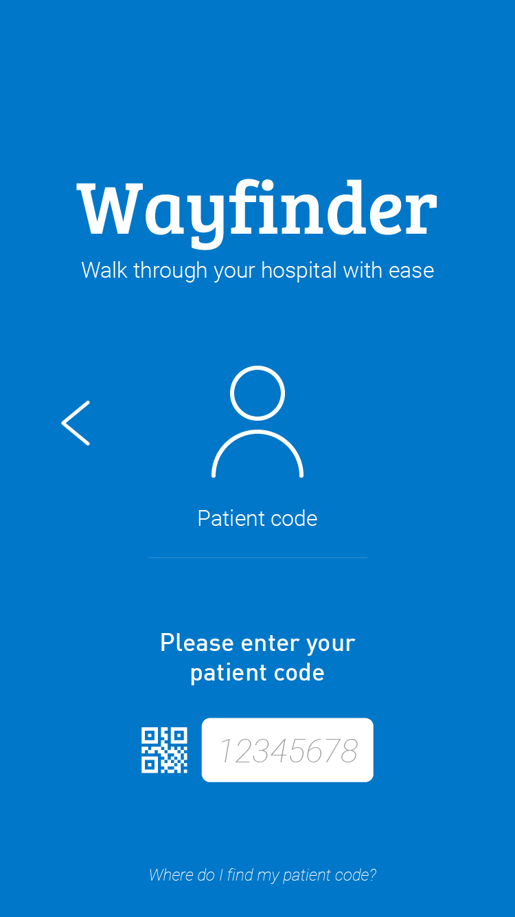
Patient Code
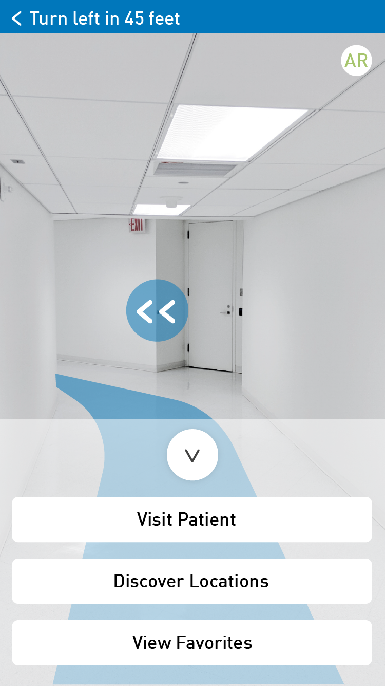
AR Navigation
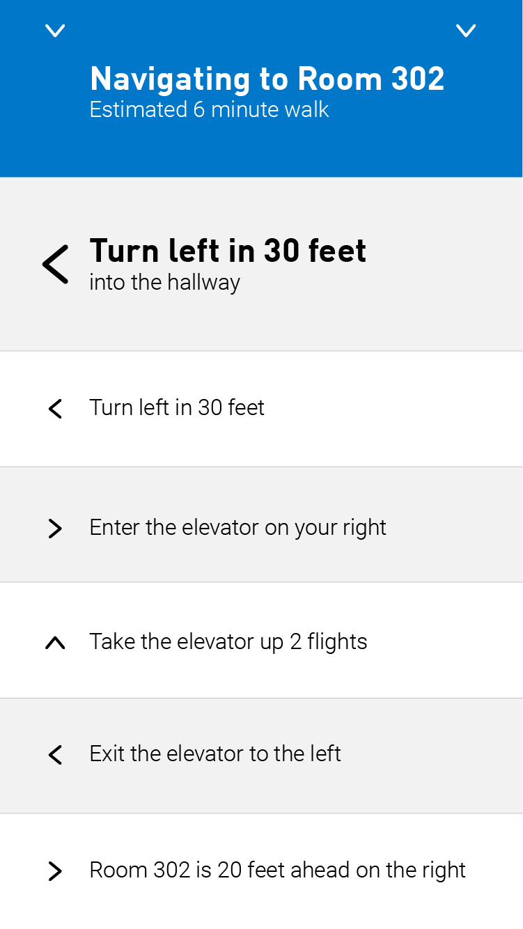
Turn-by-Turn Navigation
AR NAVIGATION
In order to get users to where they need to be seamlessly, we designed the AR navigation to show a path to walk along the floor as well as arrows pointing in the user's line of sight.
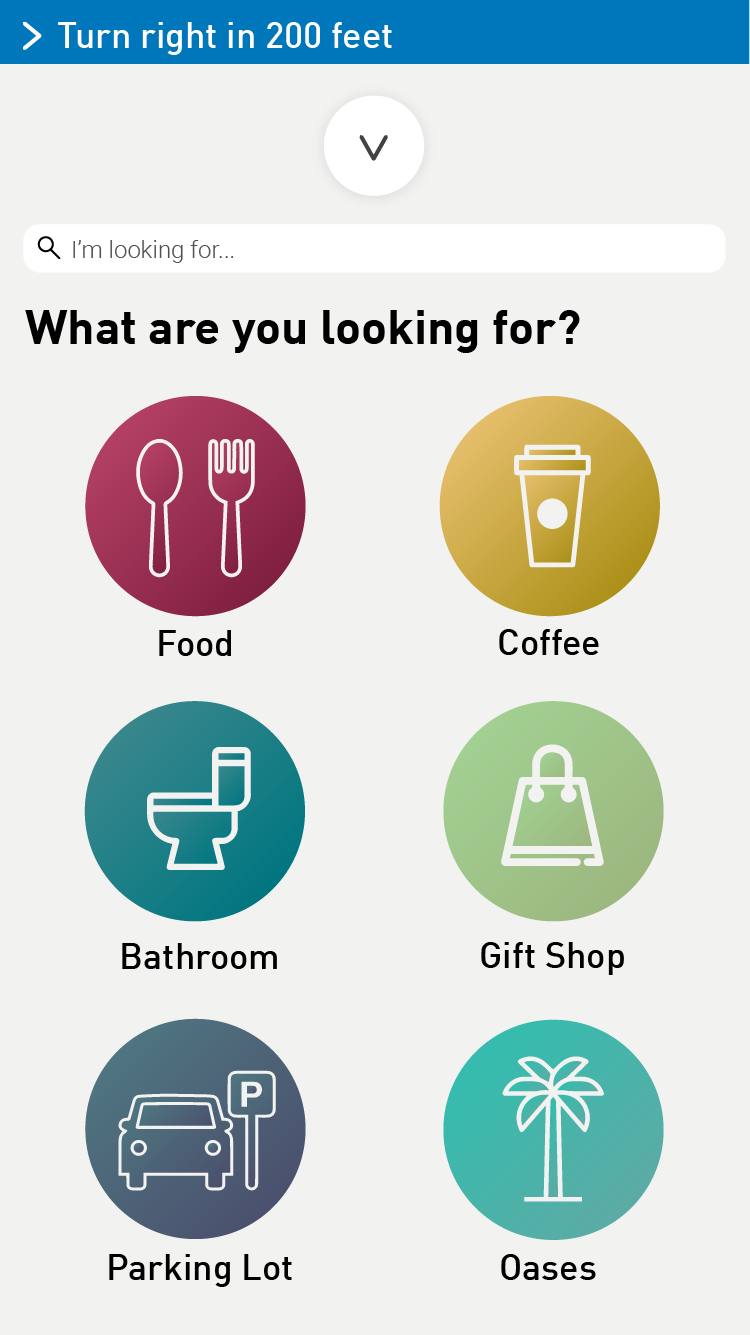
Location Categories
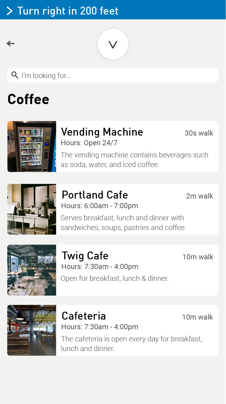
Vendors
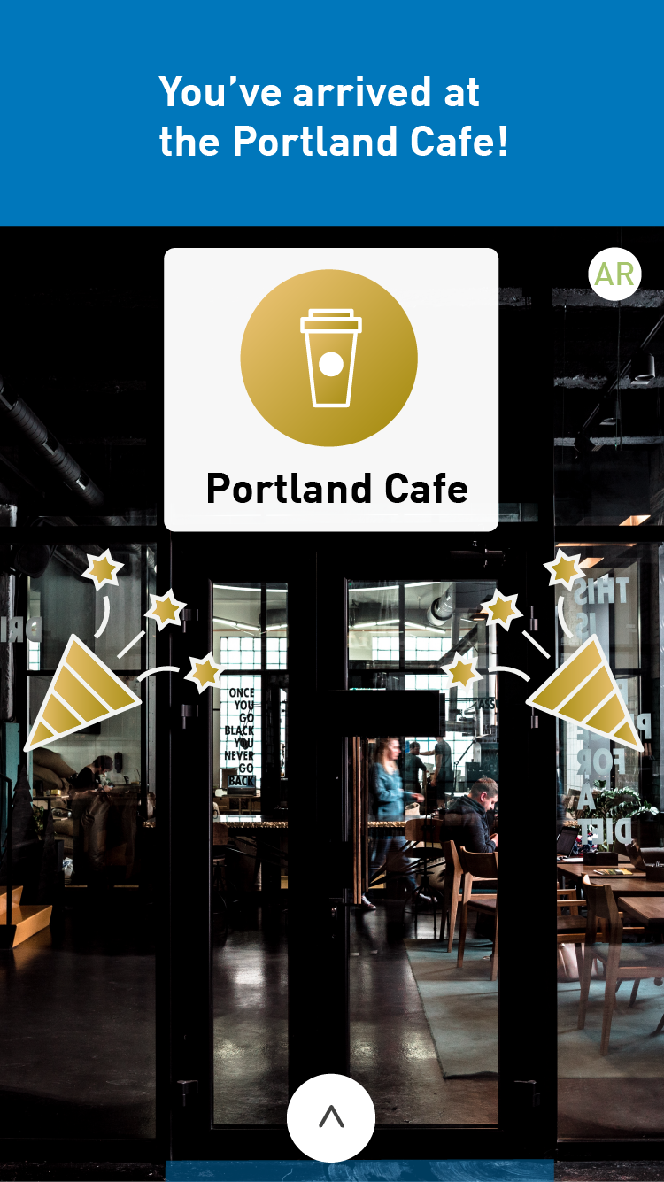
Arrived at Location
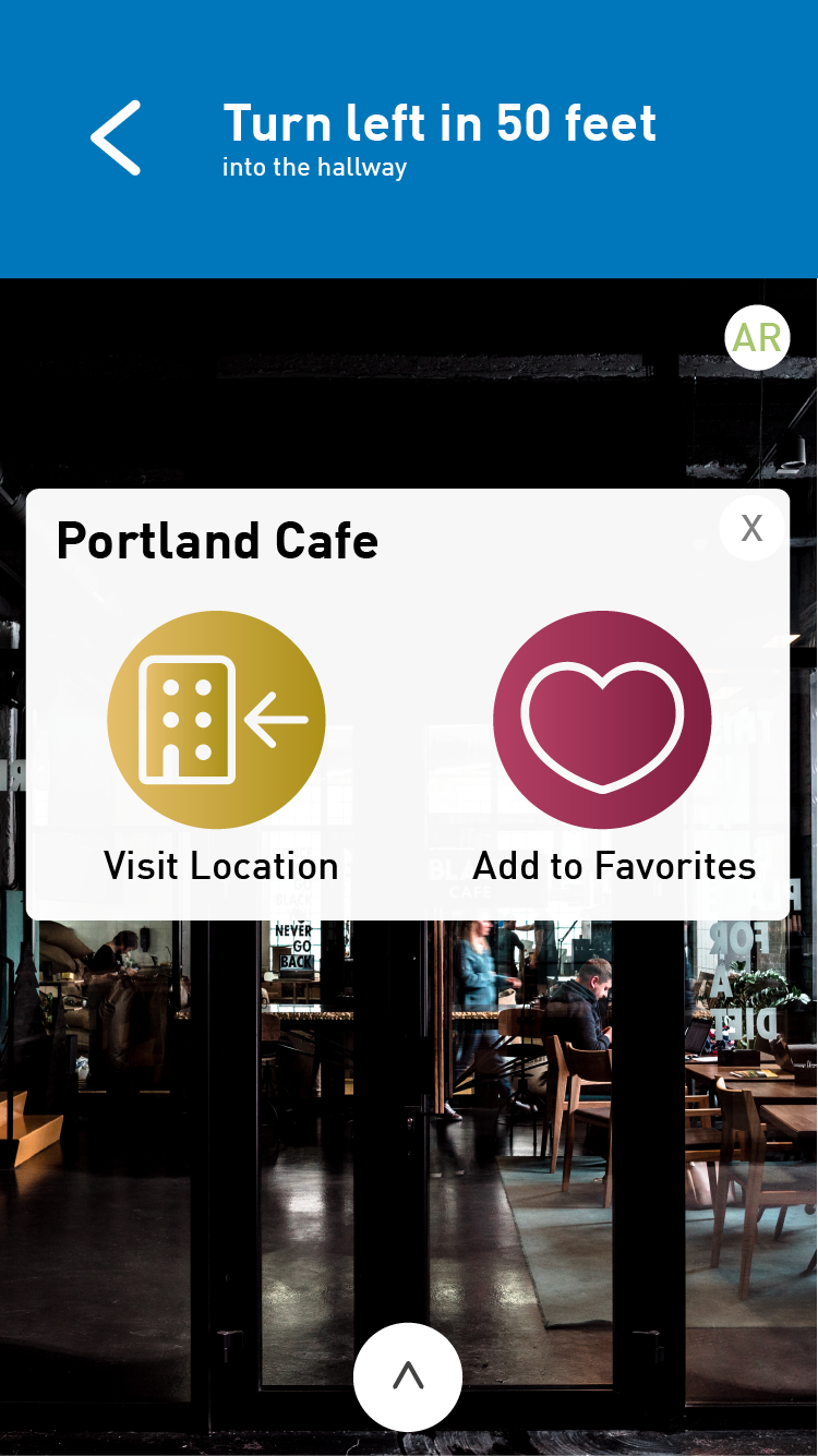
Location Options
LOCATION DISCOVERY
To give users access to all that the campus has to offer, a location discovery page split up destinations into categories based on what the user might be interested in visiting.
Animated Prototypes
Onboarding Prototype
AR Navigation Prototype