Build a PC Tablet Application
Simplifying the personal computer building experience
TASK
This app walks the user through the steps they need to take in order to successfully learn about what goes into a computer, plan for what parts they would like in their machine, and finally assembling it all together.
DURATION
February - May 2018
ROLE
UI/UX, Motion, 3D Modeling
iPad Prototype
Problem
A TIME CONSUMING PROCESS
The process of planning and assembling a custom built computer is a lengthy and overwhelming process.
WHERE TO BEGIN?
Even with the ambition, most people don’t know where to start.
Competitive Analysis
Competitive Analysis
CURRENT OPTIONS
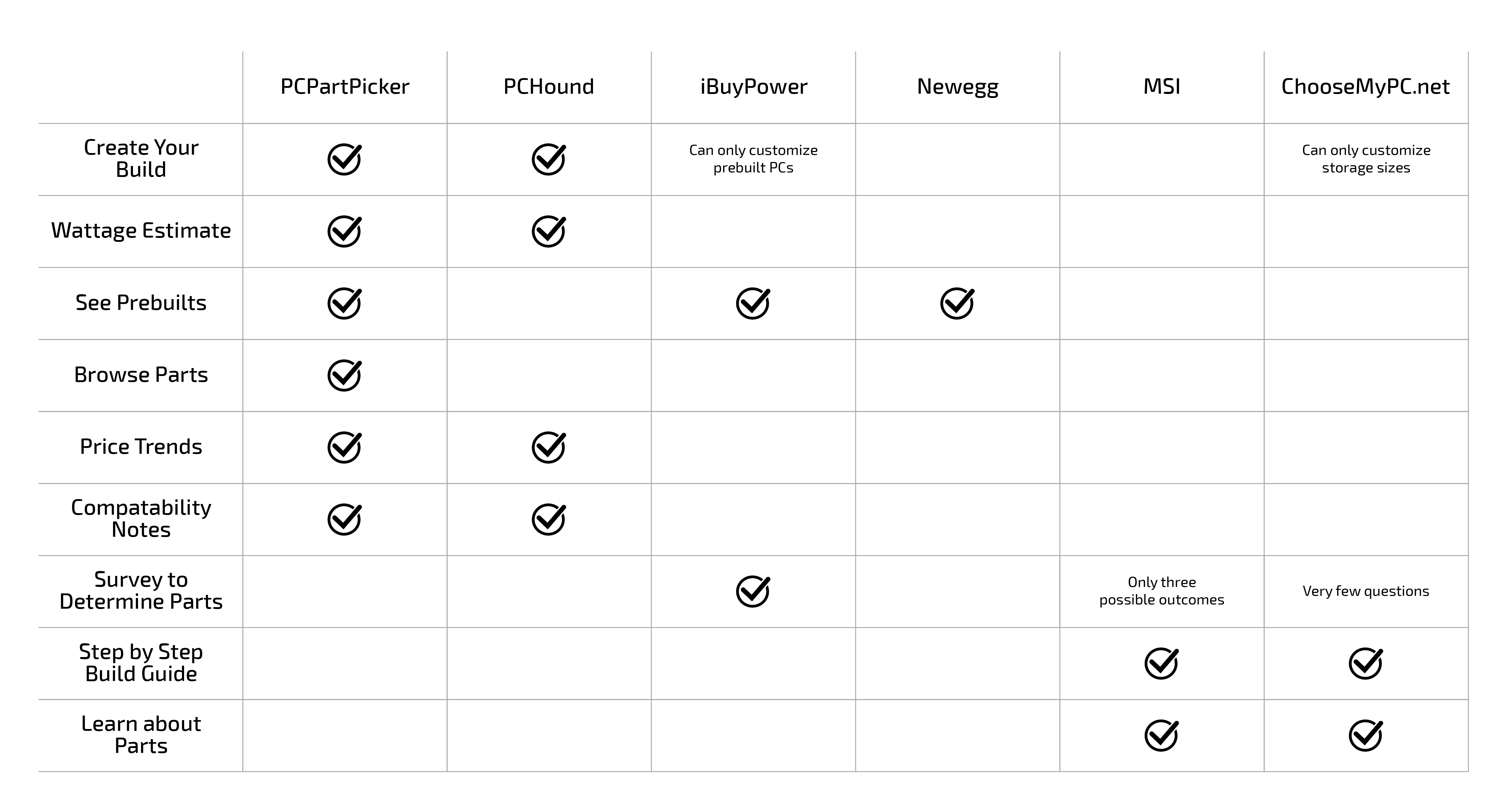
Current resources available for users to learn about and assemble their own custom PC are fairly segmented and require users to visit multiple websites in order to properly figure it all out.
Trend Research
Part Breakdown Trend
A LIST OF PARTS
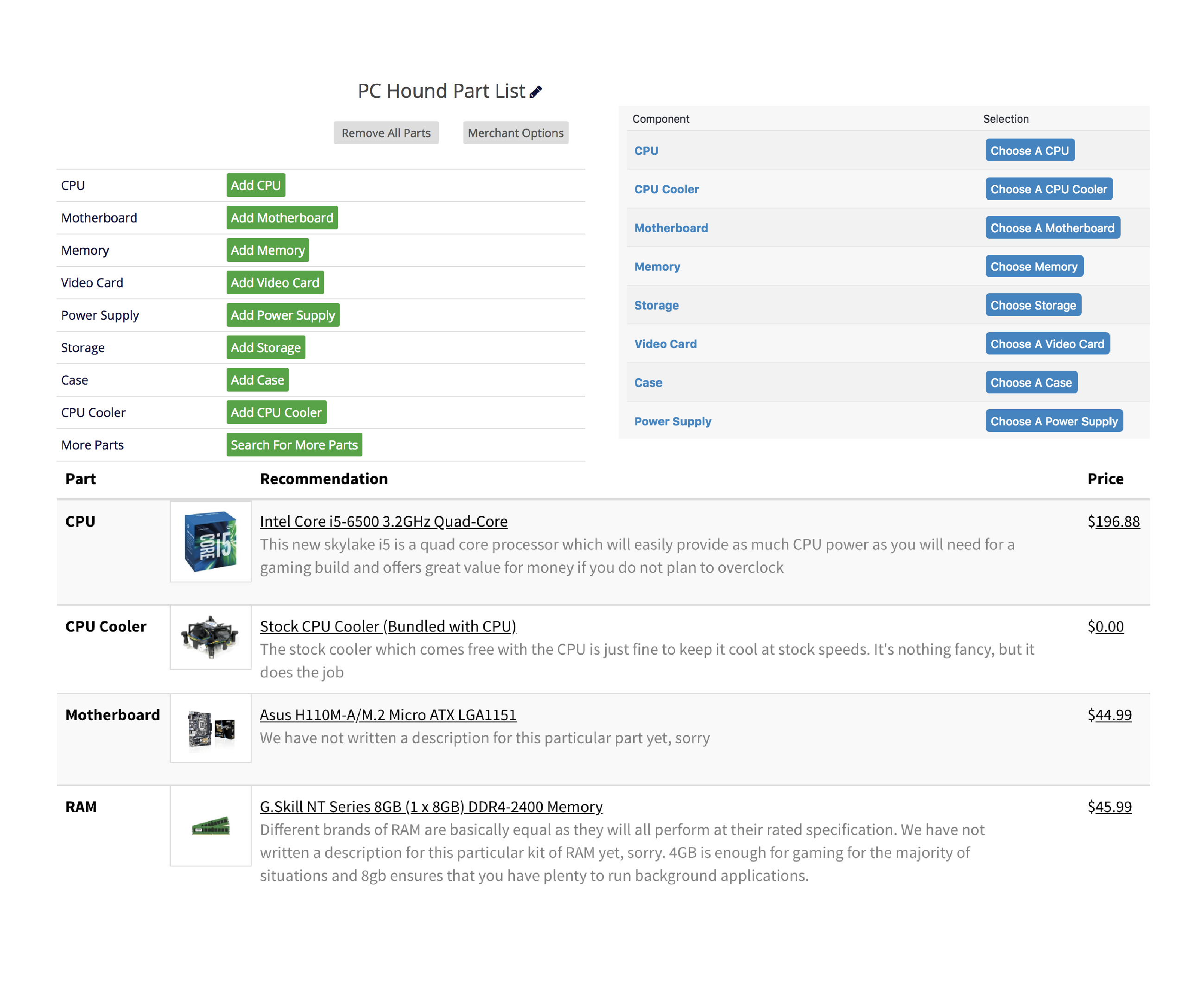
On one hand, there are resources that provide users with the ability to browse a wide variety of parts to compare specifications to choose the one that's right for them, but this can be overwhelming to some.
Customized Recommendations Trend
PREBUILDS GALORE
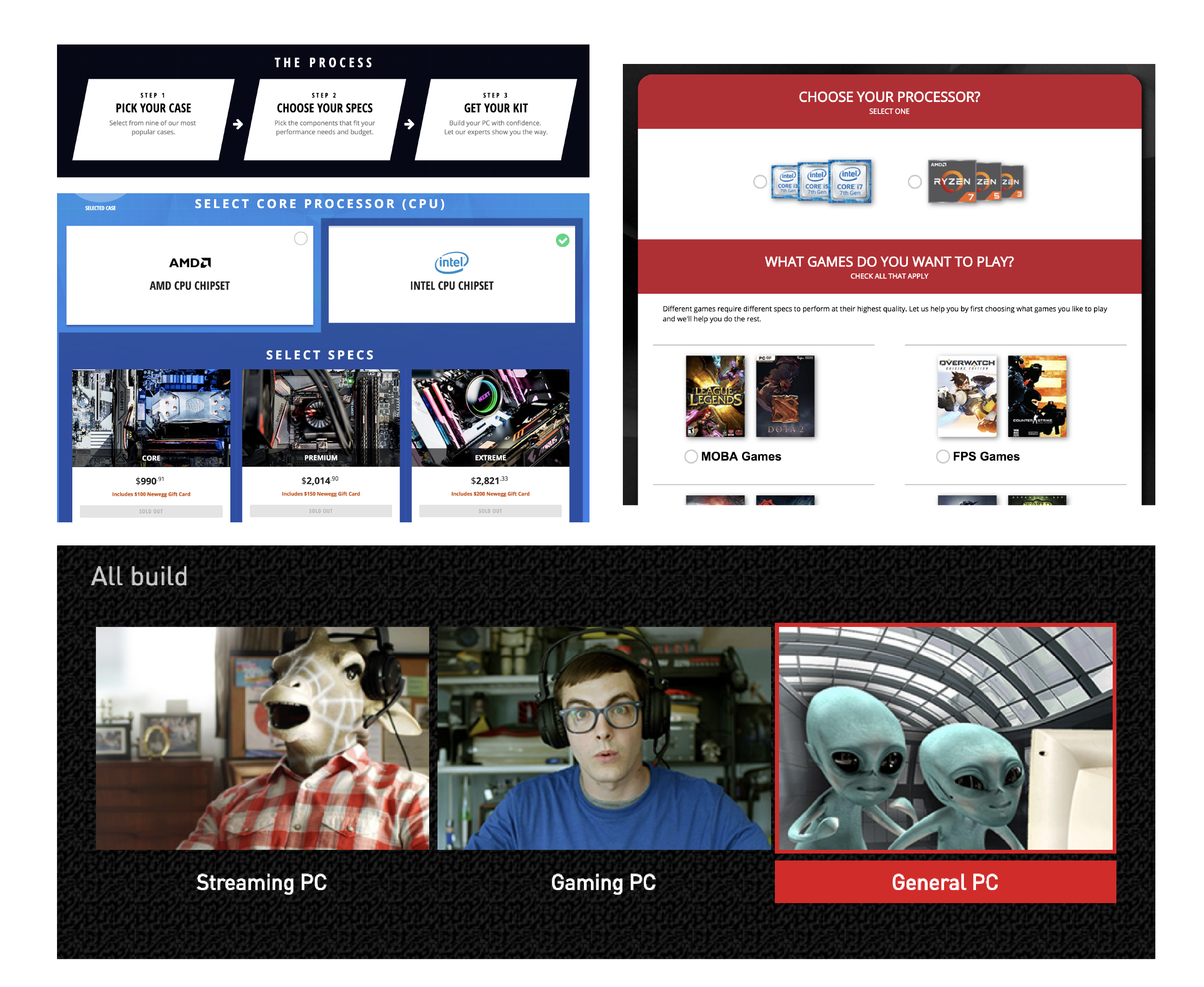
On the other hand, there are resources that require the user to answer a short survey and, based on their answers, will spit out a generic prebuilt setup that they can purchase but doesn't allow for much customization.
User Research
SURVEY STATS
I conducted a survey to determine the types of features that users would be most interested in when looking to build a computer. To narrow down an audience, I asked only people who have experience building a computer in the past to complete the survey.
I received 41 survey results from a total of 8 different countries, with people ranging from age 14 to 41.
QUOTES
"[I want a] compatibility checker. After deciding on a build, [I would like to] have some kind of feature that makes sure the components will all work together."
"[The other PC building resources] seemed segmented."
"UI design [of the competitors] is pretty universally ugly/bad."
Common Problems
THINGS TO LOOK OUT FOR
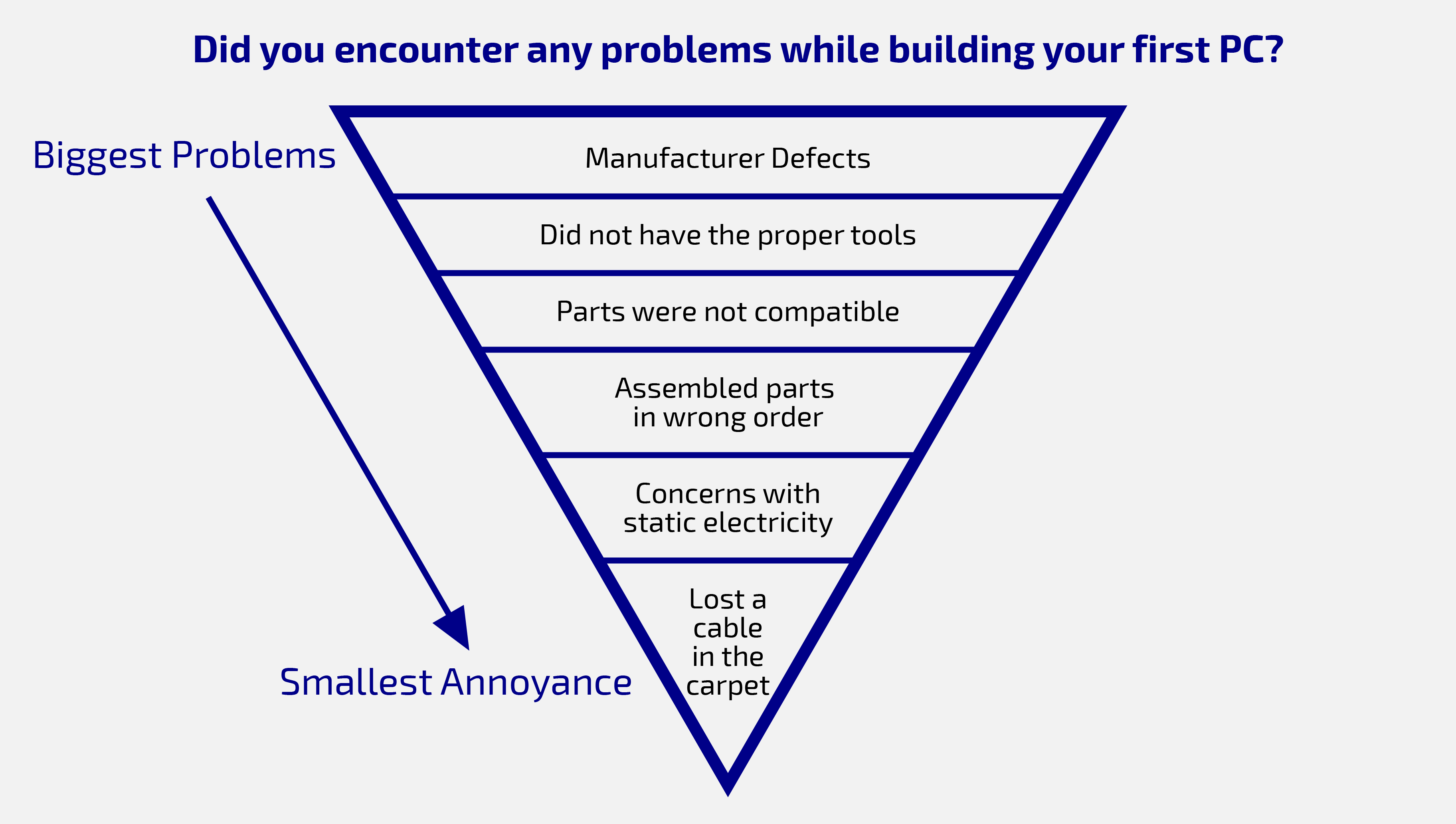
Those assembling a computer for the first time often share similar concerns, with a large amount of people not being fully aware of the tools they'll need or if their parts will even be compatible.
Competitor's Key Features
MUST HAVES
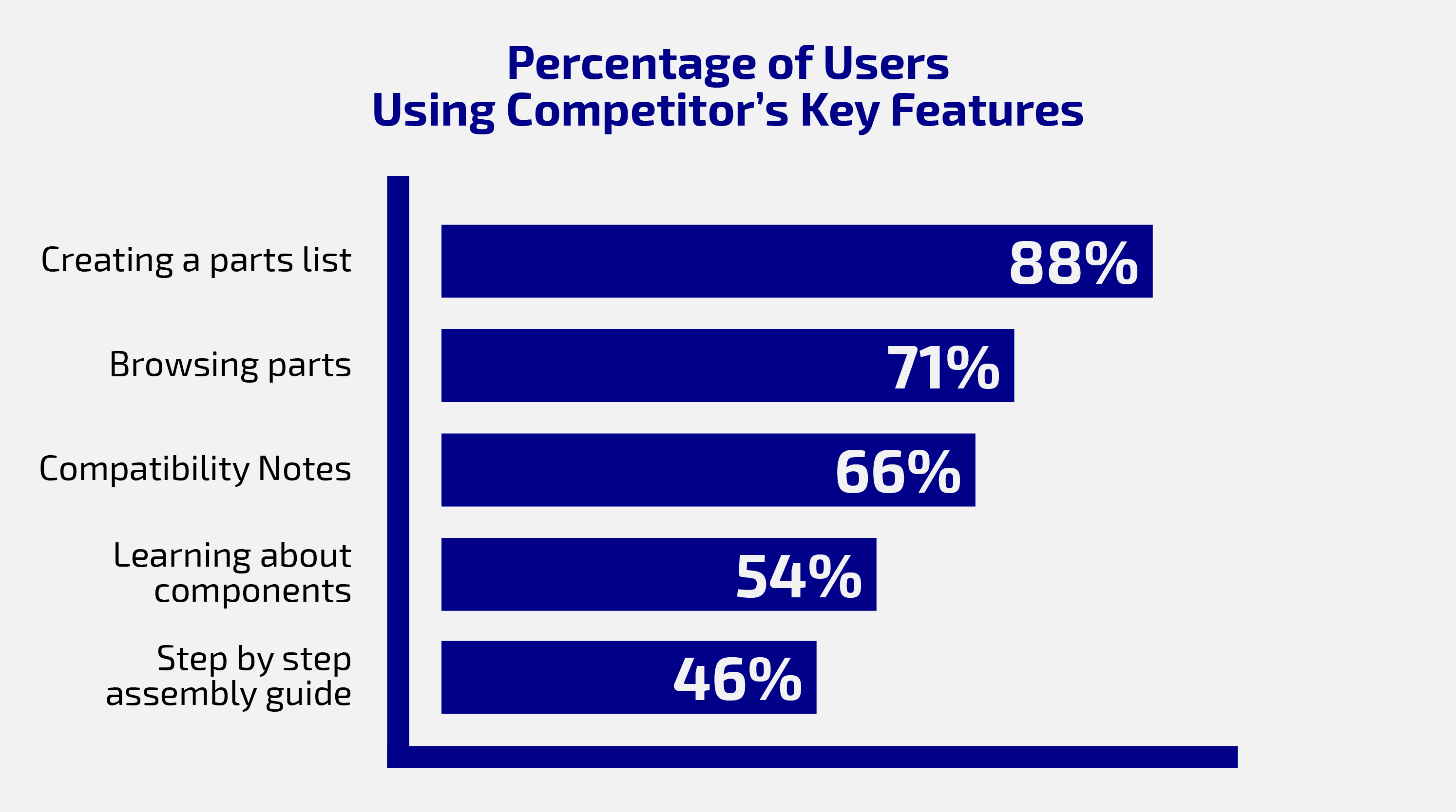
Survey results indicated that the top three features that users would like having in a PC building resource were: being able to create a parts list, the ability to browse parts easily, and making sure the parts they choose are compatible with each other.
Goals
EDUCATE
Educate those who want to know how computers work
ENLIGHTEN
Make the process of building a computer less daunting
GUIDE
Steer the user towards a successful custom build
Sketches and Wireframes
Homepage Sketch
Part Selection Sketch
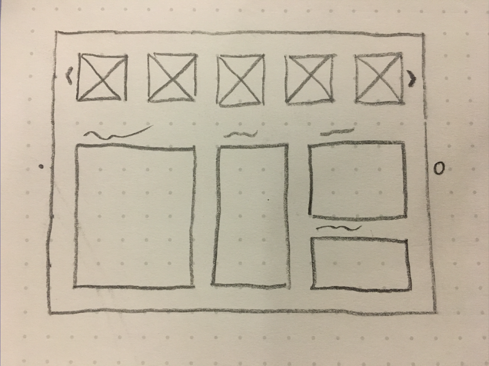
Build Overview Sketch
GETTING STARTED WITH SKETCHES
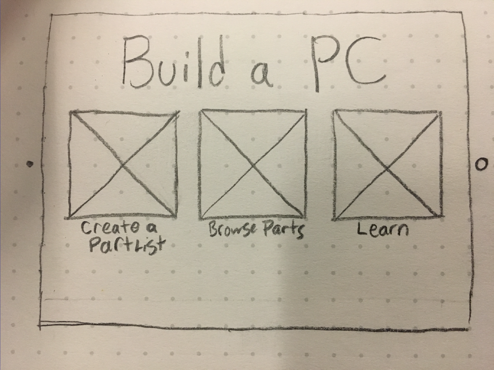
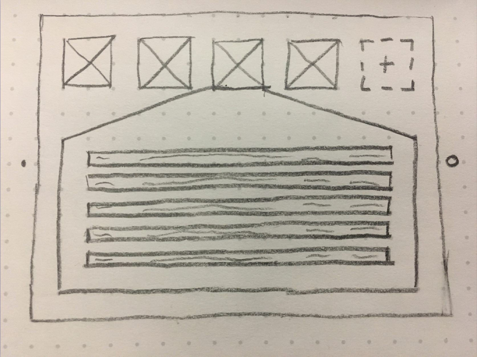
My initial sketches started with breaking up the application into three distinct sections: Learn, Plan, & Build. From there, the user would be able to search for and select parts for their custom build. Finally, their chosen parts would populate the final screen, where a compatibility check would be run to make sure each component would work when assembled.
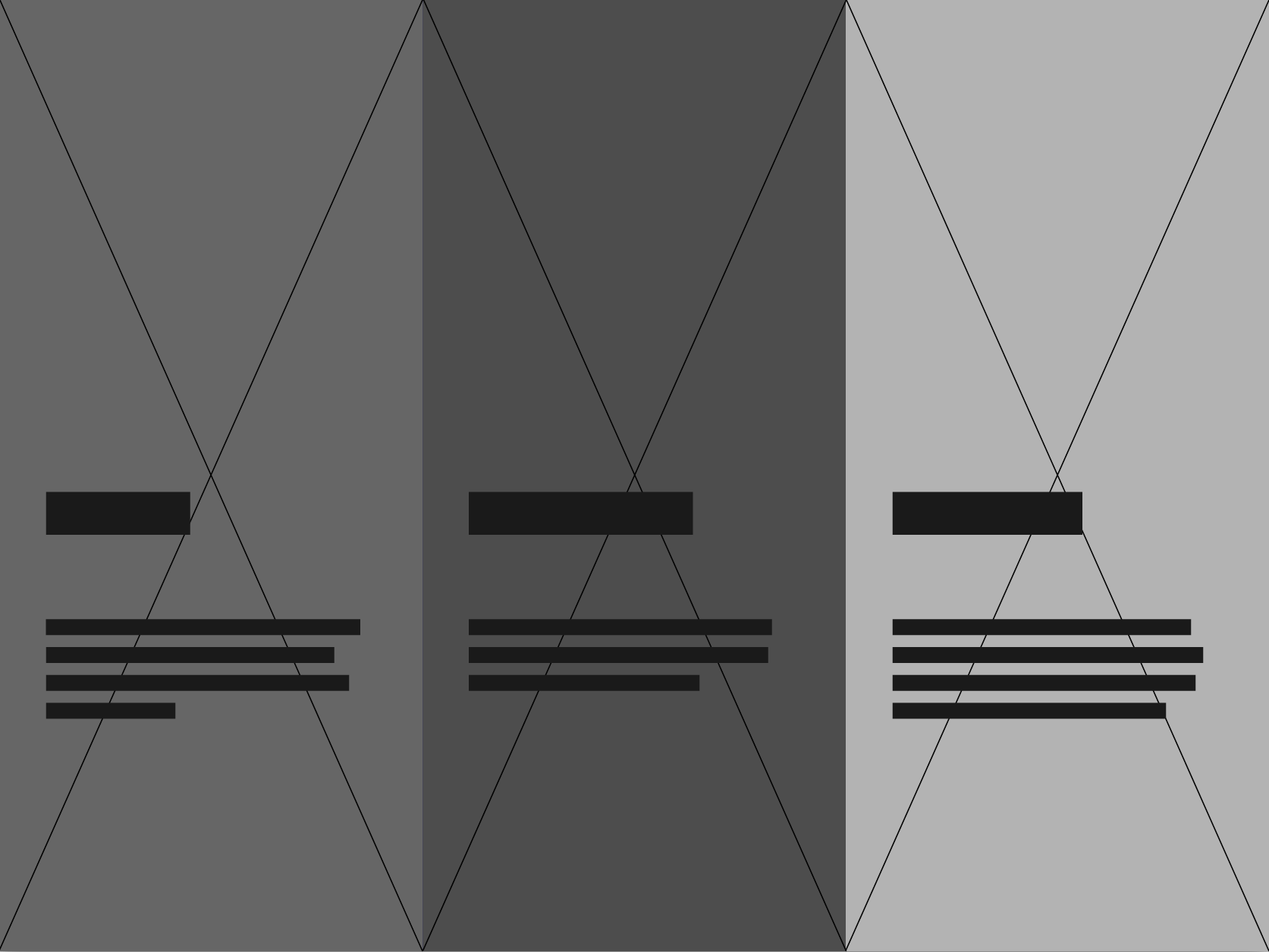
LoFi Homepage Wireframe
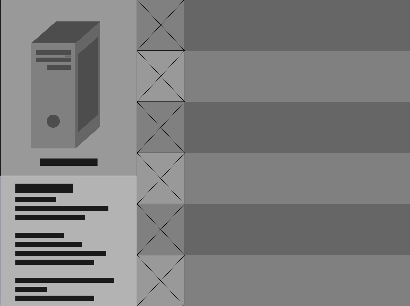
LoFi Part Selection Wireframe

LoFi Build Overview Wireframe
FURTHER DEVELOPMENT
Getting into low fidelity wireframes, the three buttons on the homepage became bigger to take advantage of the whole display and allow users to touch anywhere on the screen. The part selection and build overview changed to add a 3D model of the computer that the user would be building. This would allow them to more easily recognize the components when assembling their build.
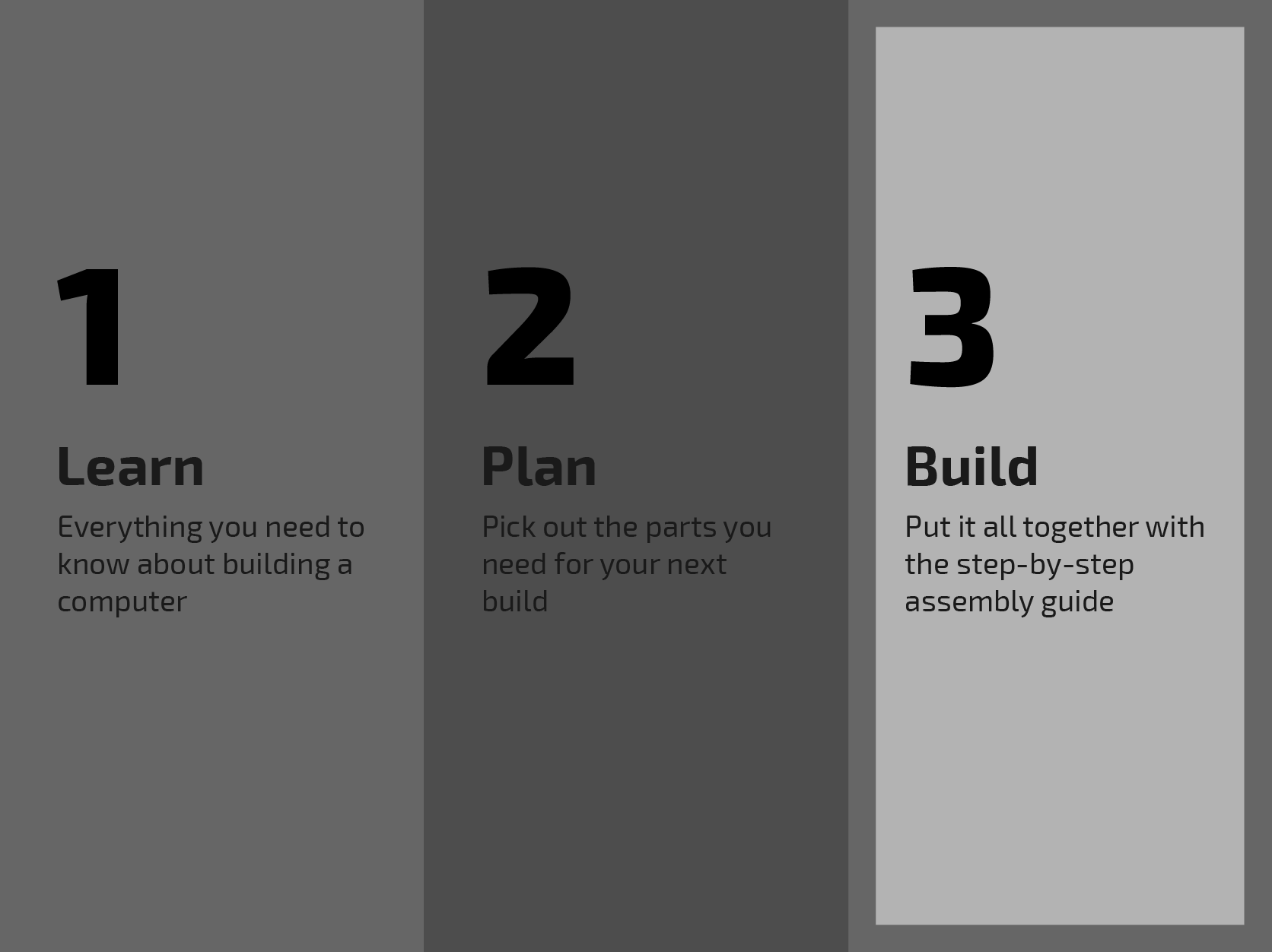
HiFi Homepage Wireframe
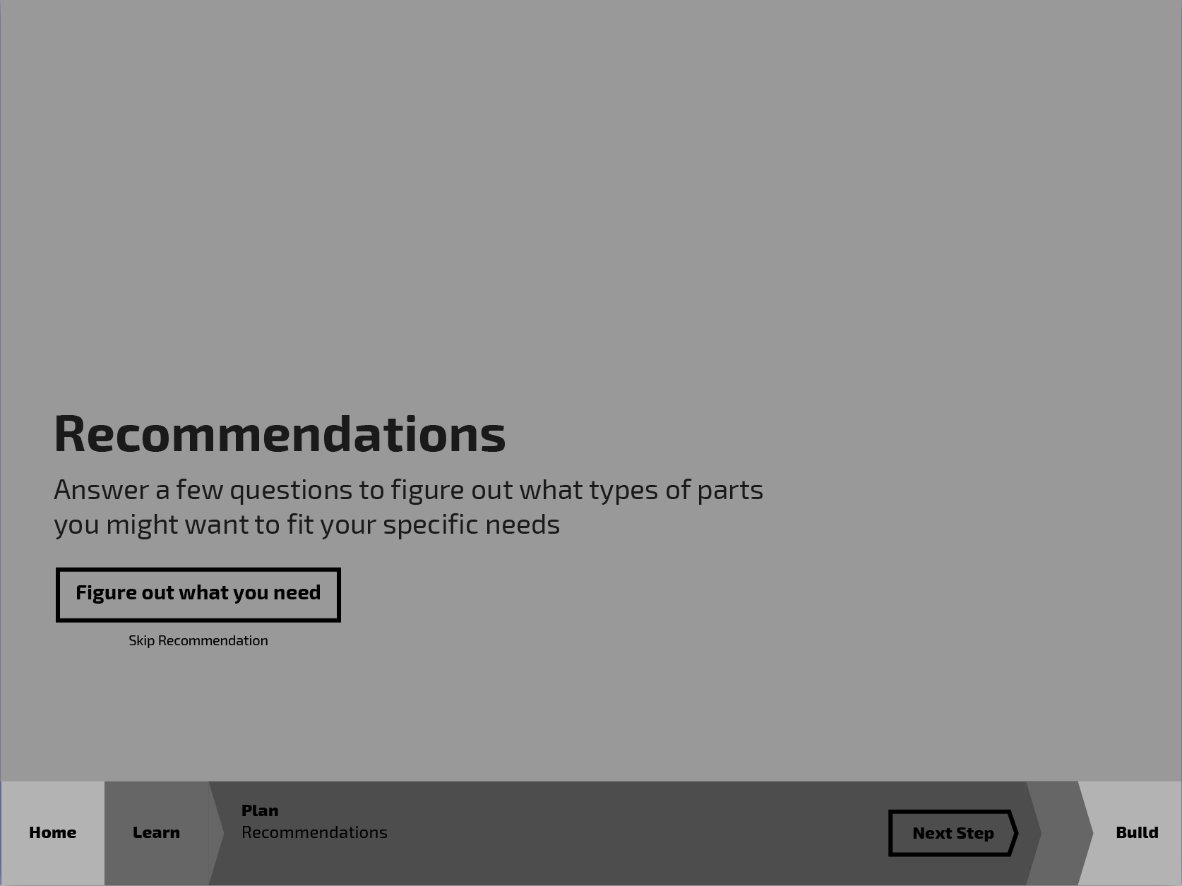
HiFi Part Selection Wireframe
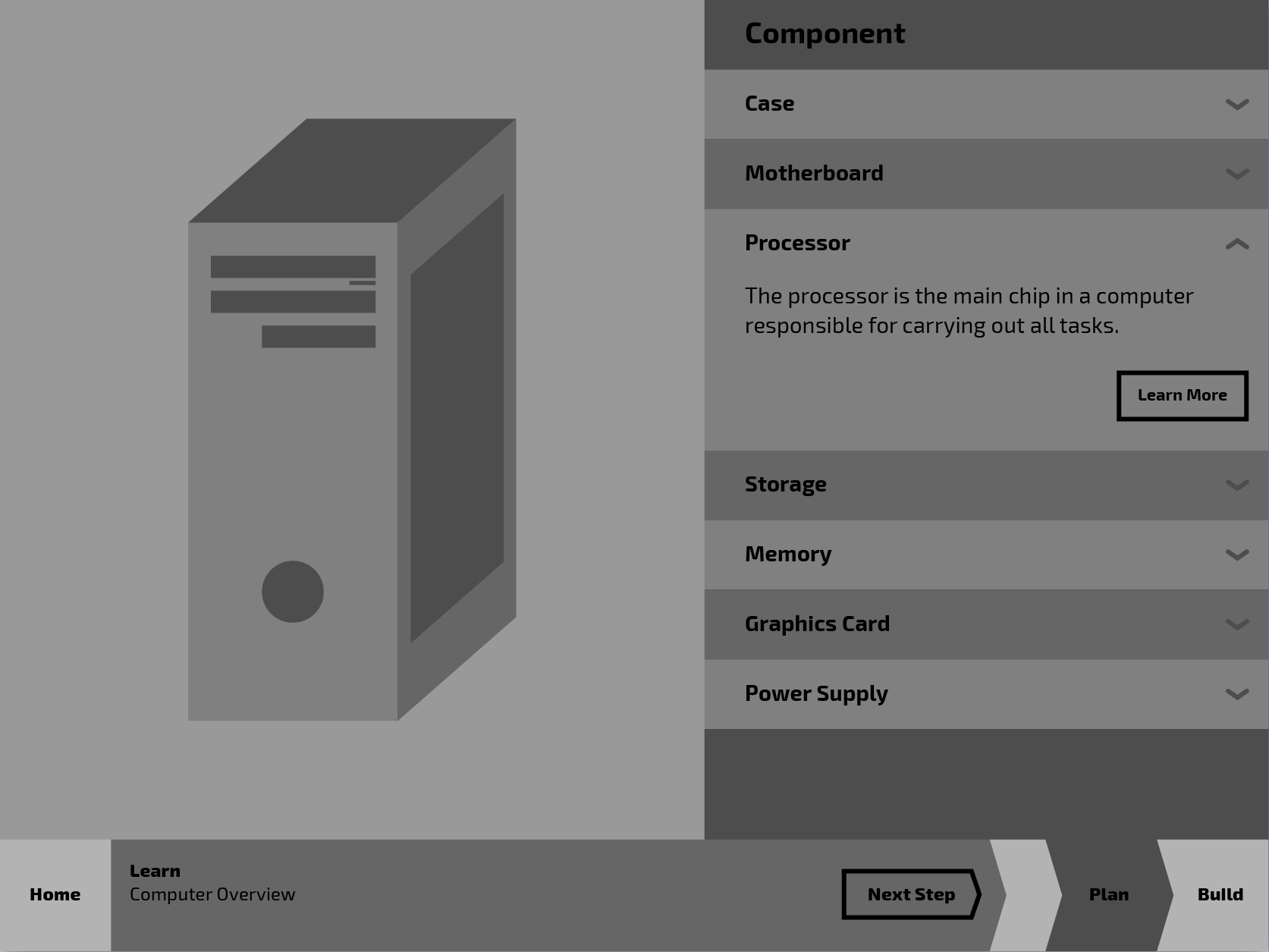
HiFi Build Overview Wireframe
HIGHER FIDELITY
With this iteration of the application, I changed directions with the part selection portion. I decided to guide the user through a short survey to determine the type of parts they might need as opposed to dumping a large amount of information on them at once. The build overview also changed to allow more space for the user to interact directly with the 3D model as well as learn about the parts they're looking at.
Styleguide
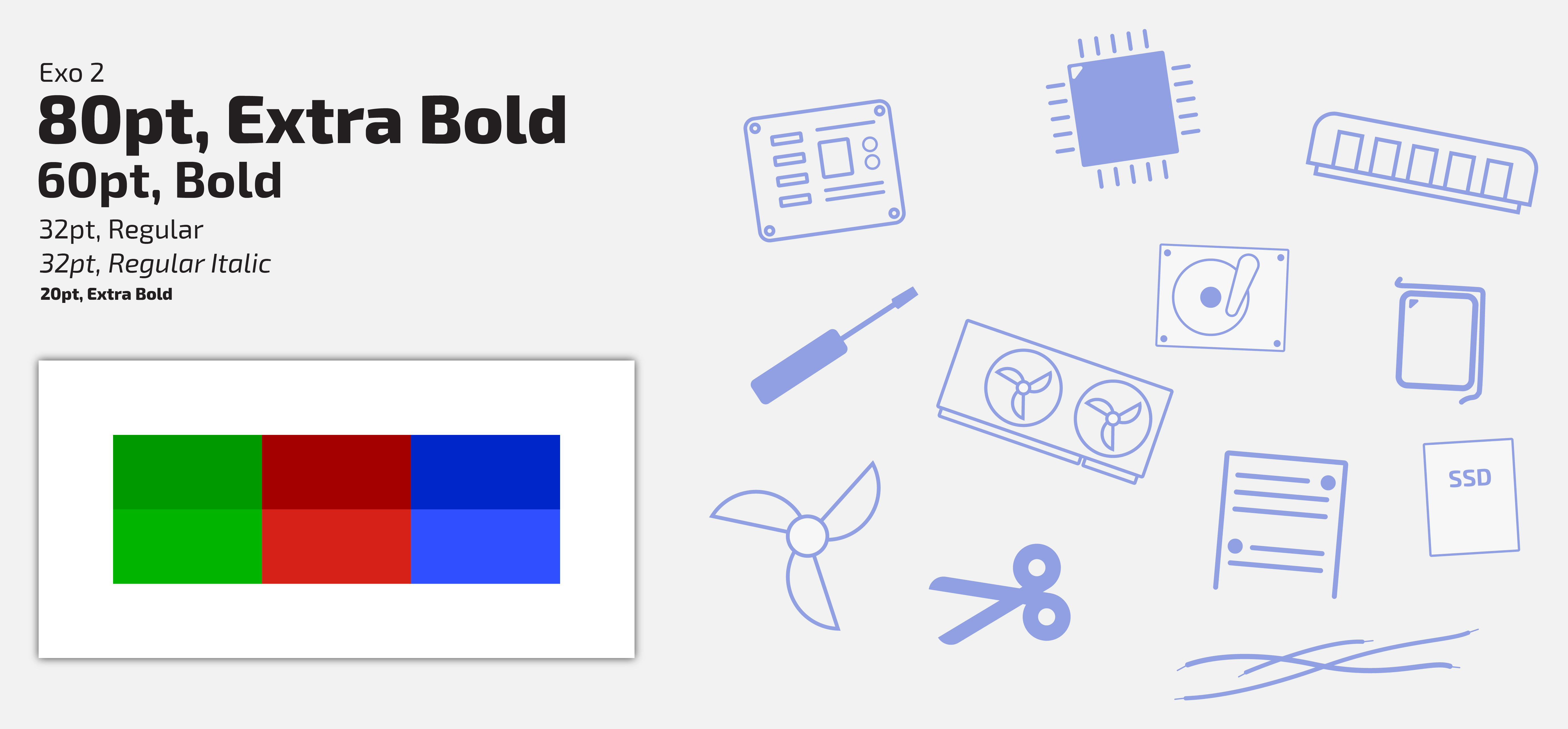
Styleguide
TYPOGRAPHY & COLOR TREATMENT
I wanted to give the application a bold look so I decided on a stark contrast between large header text and a smaller body text. I also went with bright colors to differentiate each section from one another (plus PC gamers love to add RGB to everything).
ILLUSTRATION STYLE
To add a little flair to the design, I illustrated a variety of components that can be found throughout the build that help users in identifying each part during assembly.
Visual Design
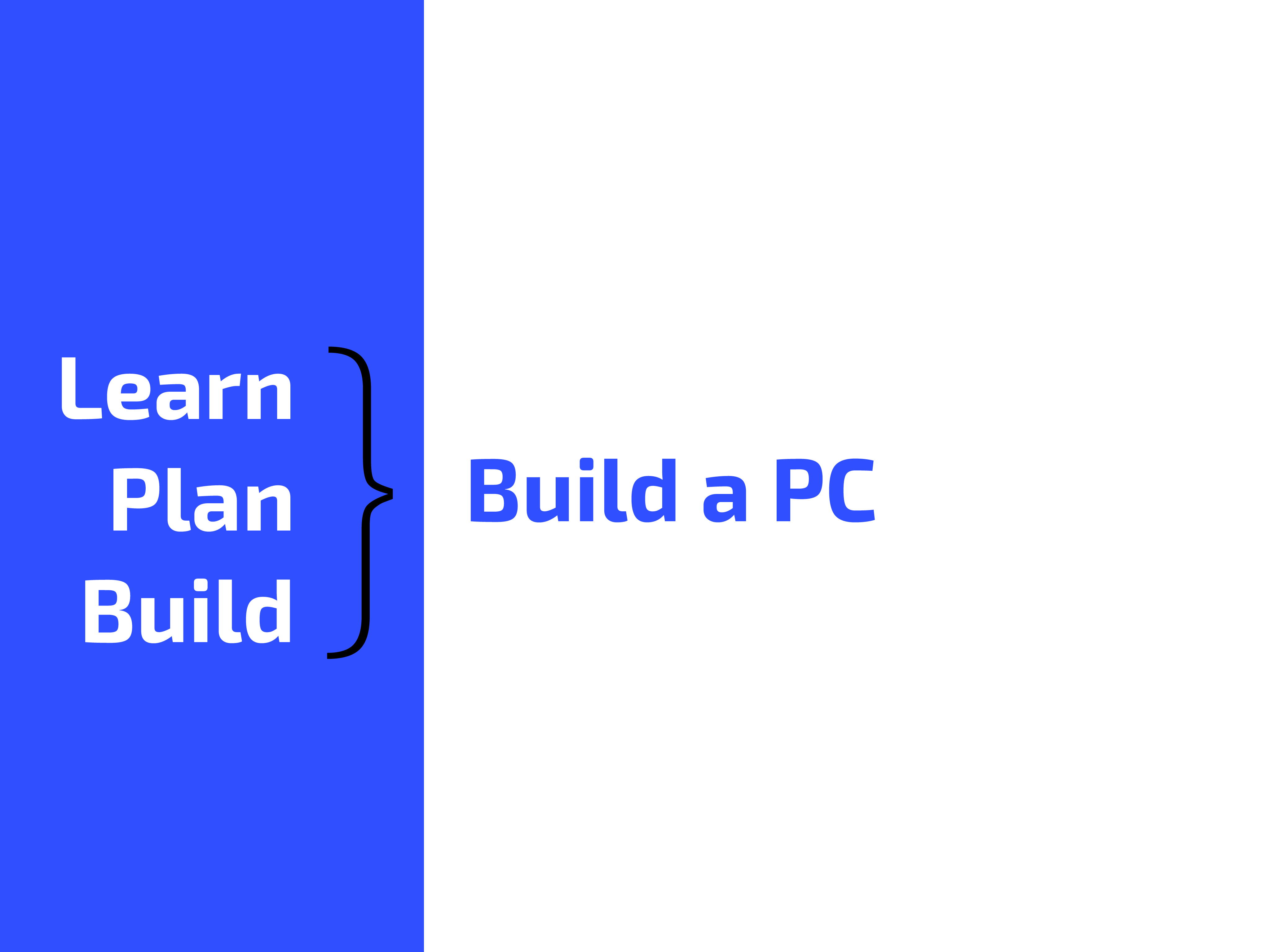
Homepage
Category Page

Learn Section
Plan Section
Build Section
SECTION SELECTION
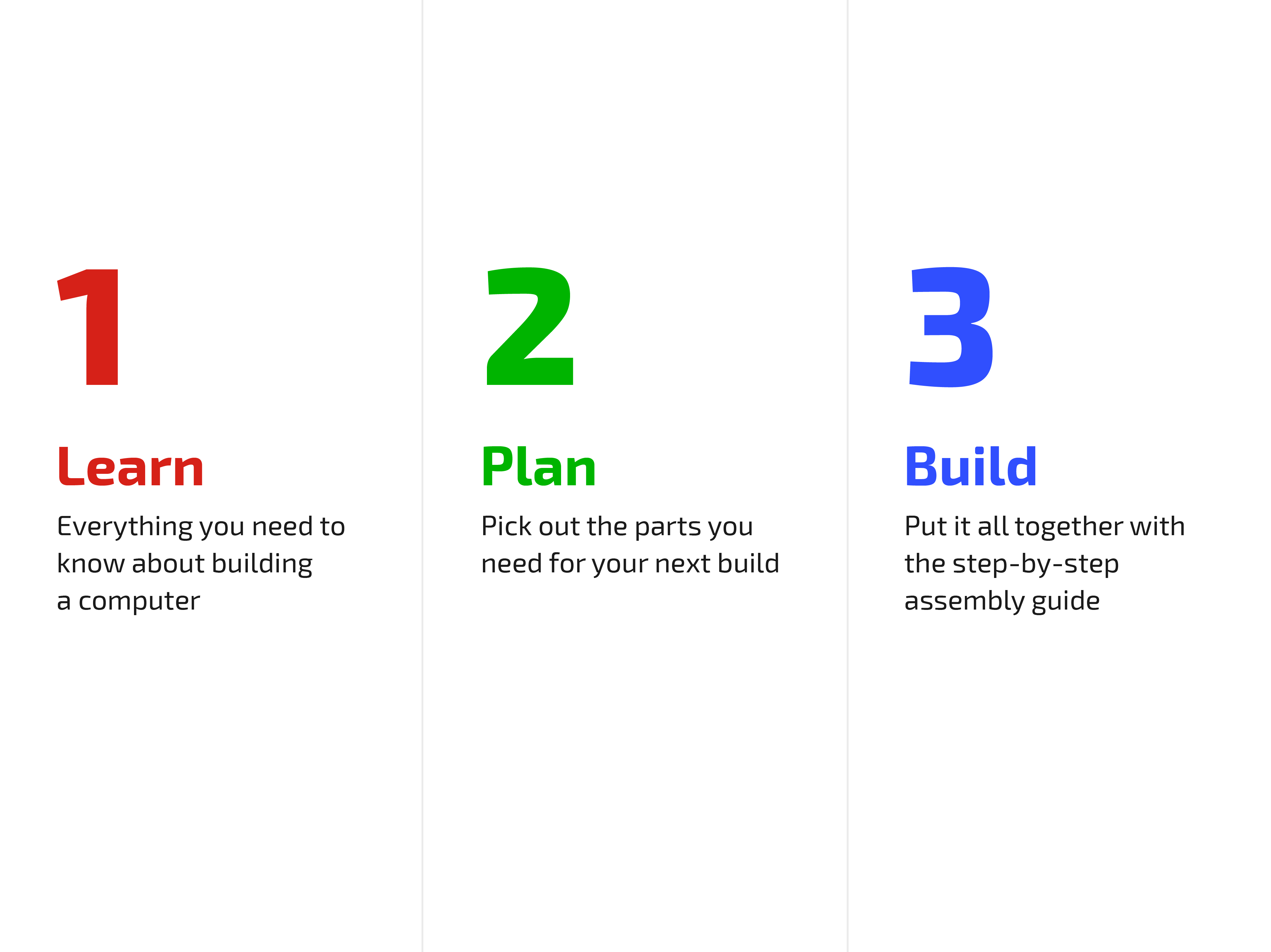
After the user is greeted by the homepage, they may select a category to delve into: Learn, Plan, or Build.
Computer Overview
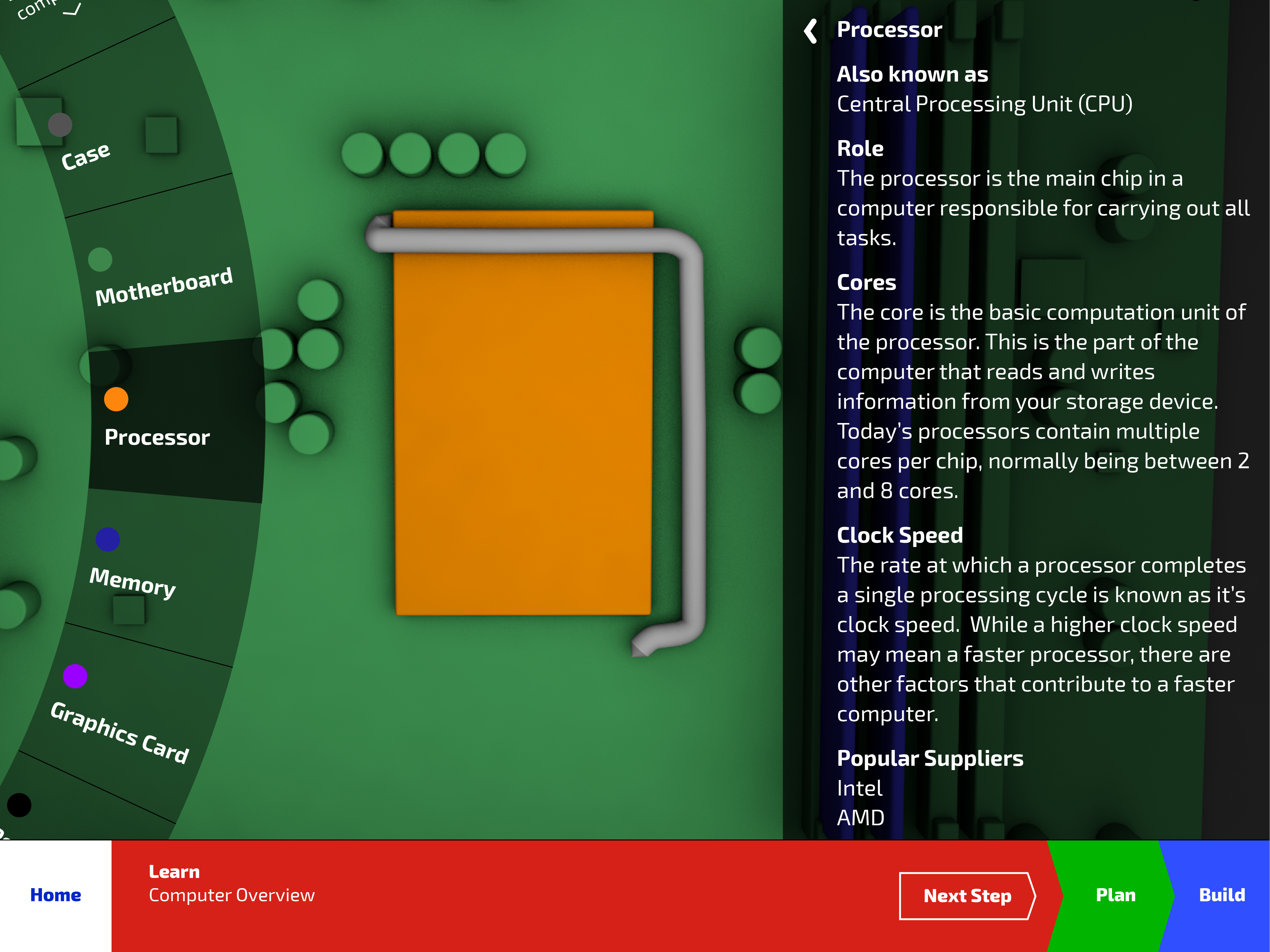
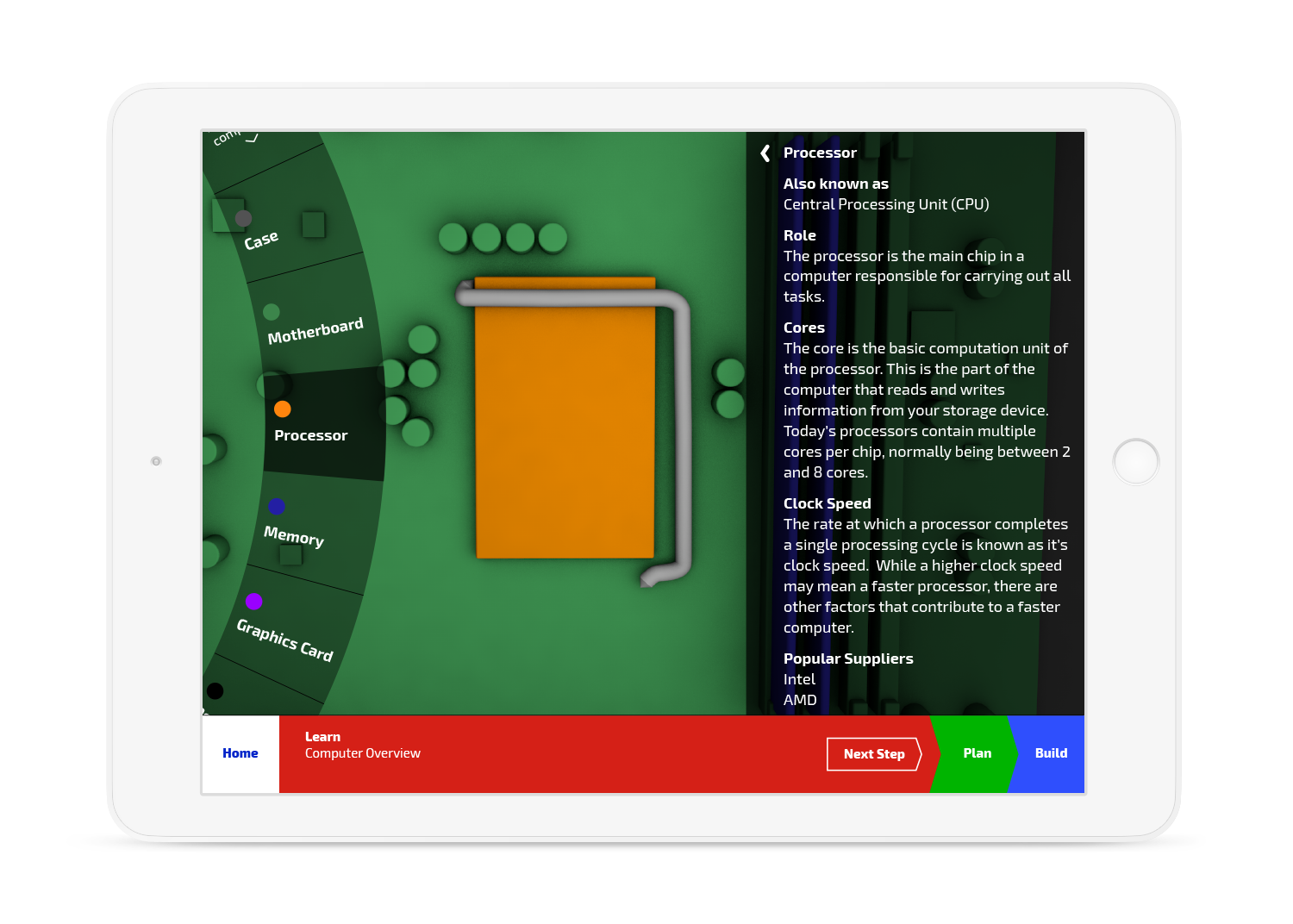
Processor Information
LEARN BY INTERACTING
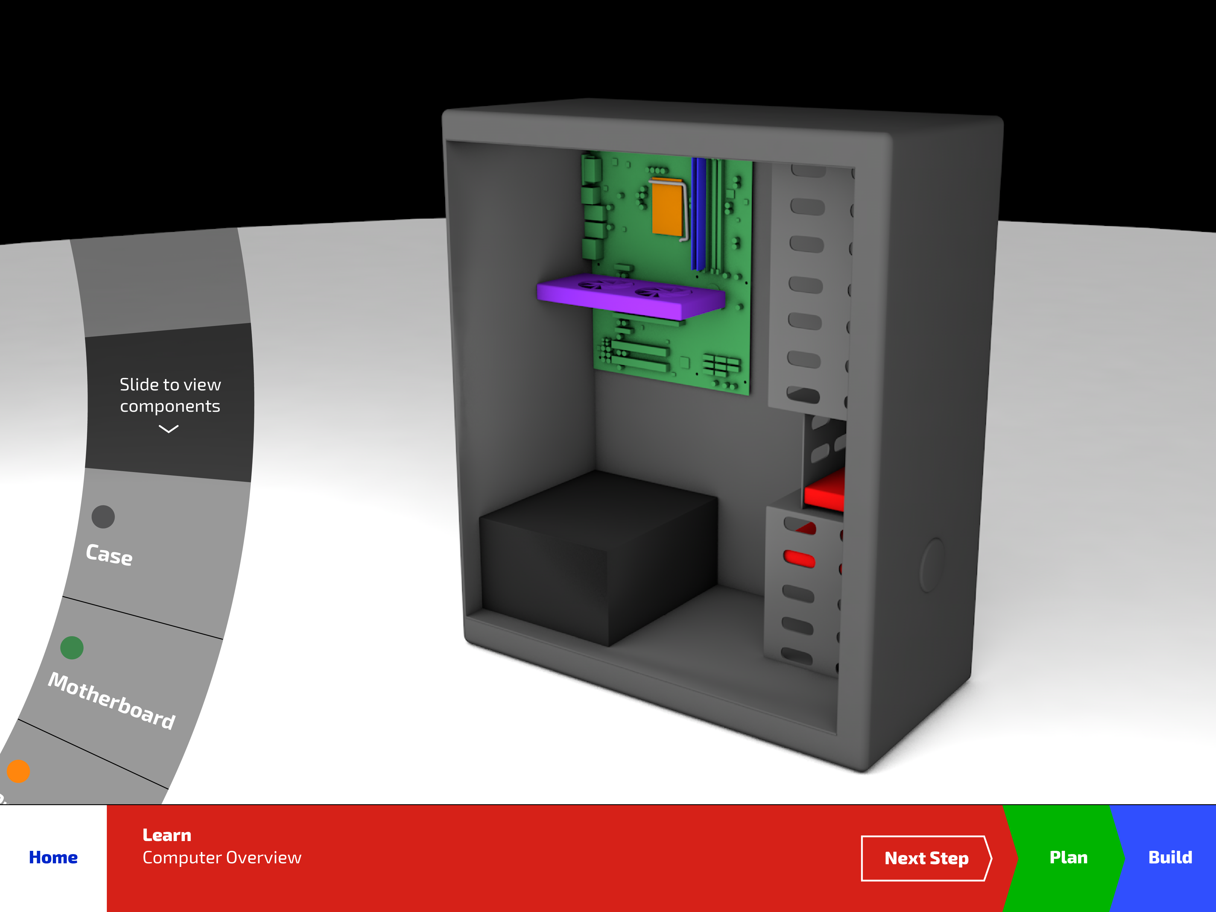
In the Learn section, the user may either tap and zoom directly with the 3D modeled computer or use the slider on the lefthand side to view each of the components that make up a completed build.

Recommendation Survey Question 1
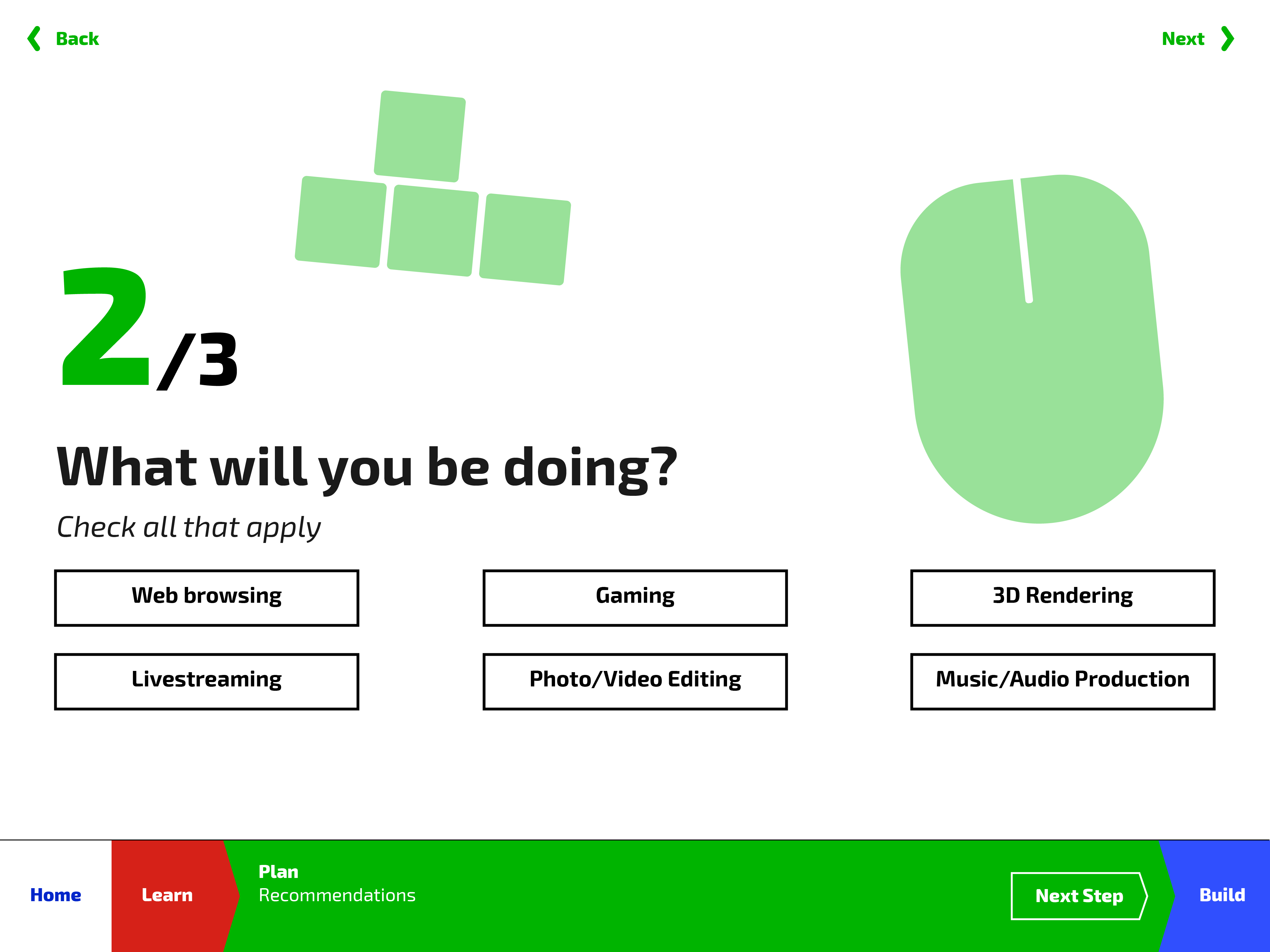
Recommendation Survey Question 2
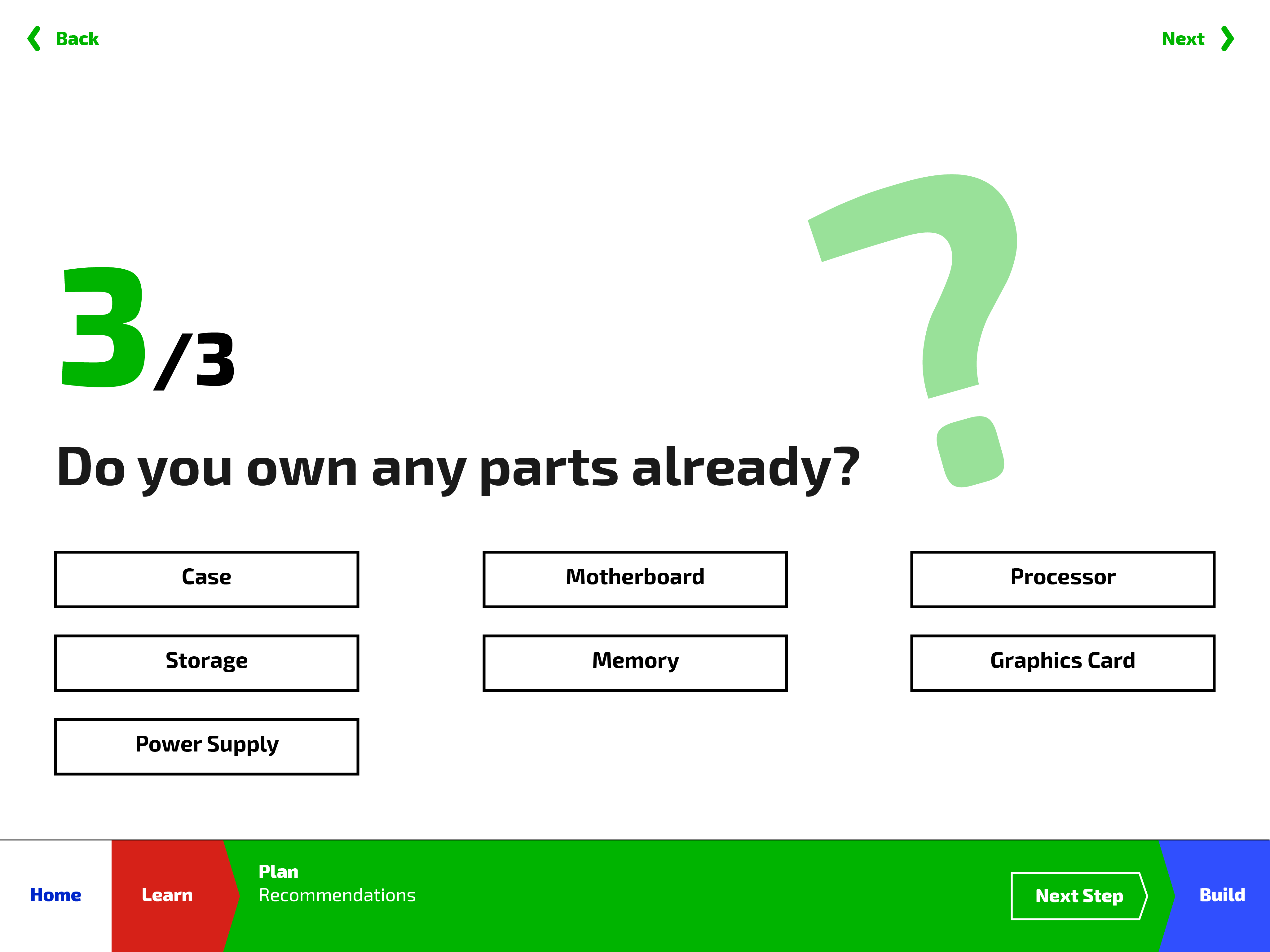
Recommendation Survey Question 3
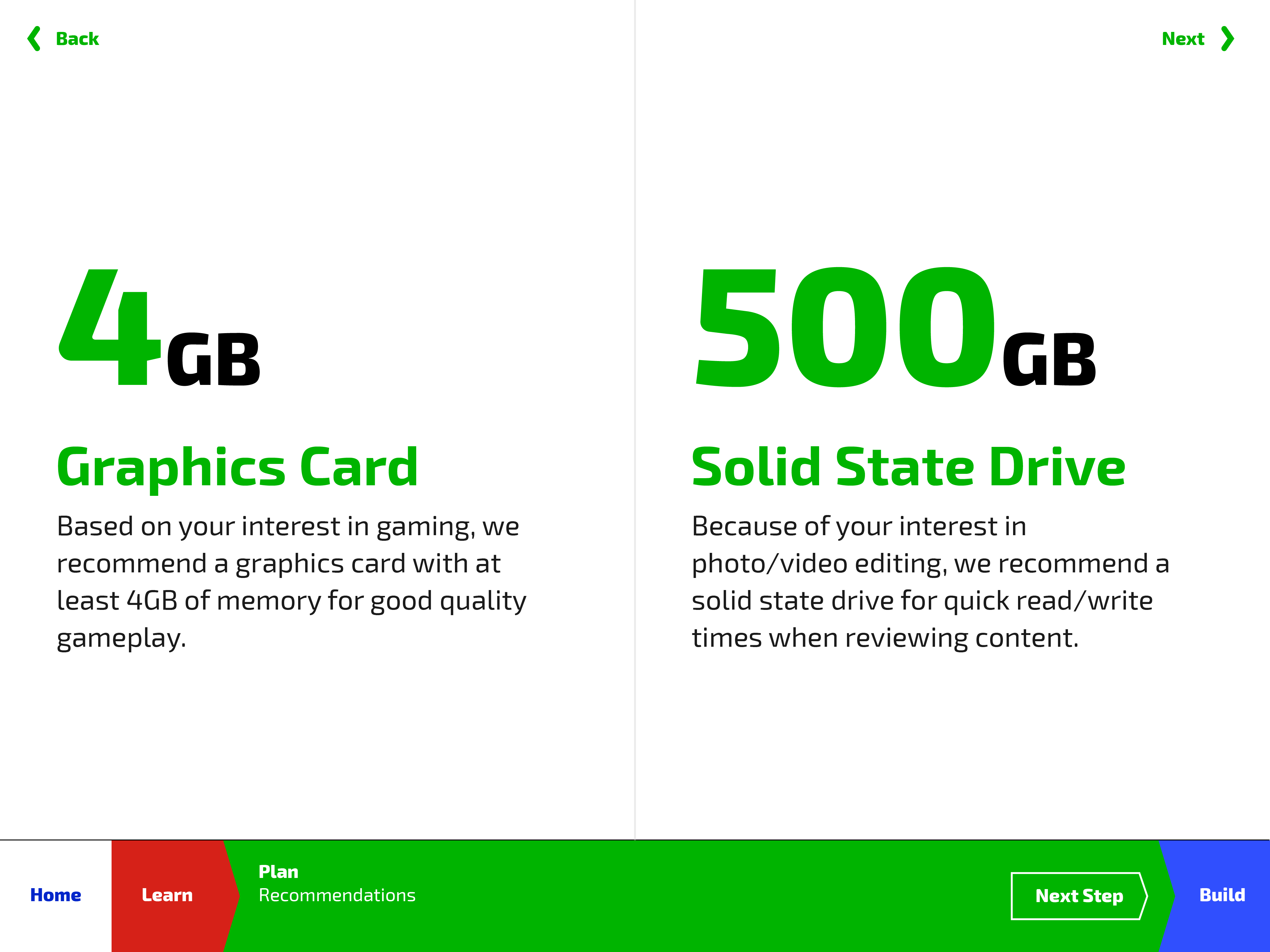
Recommendation Survey Result
FIGURE OUT WHAT YOU NEED
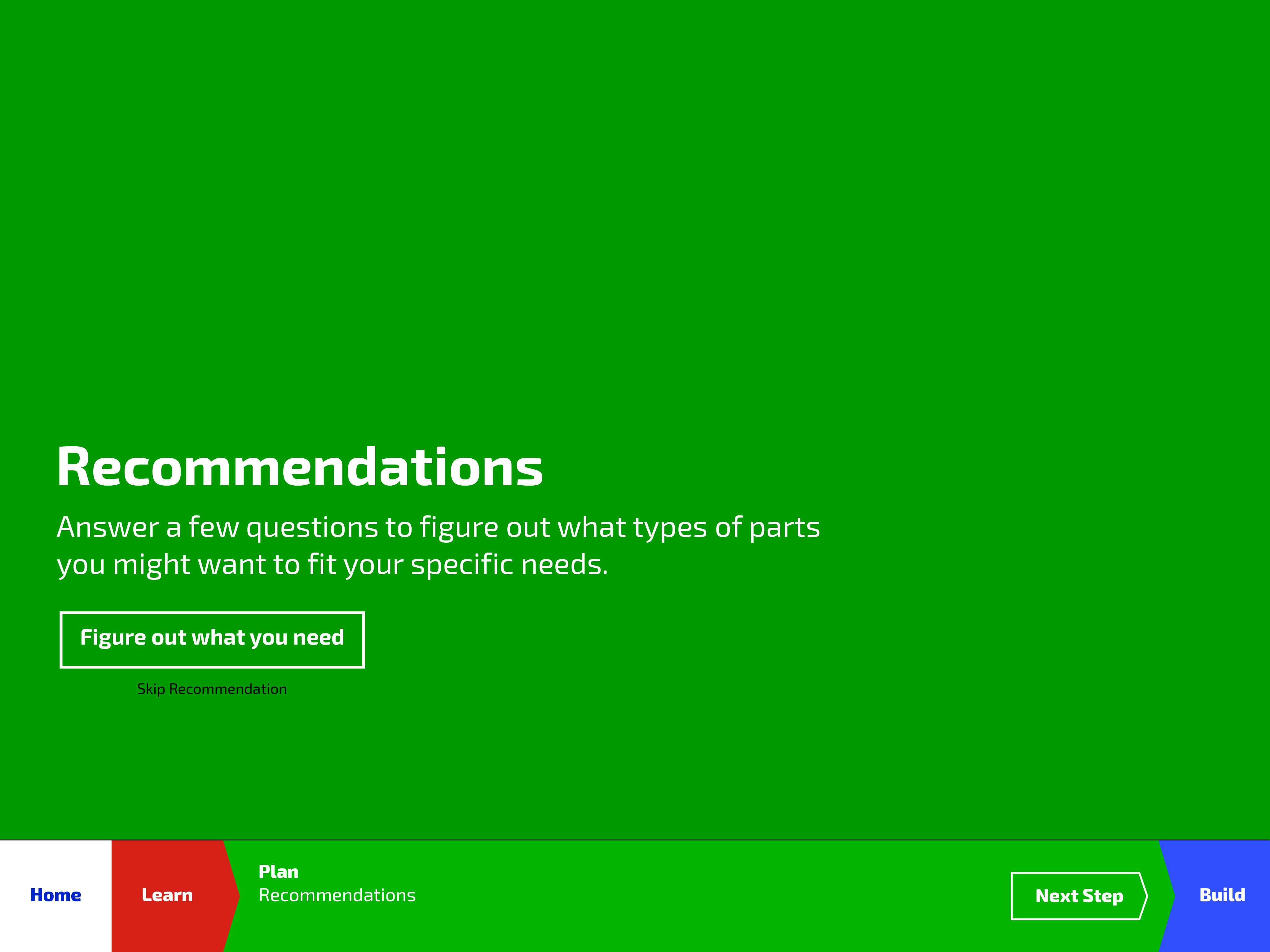
Using the quick three question recommendation survey, the user is able to get a general sense of what type of parts they might need to complete their custom build.
Selecting Parts
Choosing a Storage Solution
SELECTING THE PERFECT PART
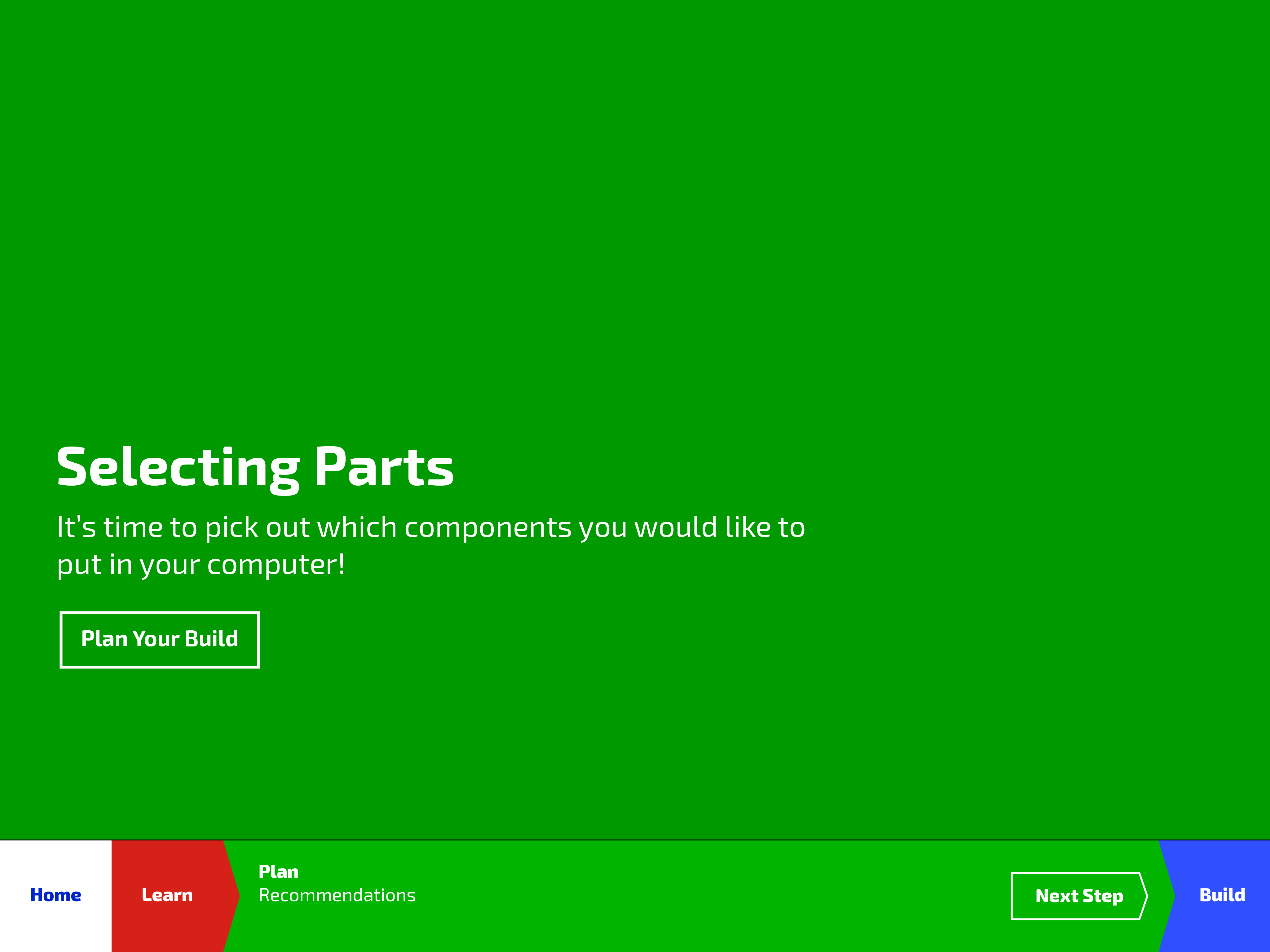
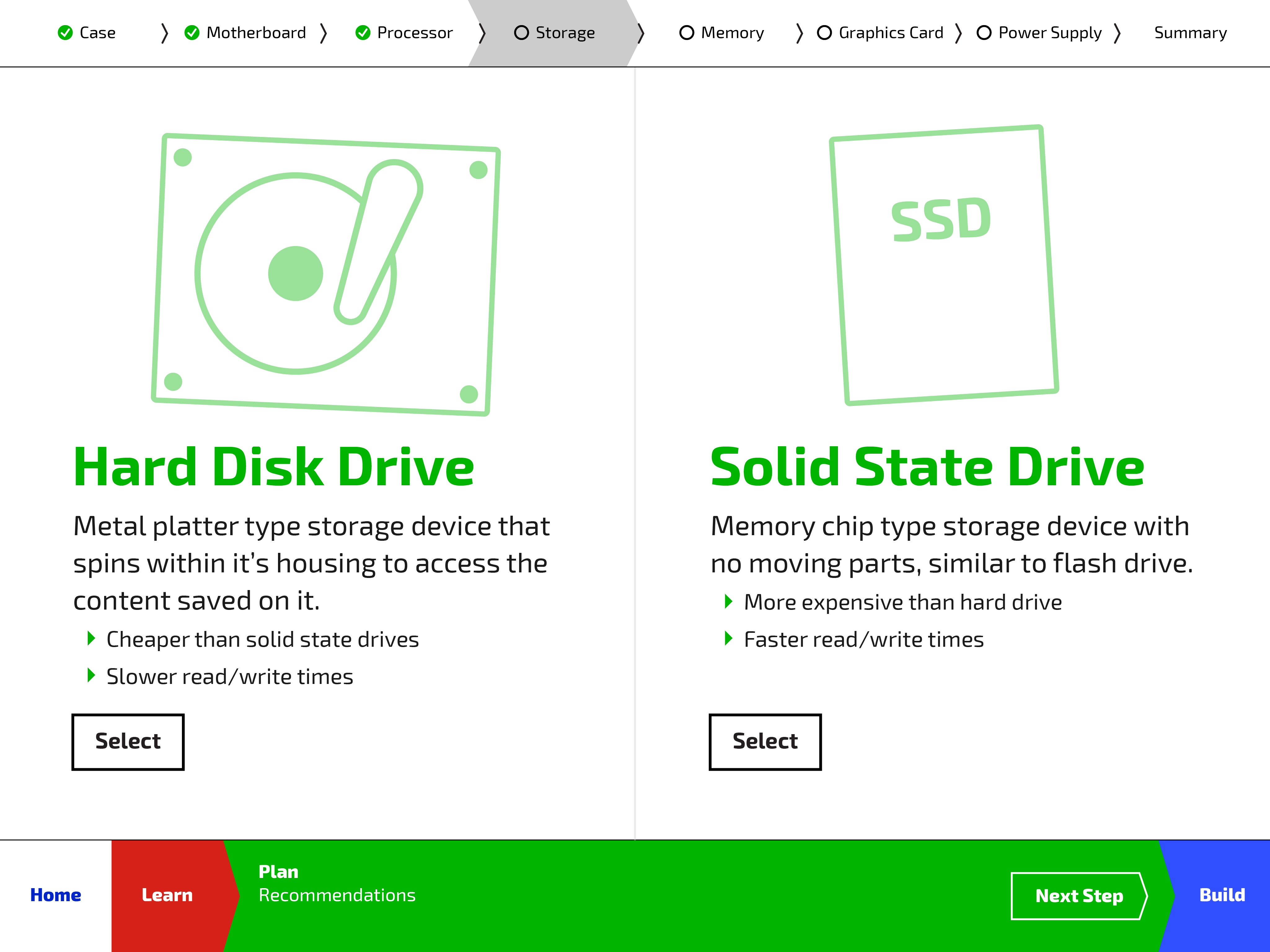
The application will then guide the user through each component in the build, prompting them to make a decision between different types of parts, all while making sure each component will be compatible with one another.
Step 1: Gather your materials
Step 2: Install the processor
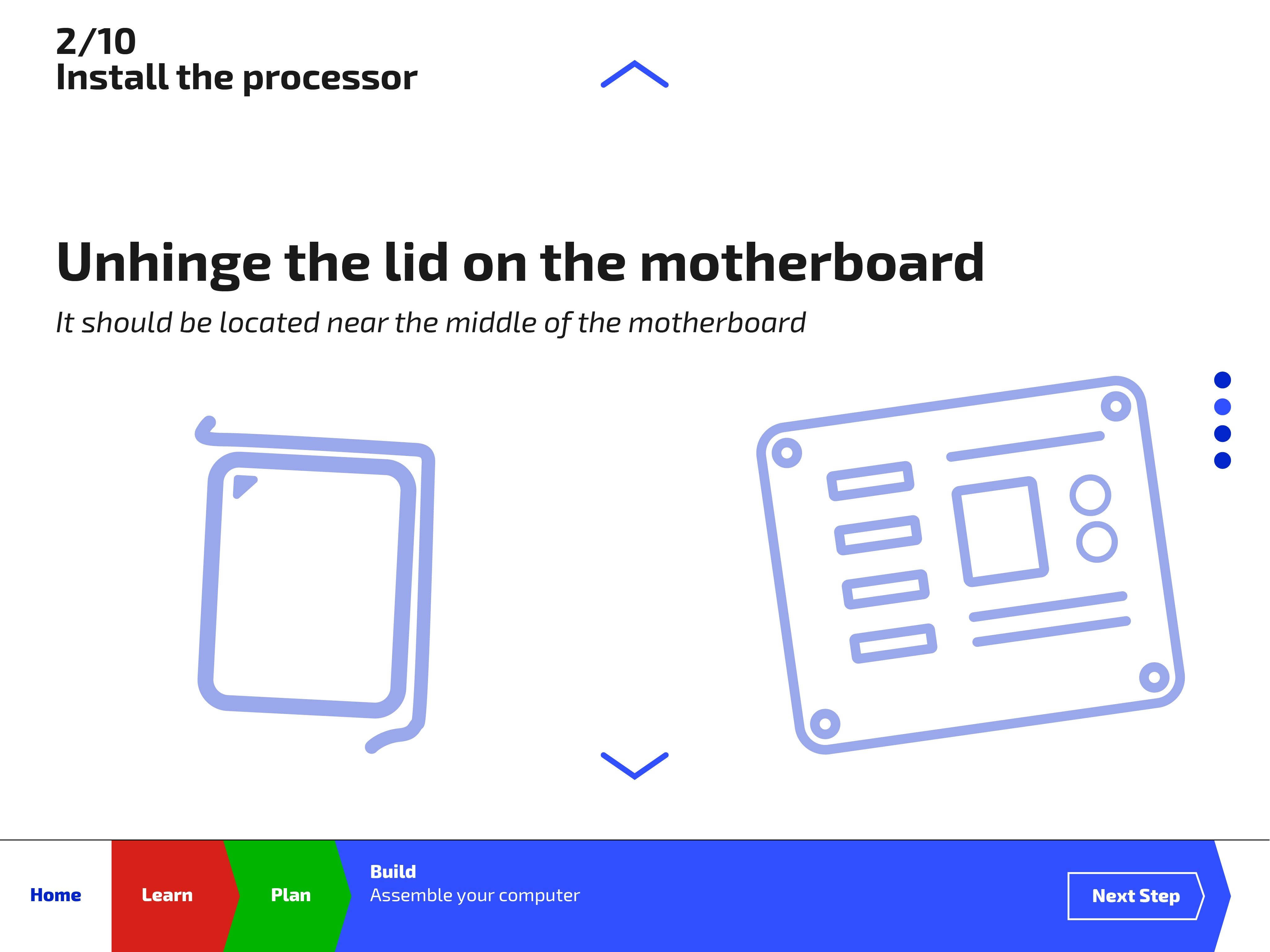
Step 2-1: Unhinge the lid
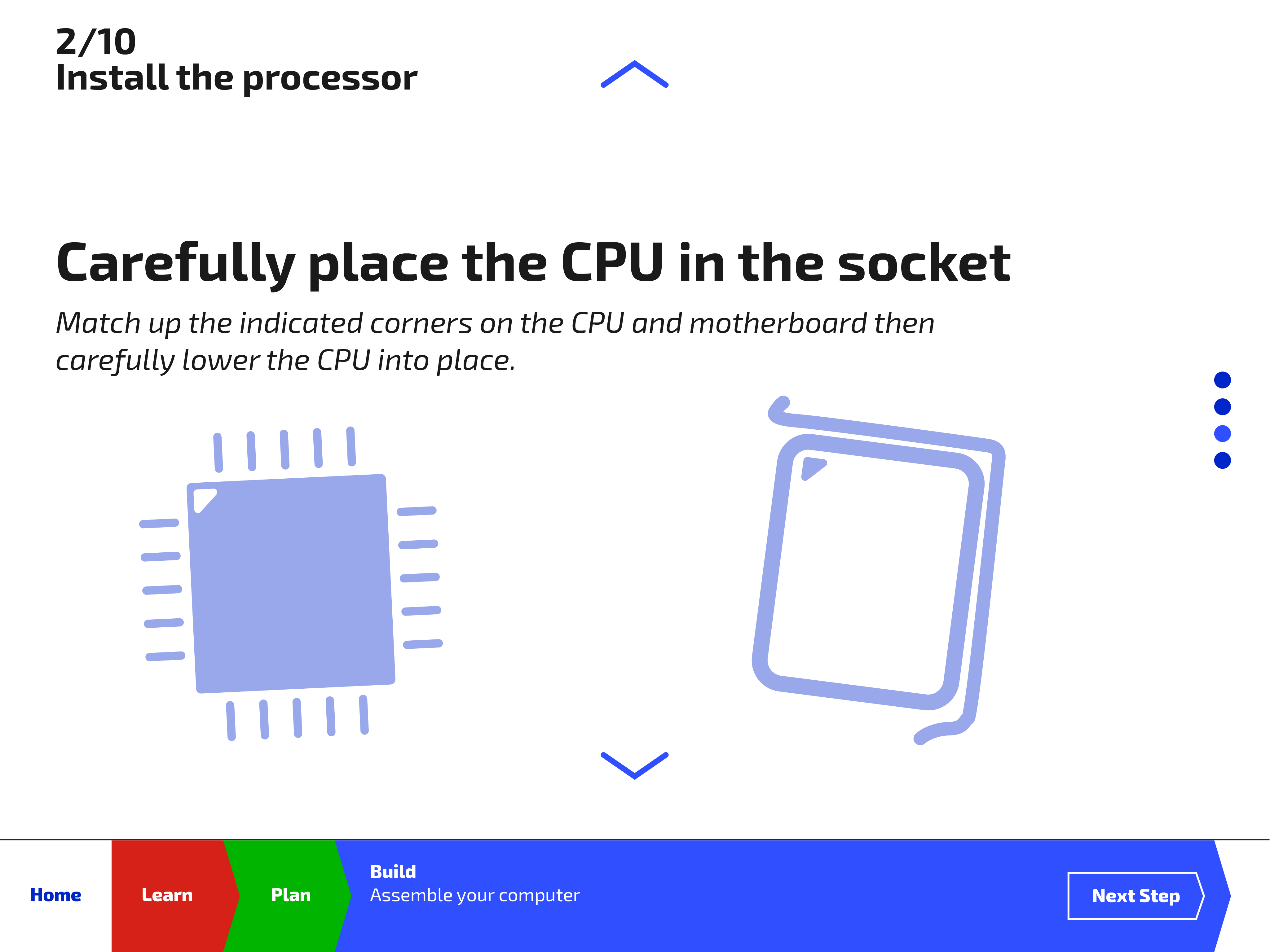
Step 2-2: Place the CPU in the socket
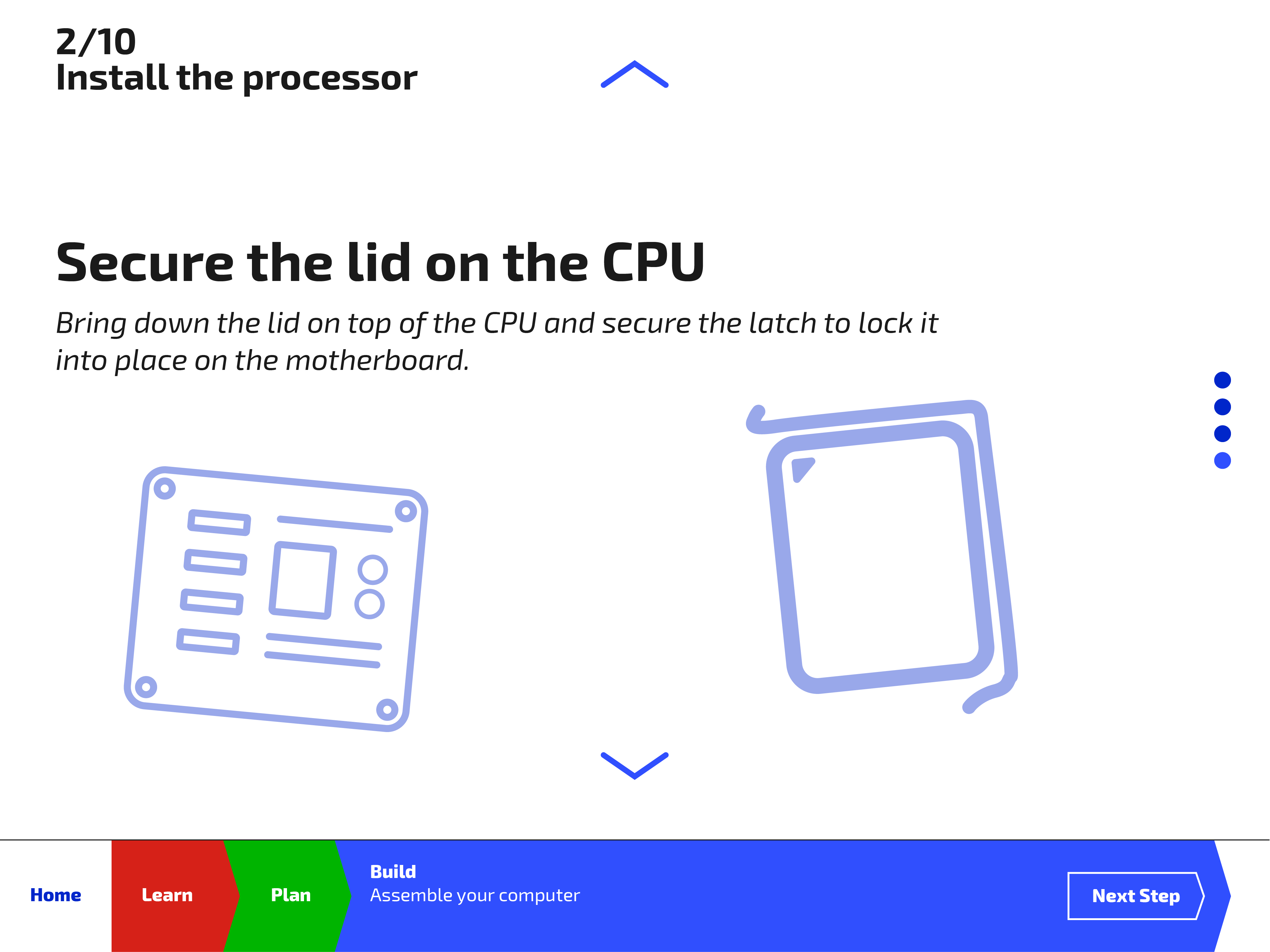
Step 2-3: Secure the lid
STEP-BY-STEP ASSEMBLY
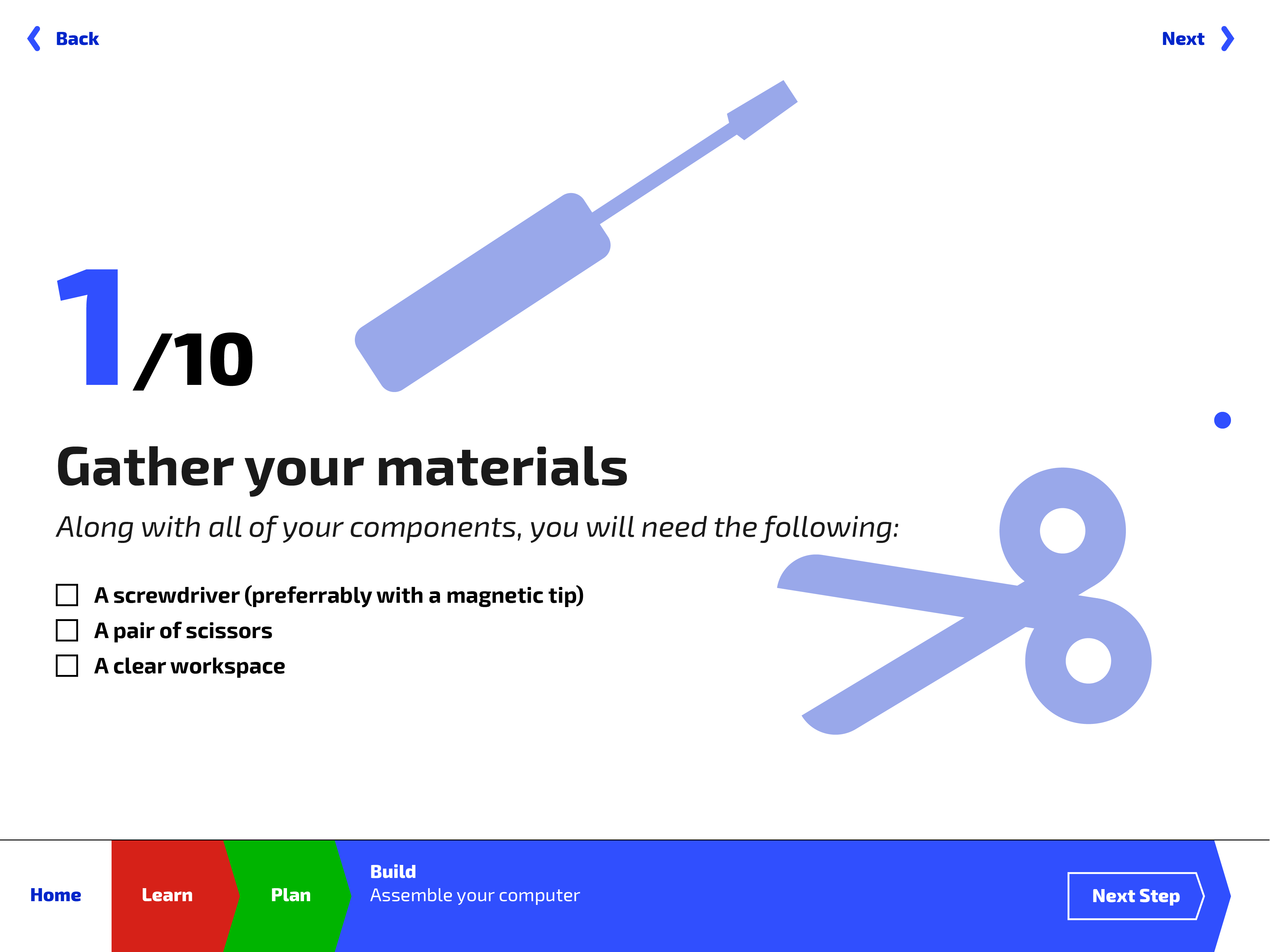
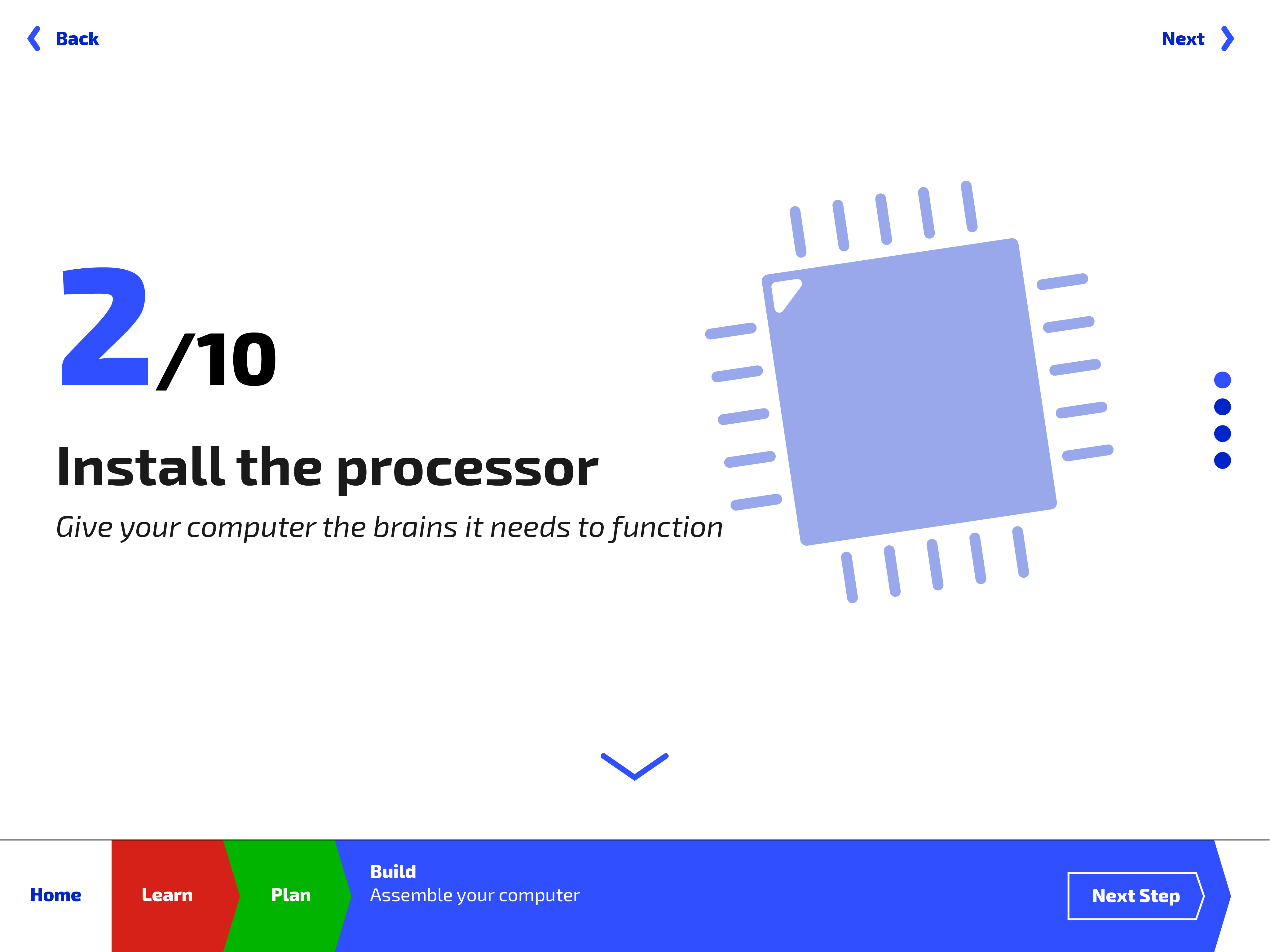
Starting with gathering the materials, the app will guide the user through the whole computer assembly process, breaking down steps into smaller actions if need be.
Congratulations on your successful build!
GREAT WORK!
At the end of the assembly process, the user is congratulated for successfully assembling their own custom computer!