Digital Identities Interactive Exhibit
An interactive exhibit for Imagine RIT 2019 designed to allow visitors to visualize their individuality through personal expression and image abstraction.
TASK
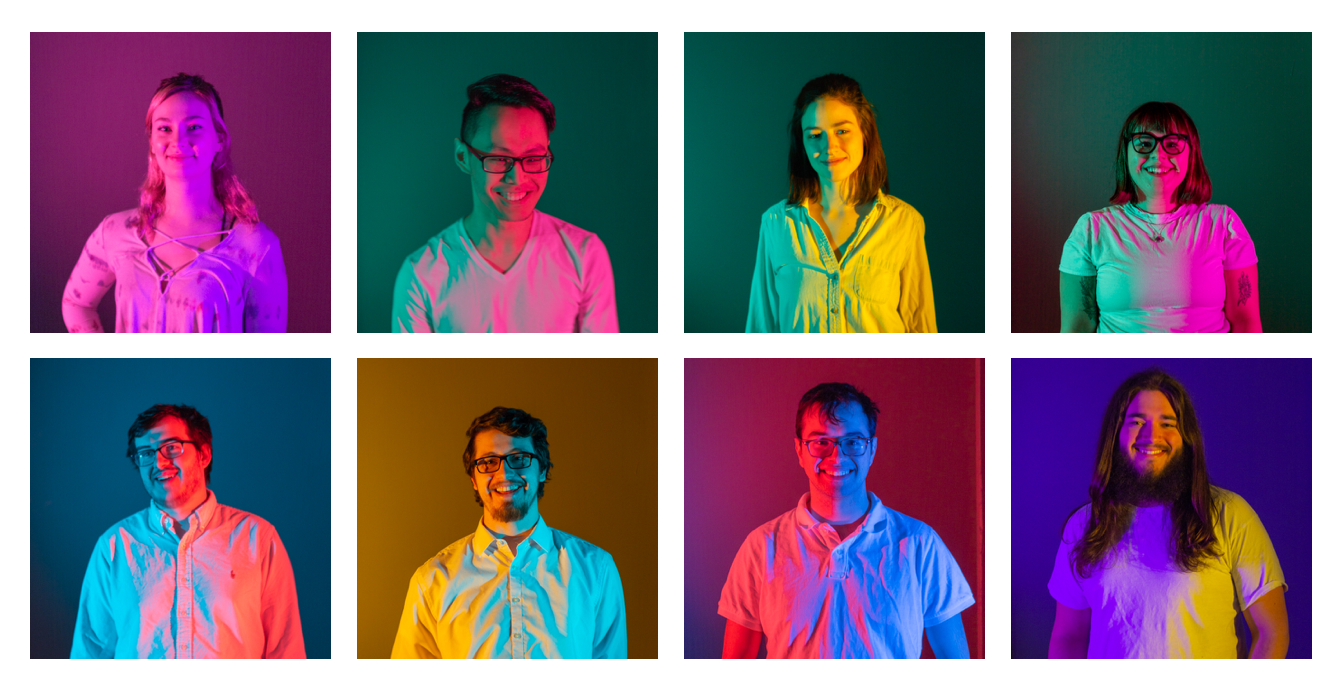
This semester-long senior capstone project was designed and developed by Alex Kim, Shelby Mason, Caren Flohr, Erika Kallio, Ian Loomis, Matthew Freeberg, Patrick Bell, and myself.
DURATION
January - May 2019
ROLE
UI/UX, Development
Imagine RIT Recap
Imagine RIT
DO GOOD
We were tasked with creating an interactive exhibit for the Rochester Institute of Technology's 2019 Imagine RIT: Creativity & Innovation Festival, and with a loose prompt of "Do Good", the possibilities for our senior capstone project were endless.
INTERDISCIPLINARY TEAMS
Adam Smith, of the New Media Design program, and Sten McKinzie, of the New Media Interactive Development program, collected short questionnaires from seniors of the two majors and divided them up into eight teams to work together on projects for the annual festival.
Meet the Team
The Team
WORKING TOGETHER
Our team consisted of five New Media Design majors, two New Media Interactive Development majors, and one design student on exchange for the semester from Dessau, Germany.
BRAINSTORMING
After coming together to meet a few times to discuss what our project should be about, we made the decision to focus on individuality in the age of social media.
Research
HERD MENTALITY
Research shows that "social influence is a powerful force in nature and society" and that, while useful in certain circumstances such as avoiding dangerous situations for animals or getting the best smartphone on the market, it can lead to "individuals [devaluing] their own personal information in favor of imitating the actions, or opinions, of others."
SELF(IE) IDENTITY
This idea is just as prevalent in social media. One article tells us that "differences between our “real” and online identities can shape not only how others perceive us but our self-perceptions, creating pressure to be more like the often idealized digital versions of ourselves and our peers," and another argues that the "shift in identity, from internally derived to externally driven, can't be good for us as individuals nor for us as a society."
Our Solution
Quiz Station
Taking the Quiz
Visualizing Individuality
VISUALIZING INDIVIDUALITY
In order to get away from the pressure to conform, we decided to provide visitors an opportunity to visualize their individuality through personal expression and image abstraction.
UNIQUE EXPRESSION
Visitors would answer a few questions about themselves and their personal preferences through an interactive survey and their answers were translated into an abstracted visual representation of what makes them unique.
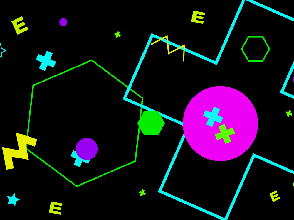
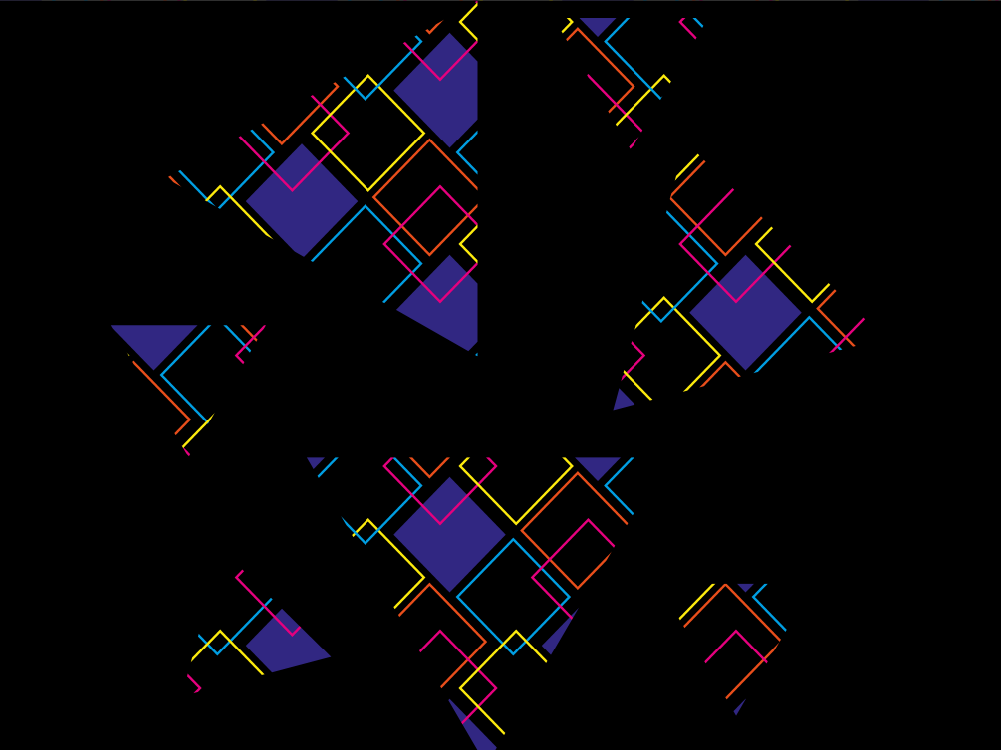
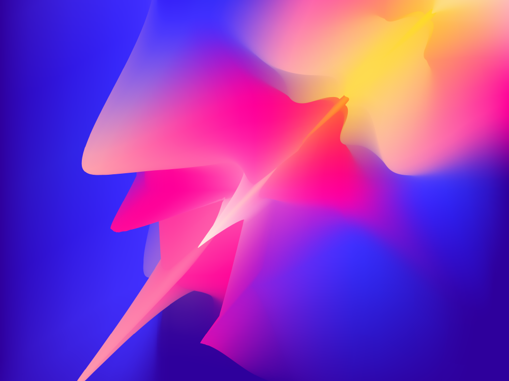
How do we visualize identity?
February Mockup 1
February Mockup 2
February Mockup 3
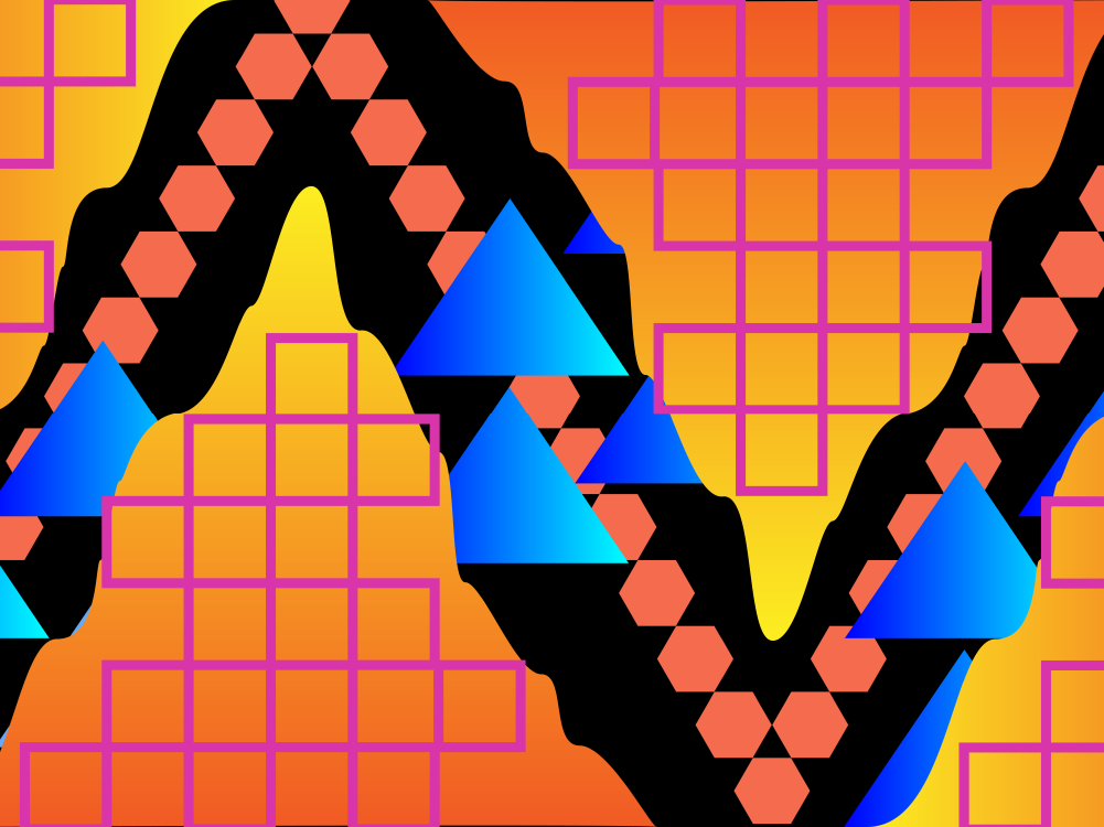
PLAYING WITH COLOR
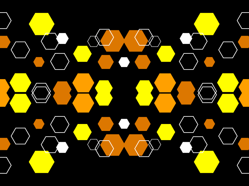
After some initial color tests, we decided to go with a bright and neon type of theme for the project. We wanted people to be loud and proud when it came to their personality so we figured bold colors would help accomplish this.
March Mockup 1
March Mockup 2
SYMMETRY
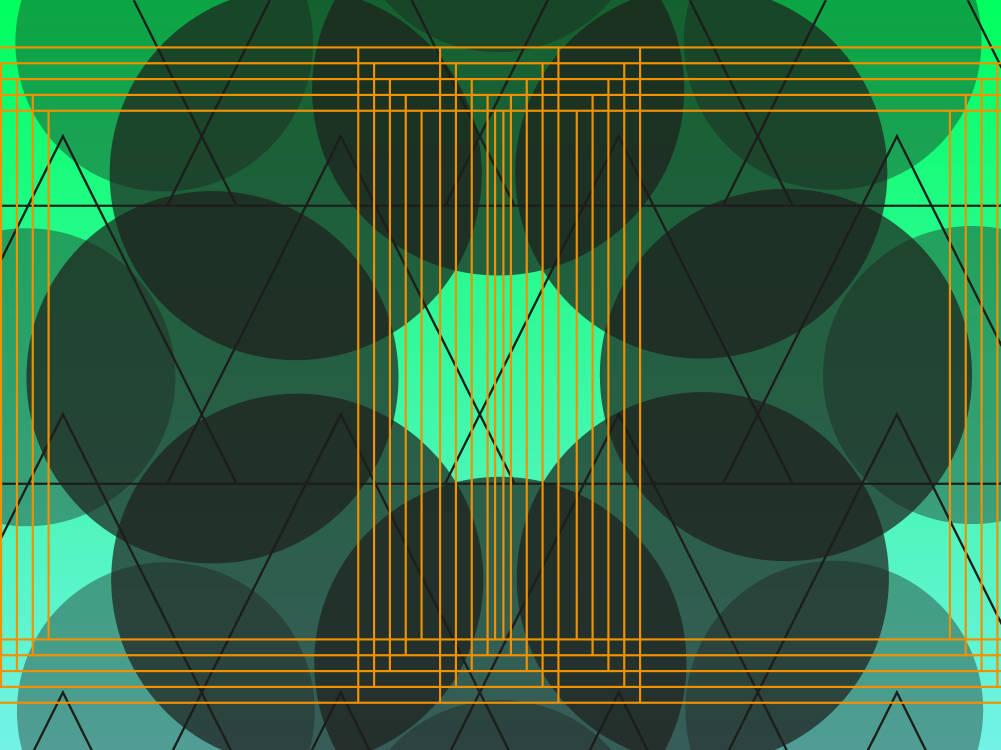
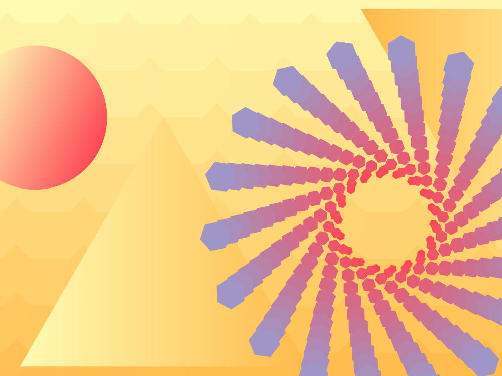
Since our art was going to be generated using personality quiz answers, we had to create a design system that would look cohesive no matter what inputs were used. We played around with symmetry and asymmetry to give our concept art the feeling of generated art.
March Mockup 3
March Mockup 4
CREATING DEPTH
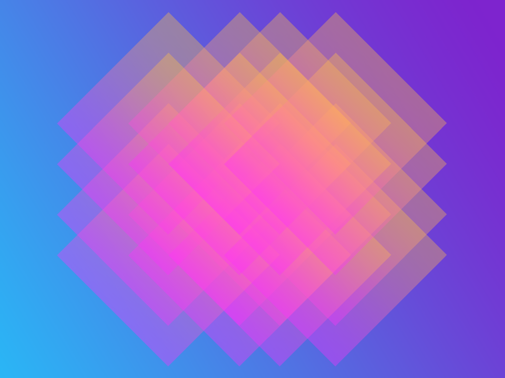
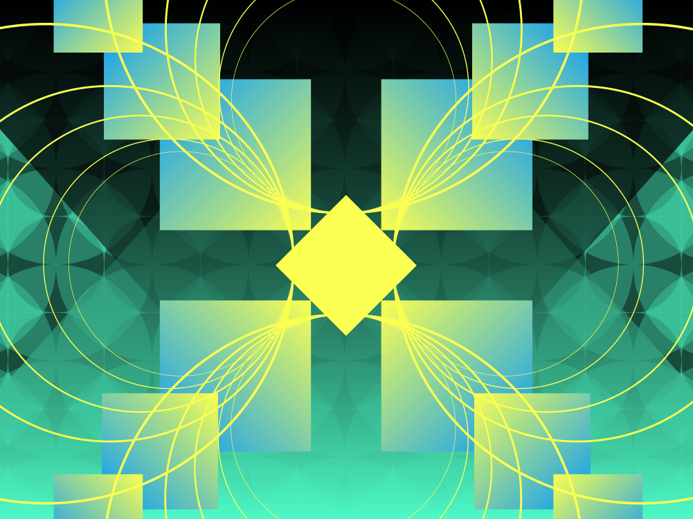
In order to create more visual interest in the portraits, we then focused on putting elements in the foreground, middleground and background to create a greater sense of depth.
March Mockup 5
March Mockup 6
April Mockup 1
COMBINING IT ALL TOGETHER
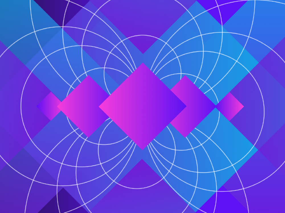
Adding each of these elements together pushed our mockups in a direction that we were all super interested in, and hoped that our excitement would be passed on to our visitors.
Defining a Brand

Logo Iteration 1
Logo Iteration 2
Final Logo Design
DEVELOPING OUR BRAND IDENTITY
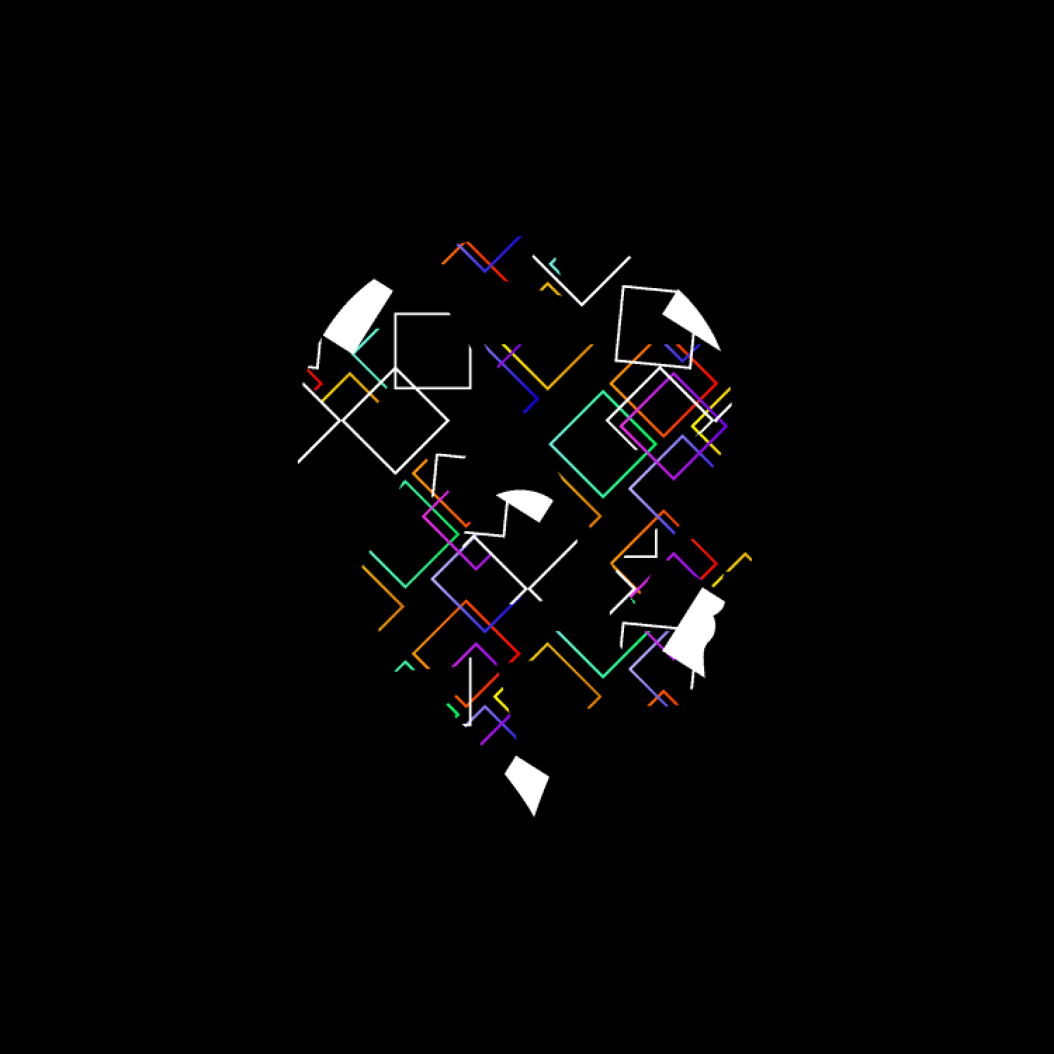
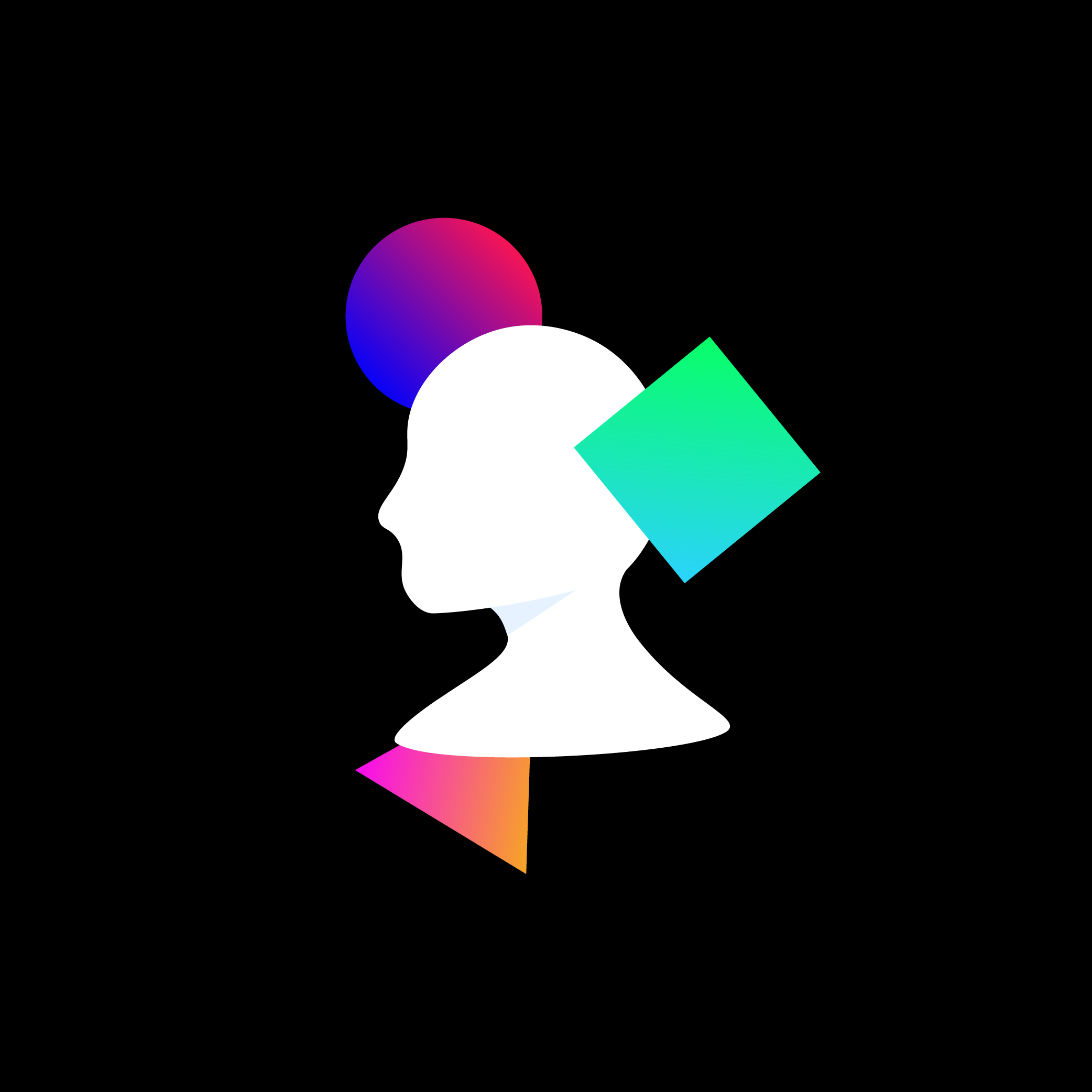
Now that we had a visual style for the generated art, we started to build up the brand to support the project. Our early logo concepts reflected our early mockups but as the style developed, so did our brand identity.
The Quiz
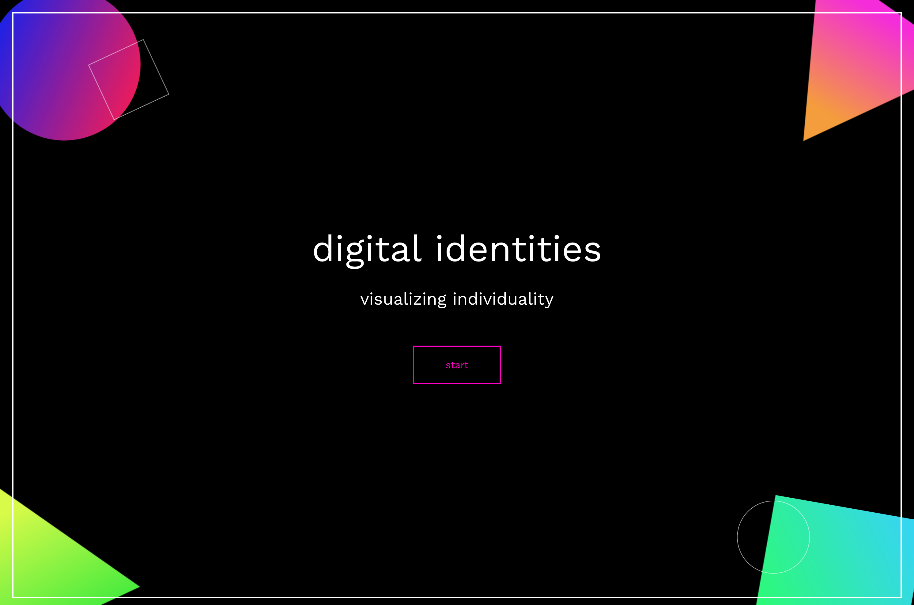
Start Quiz
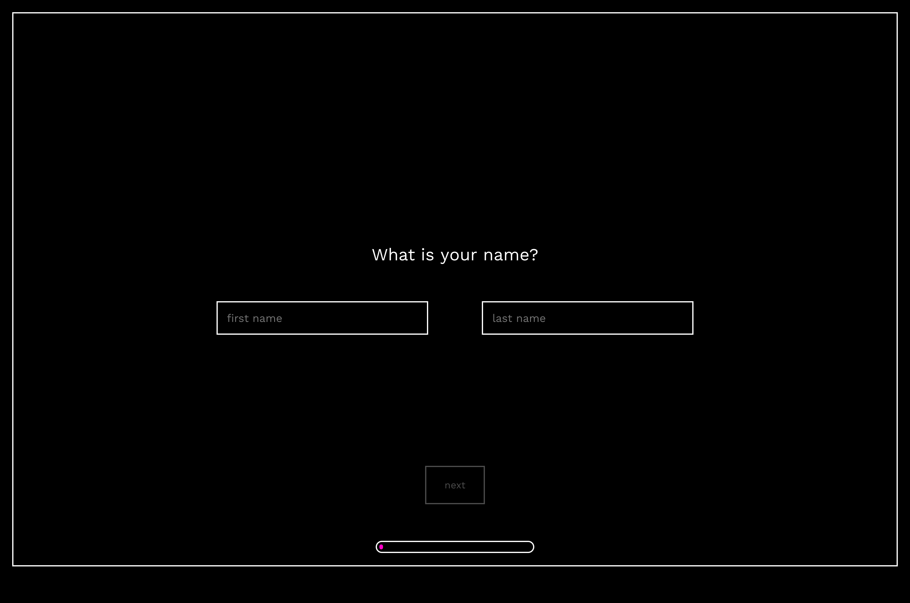
What is your name?
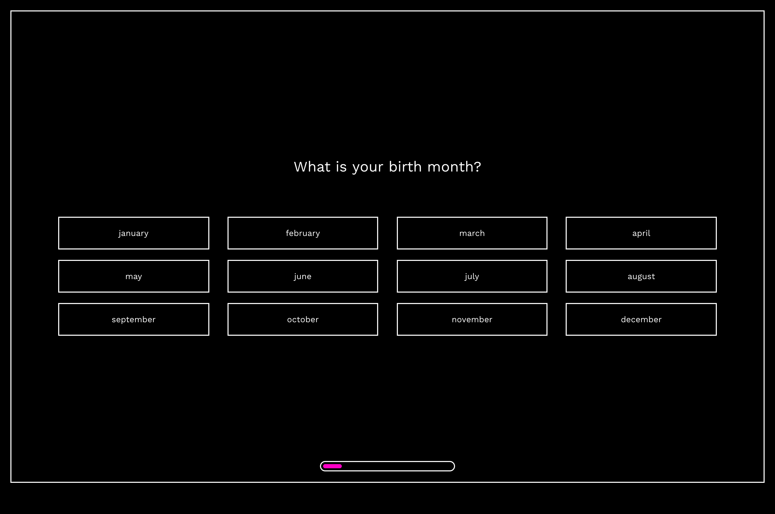
What is your birth month?
QUIZ QUESTIONS
In order to create a unique portrait for each and every person, we had to come up with a list of questions that would influence the art in different ways for everyone. We decided that a good starting off point was a person's name and birth month.
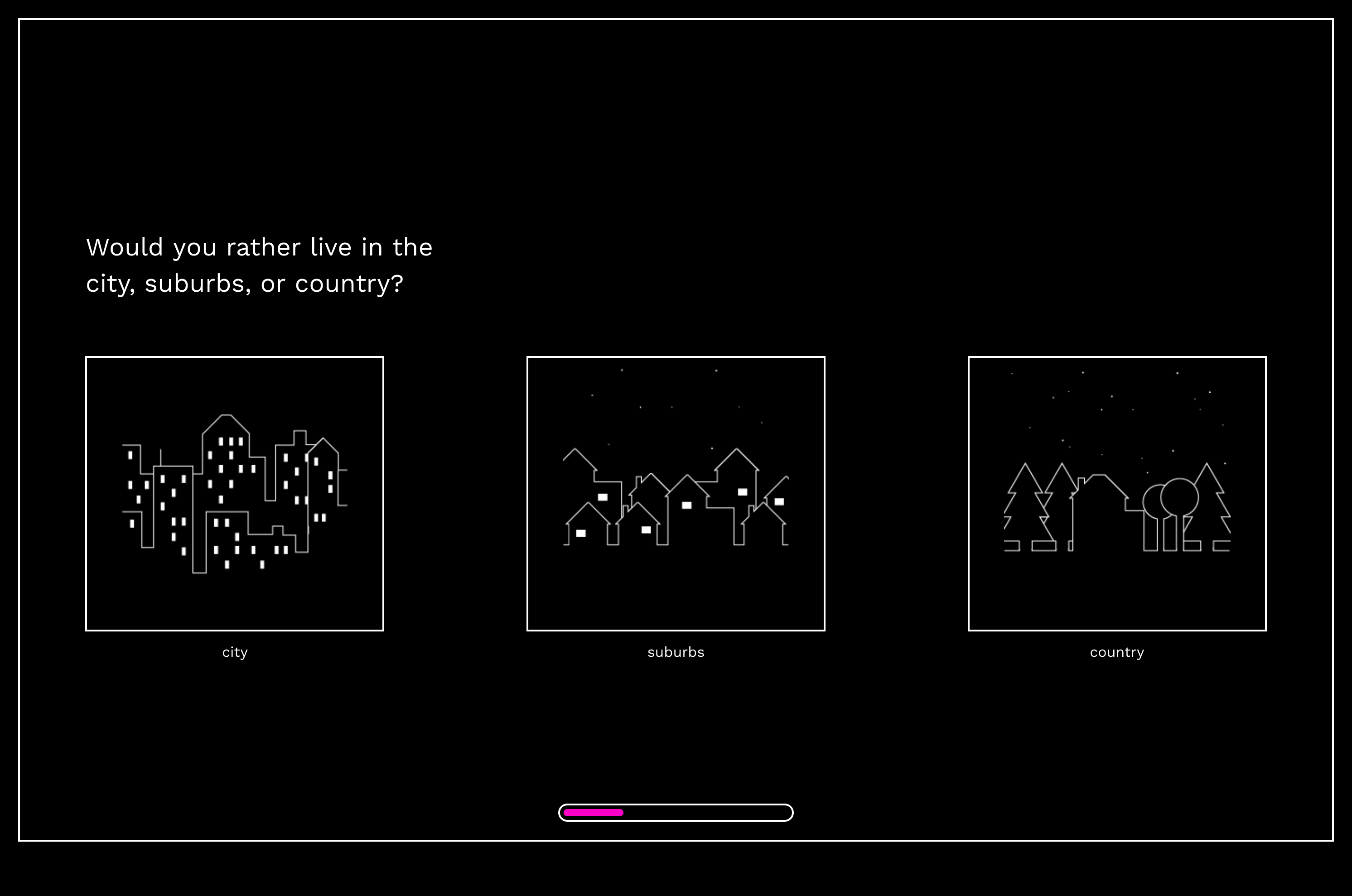
Would you rather live in the city, suburbs, or country?
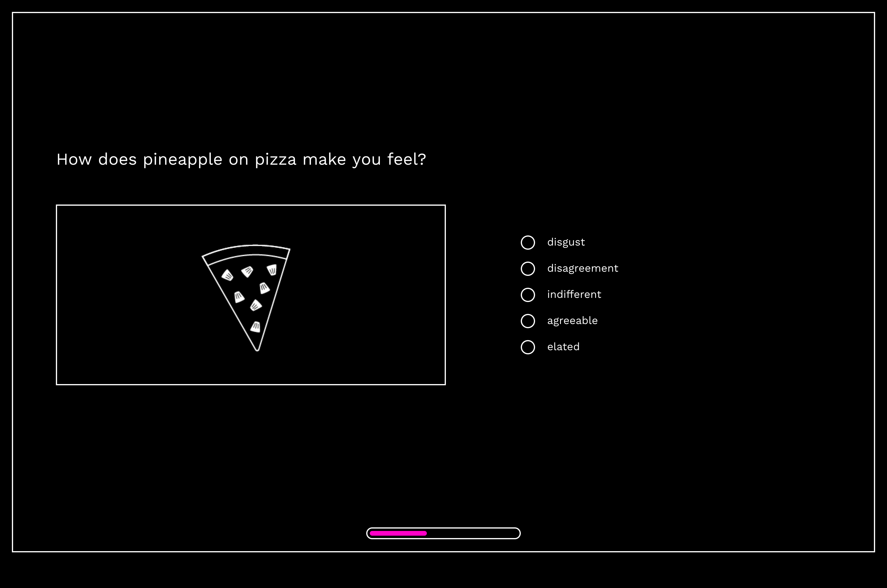
How does pineapple on pizza make you feel?
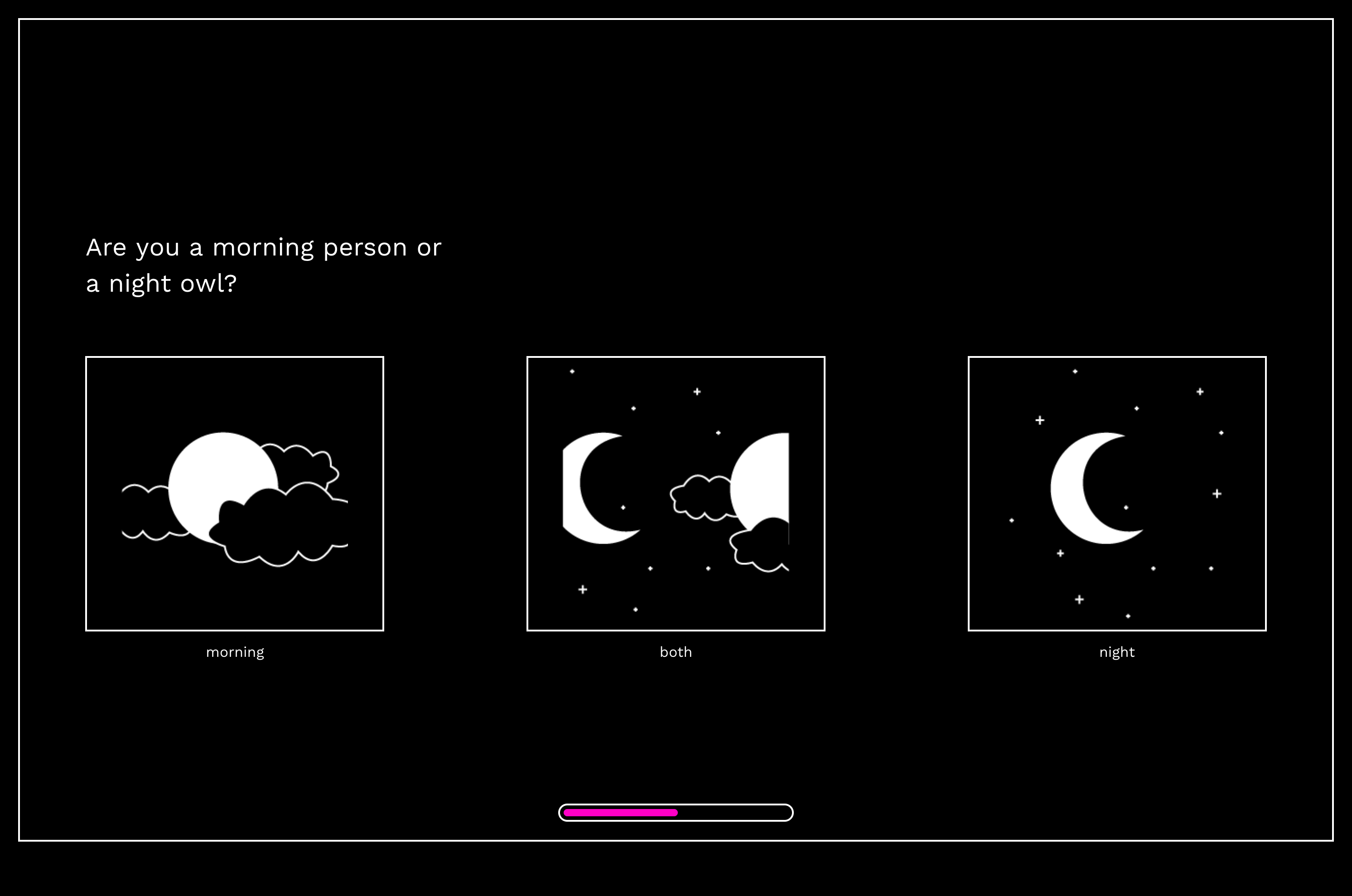
Are you a morning person or a night owl?
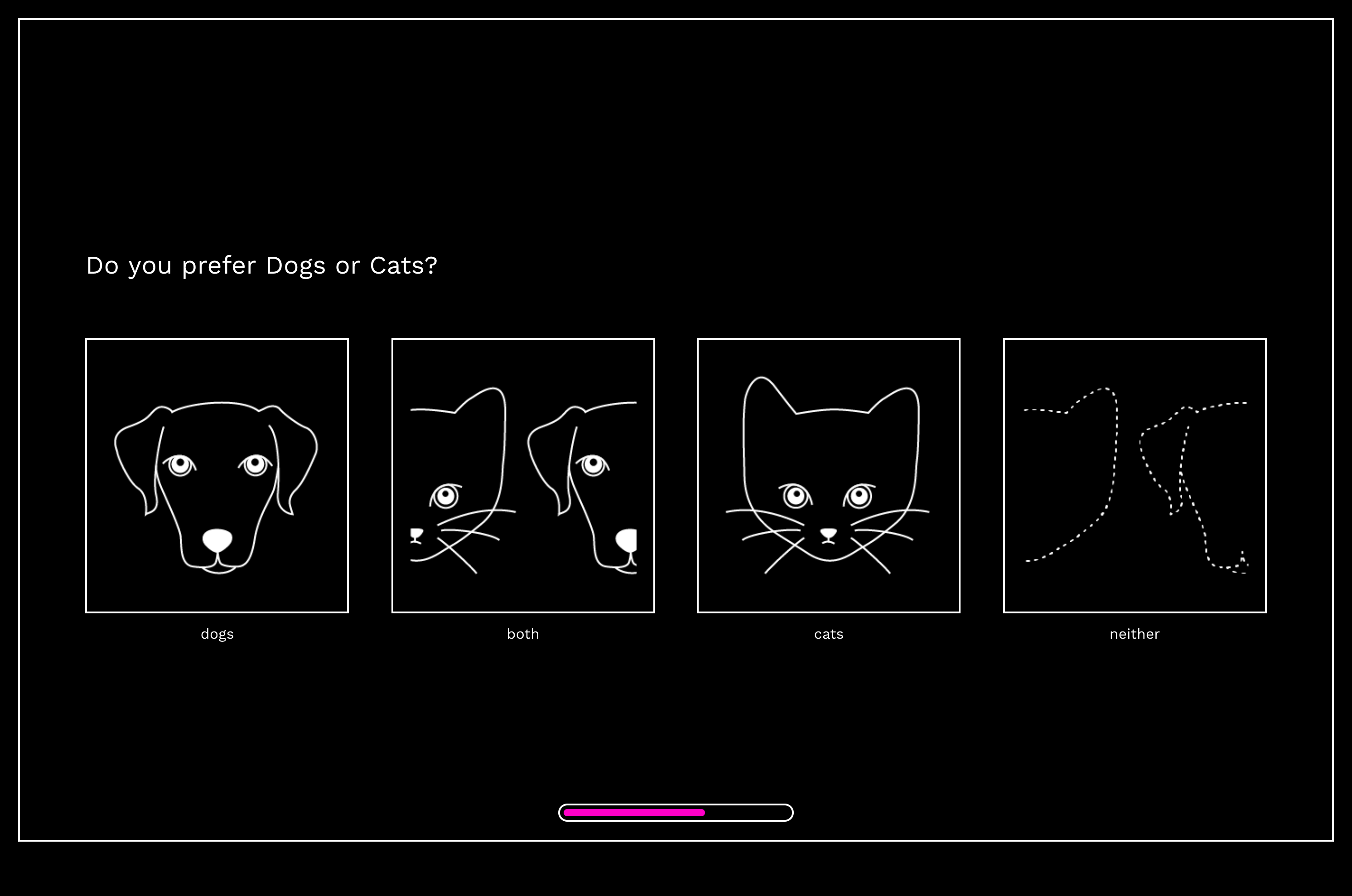
Do you prefer dogs or cats?
PREFERENCE-BASED
The next set of questions were more focused on how a person answers more preference-based questions such as where they would want to live, if they're a morning person or a night owl, if they liked cats or dogs more, or even how they felt about pineapple on pizza.
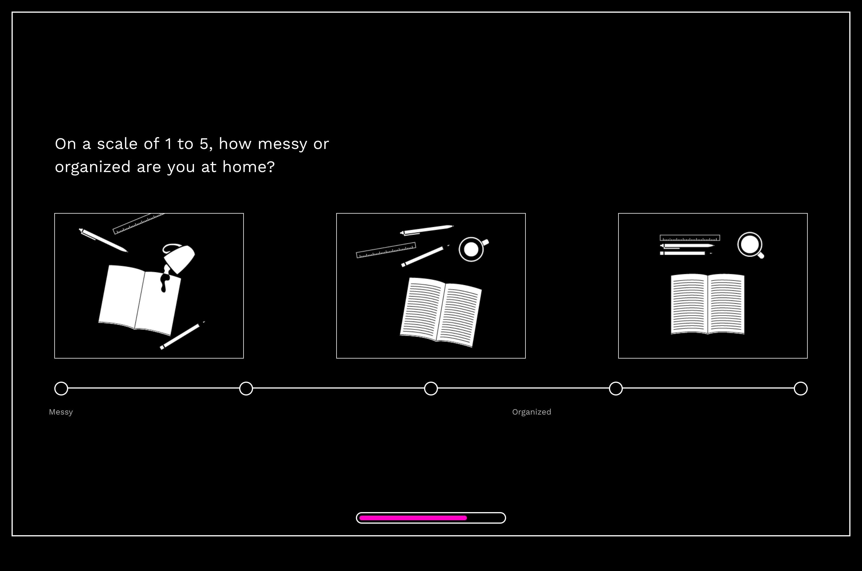
On a scale of 1 to 5, how messy or organized are you at home?
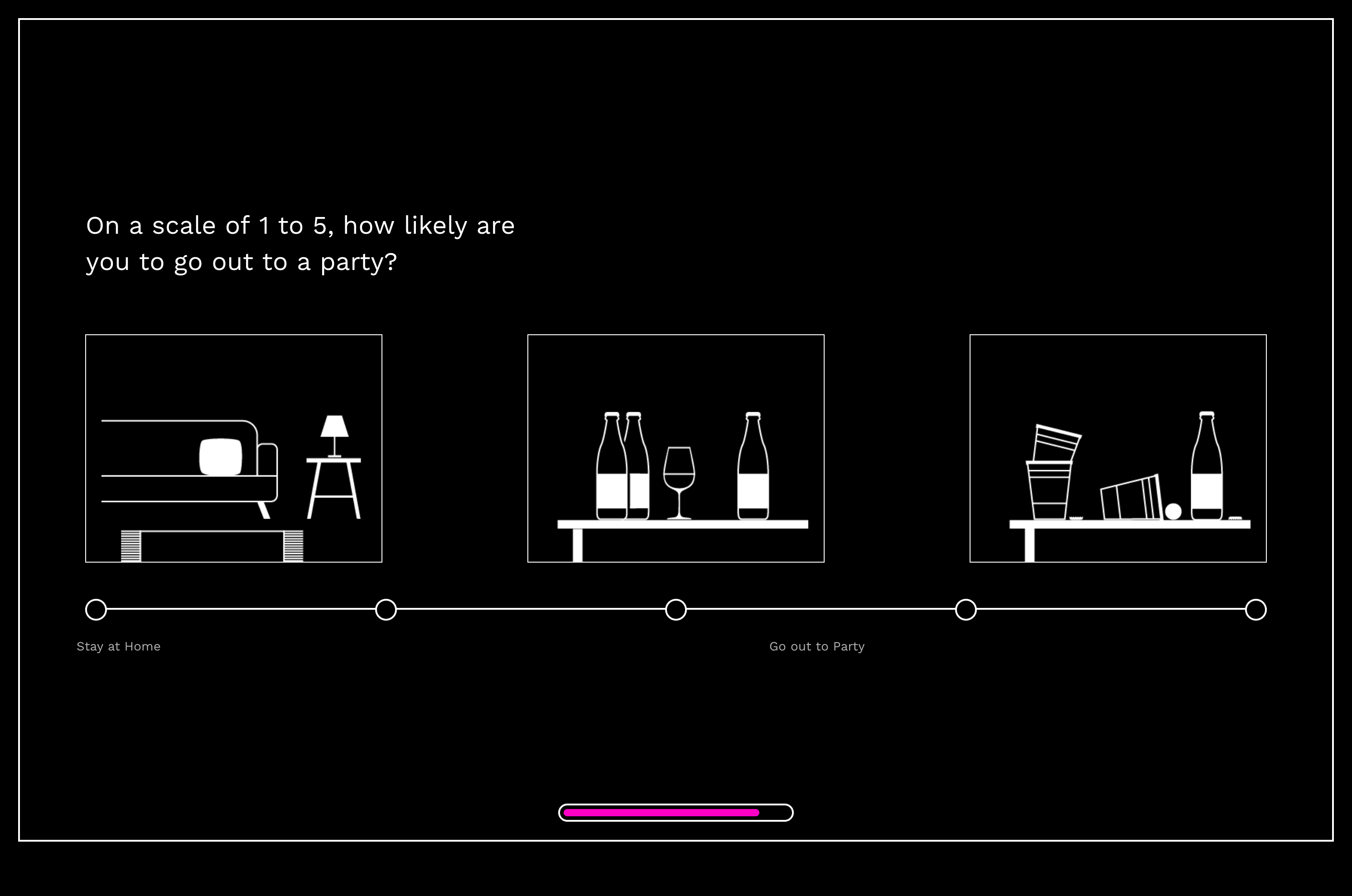
On a scale of 1 to 5, how likely are you to go out to a party?
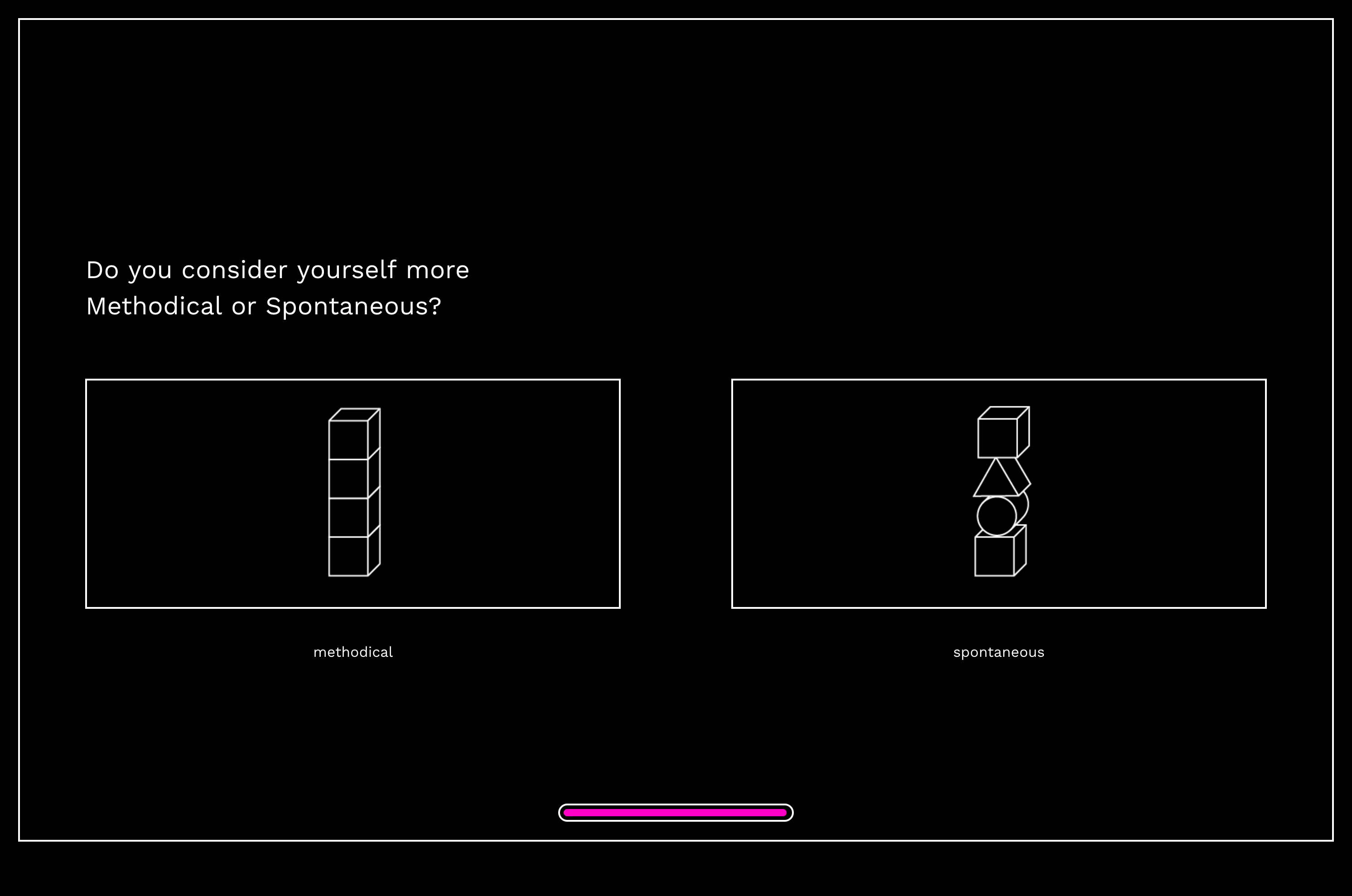
Do you consider yourself more methodical or spontaneous?
SELF-REFLECTION
These questions are more based on how a person sees themselves such as how messy or organized they think they are, if they're more introverted or extroverted, or if they consider themselves more methodical or spontaneous.
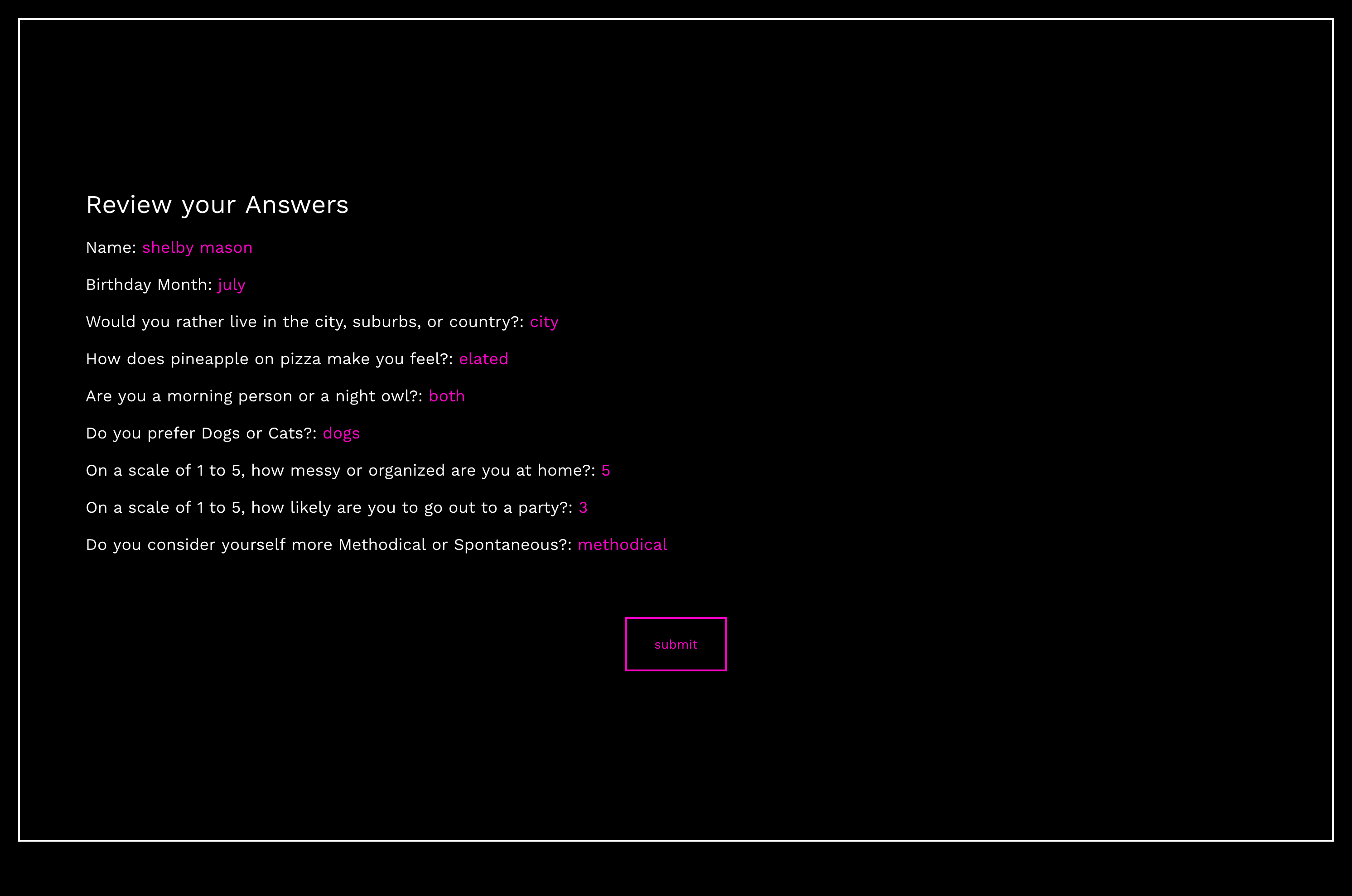
Review Your Answers
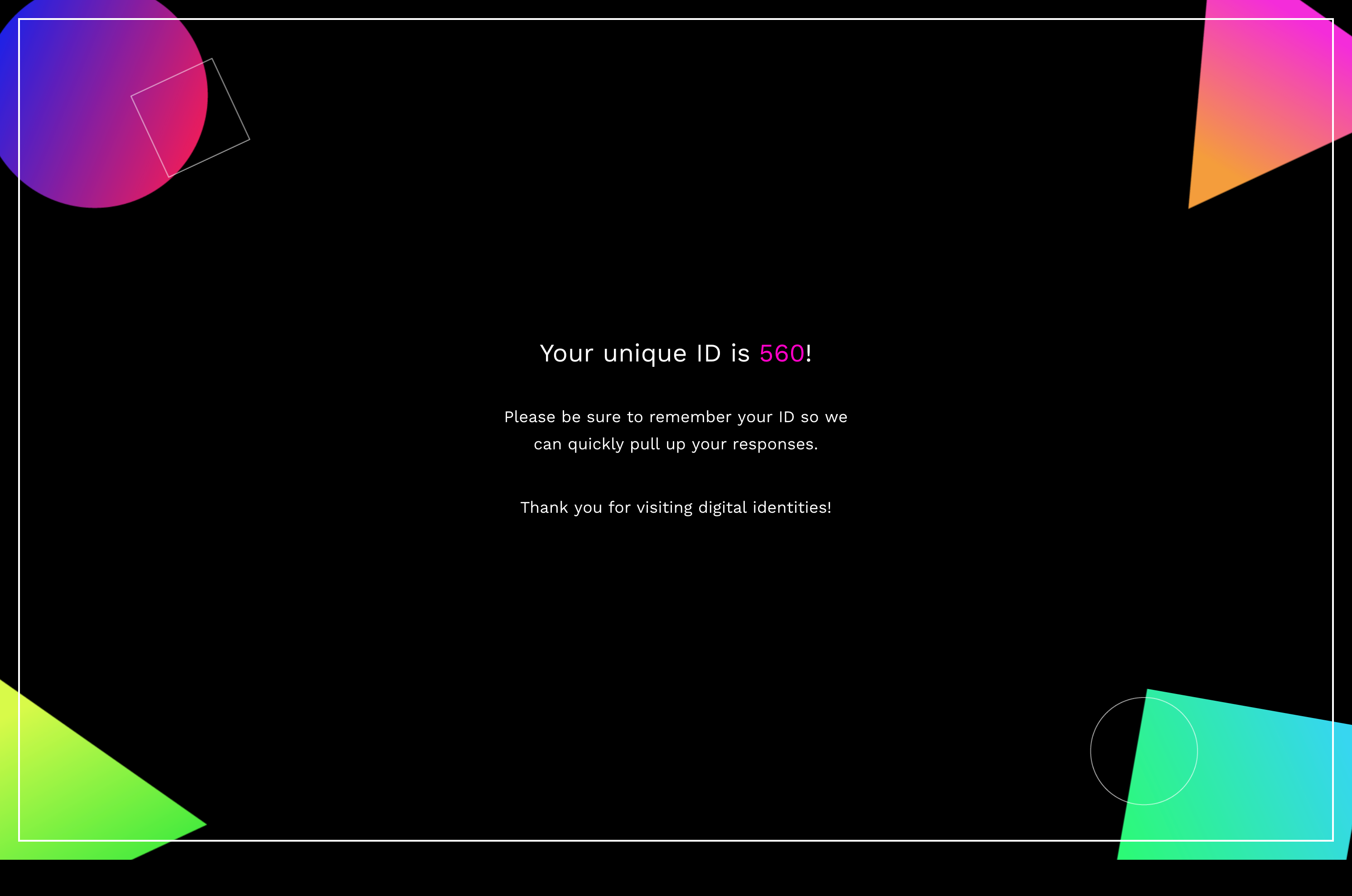
Unique ID
FINISHING UP
Once the user answers all the questions, they get a review of how they answered and then are assigned a unique ID number that is associated with their stored results on our backend server.
Development

p5.js

Google Firebase
IMAGE GENERATION
We used the JavaScript library p5.js for our image generation for its full set of drawing capabilities that play nicely with HTML canvas elements.
BACKEND STORAGE
Since we wanted people to take the quiz and view their generated art on different devices, we needed a way to transfer that data across platforms. To accomplish this, we used Google Firebase to store the answers from each quiz submission.
Displaying Letters
Creating Gradients
Variety of Shapes
INITIAL DEVELOPMENT TESTS
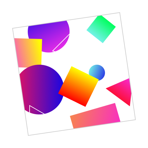
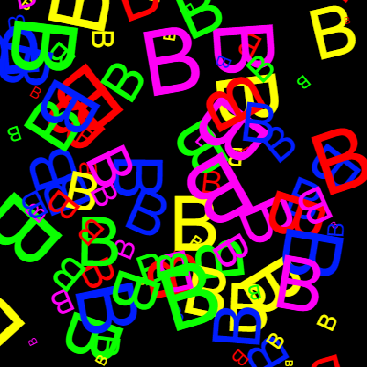
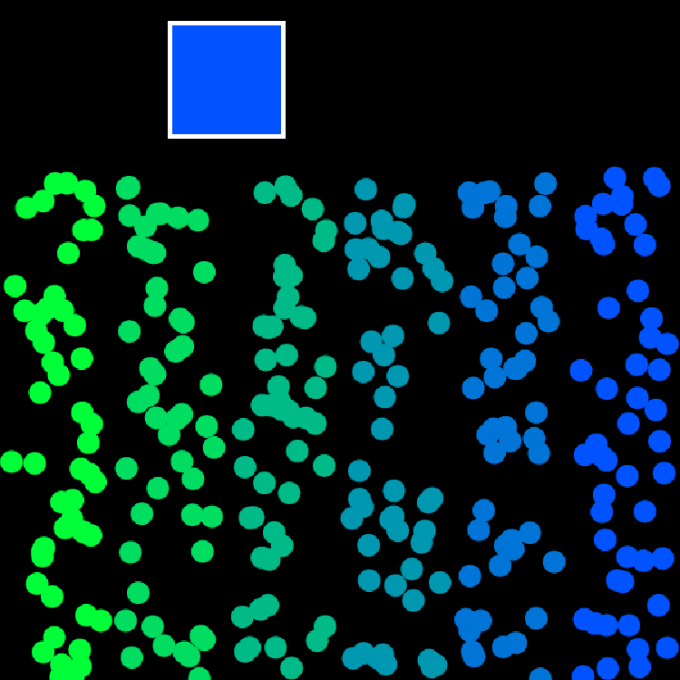
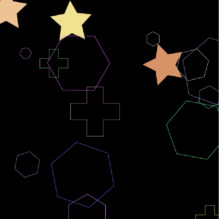
Early on in the development process, we played around with how different elements would be displayed on the final artwork. We decided against using recognizable letters in favor of more abstracted shapes and gradients but needed something more deliberate than randomly placed objects.
Developed Mockup 1
Developed Mockup 2
DEVELOPED MOCKUPS
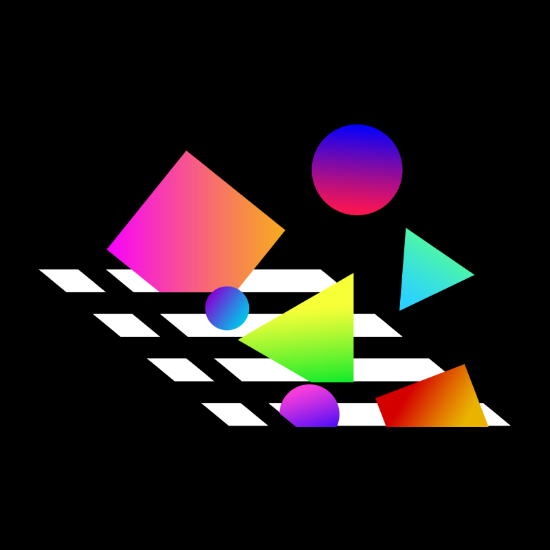
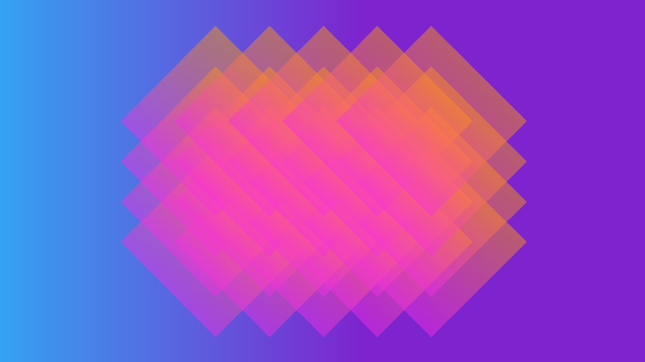
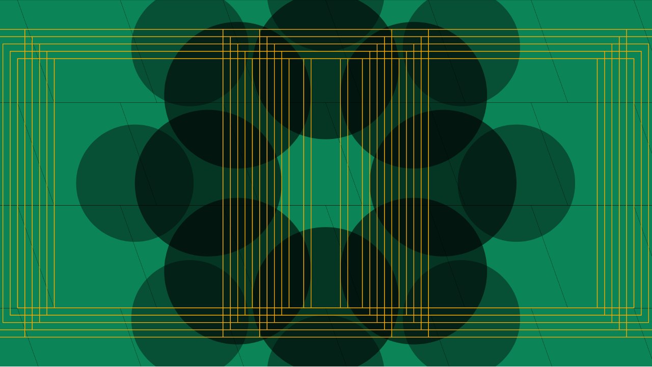
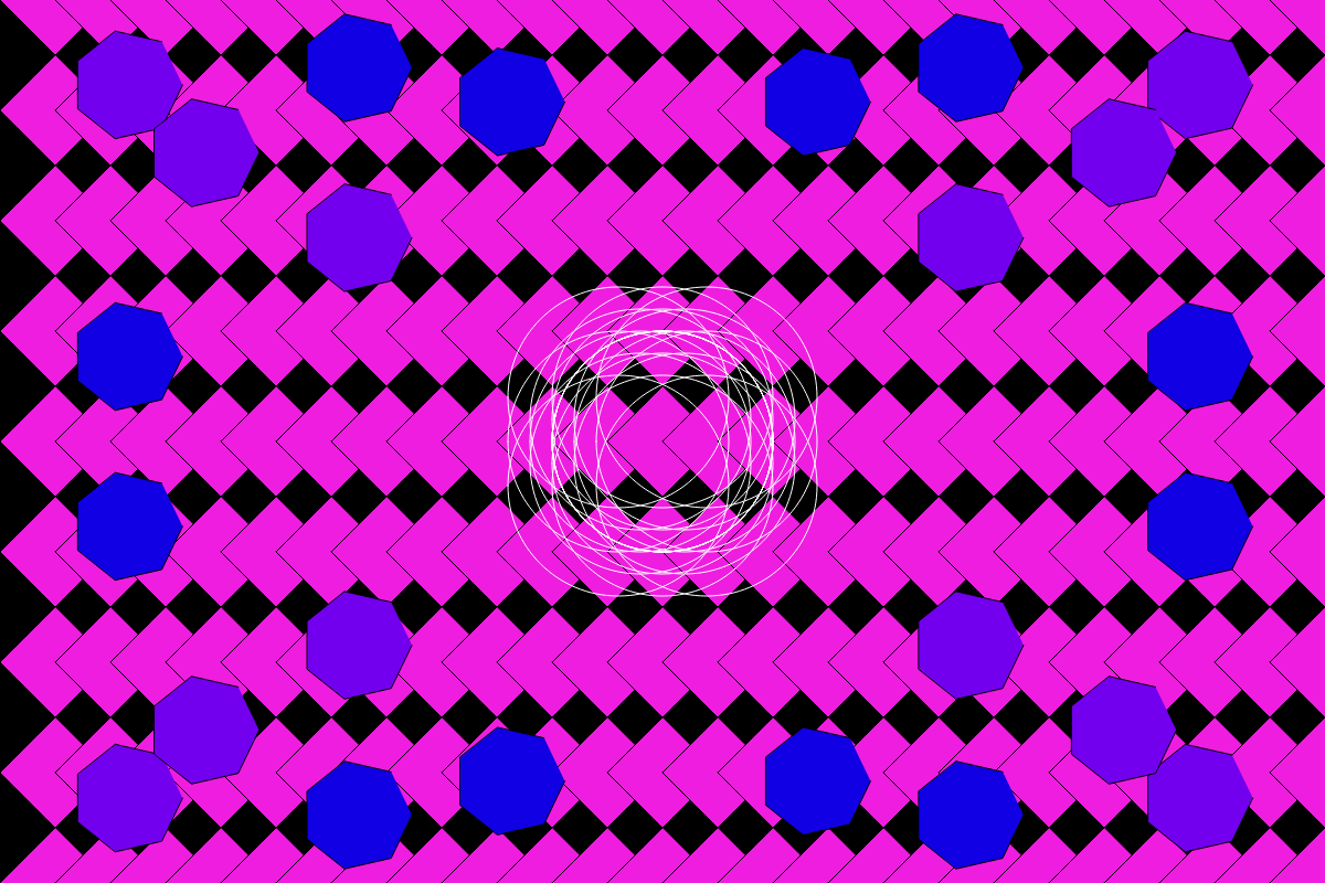
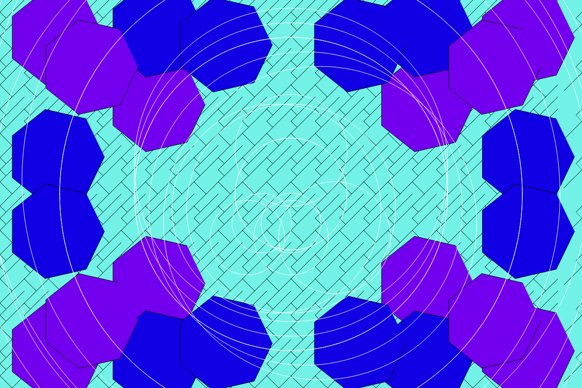
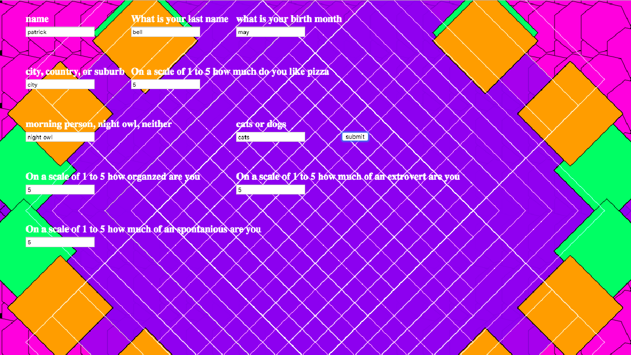
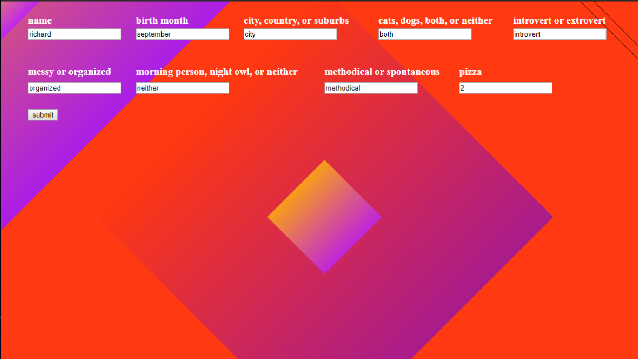
As the designers of the group honed in on a more specific direction towards the final pieces, the developers started replicating their mockups in p5 so we had examples of how to create similar shapes.
Input Mockup 1
Input Mockup 2
Input Mockup 3
Input Mockup 4
Input Mockup 5
PUSHING IT FURTHER
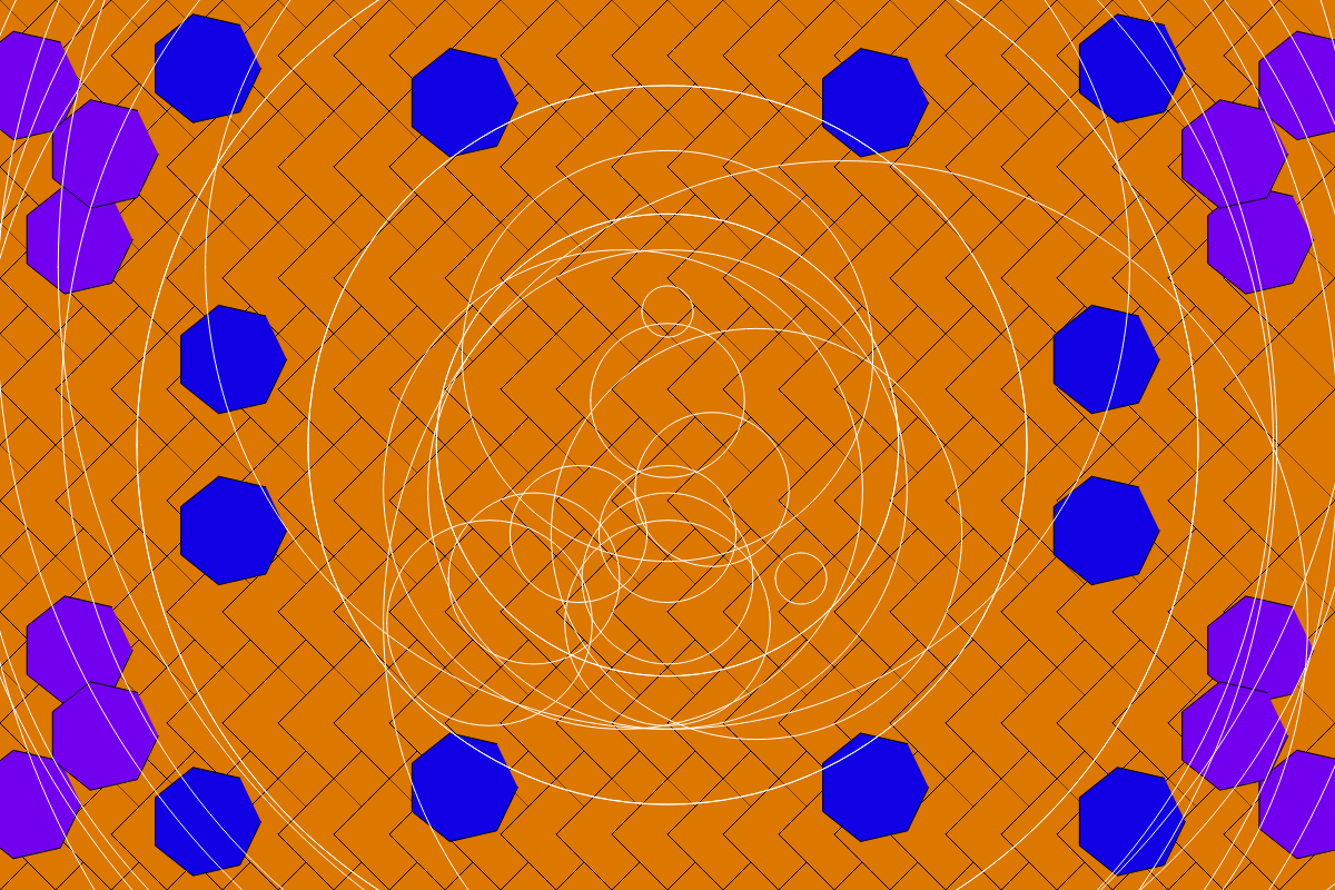
After starting to build up a code library of a variety of shapes and elements, we started to test which questions would affect the different portions of the art.
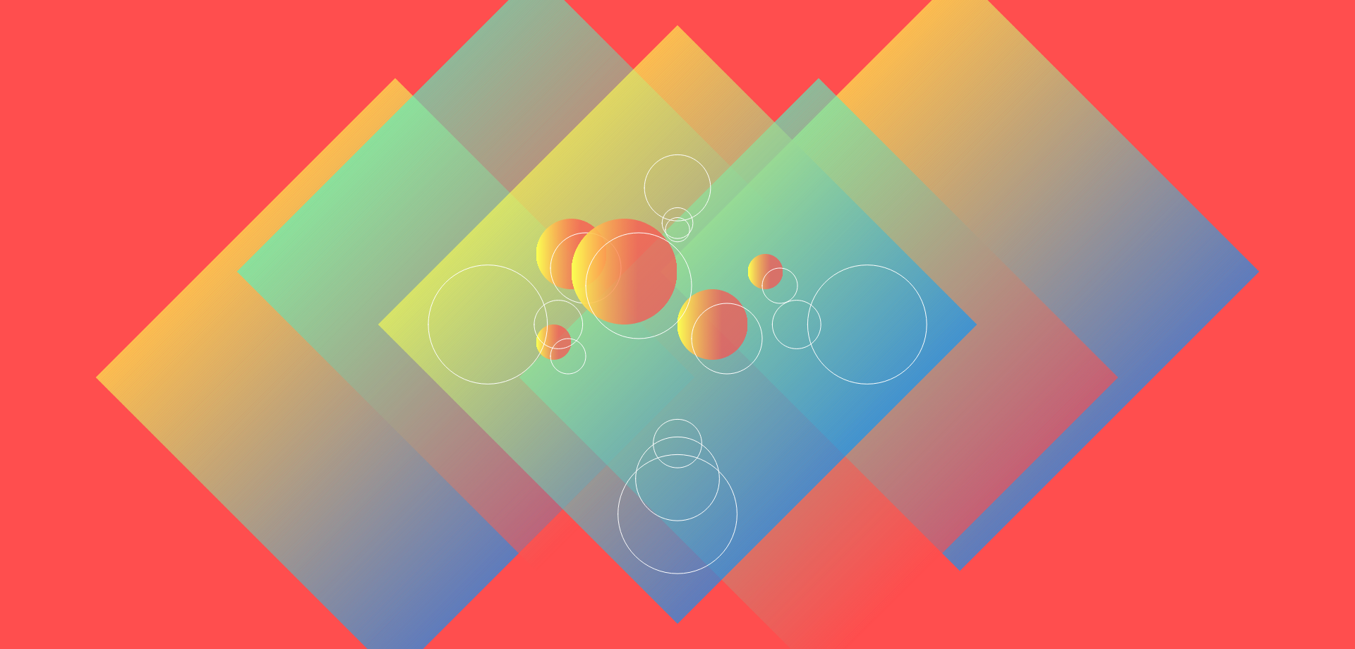
Generated Art Example 1
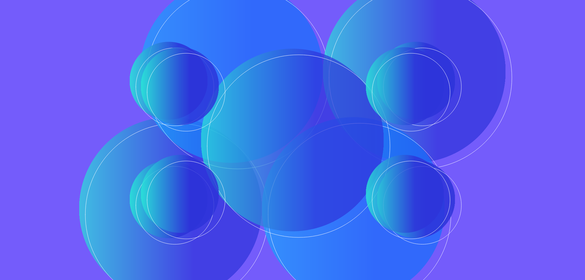
Generated Art Example 2
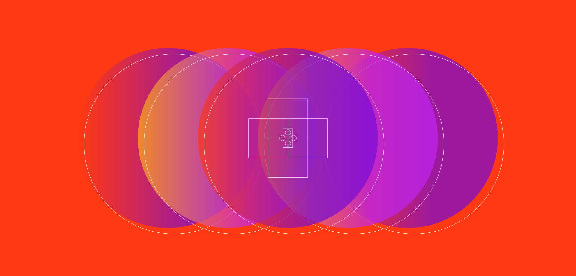
Generated Art Example 3
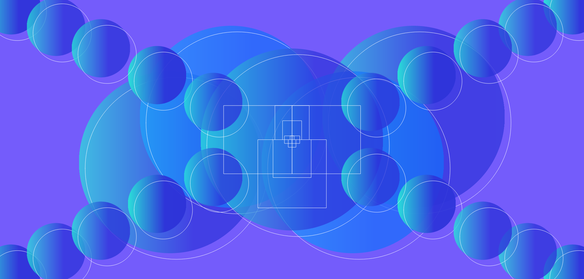
Generated Art Example 4
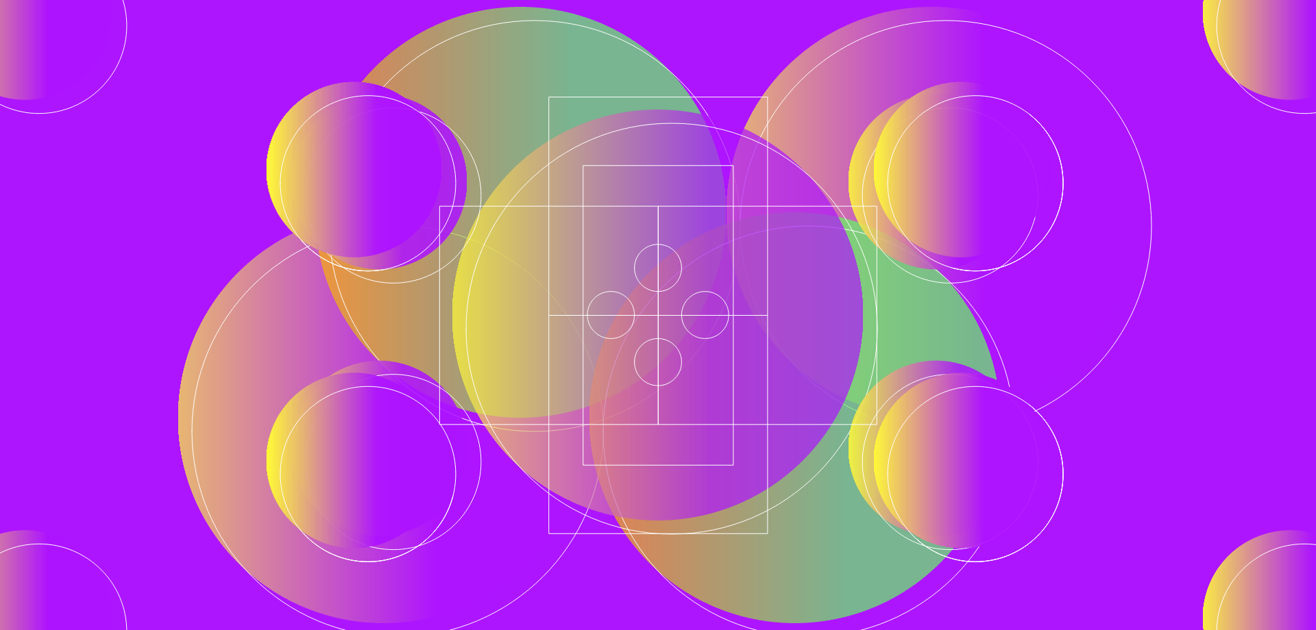
Generated Art Example 5
FINIALIZING THE PROGRAM
Finally in the nick of time, we finalized the image generation program and started going around to a small trial group to take the quiz and test it out so we could squash any bugs and make any final decisions about how the questions would affect the art.

What affects what?
Building the Platform
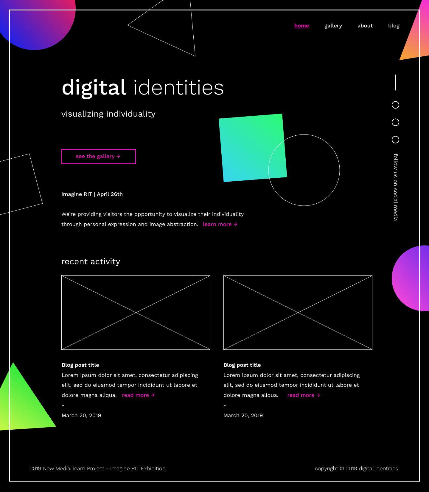
Homepage Mockup
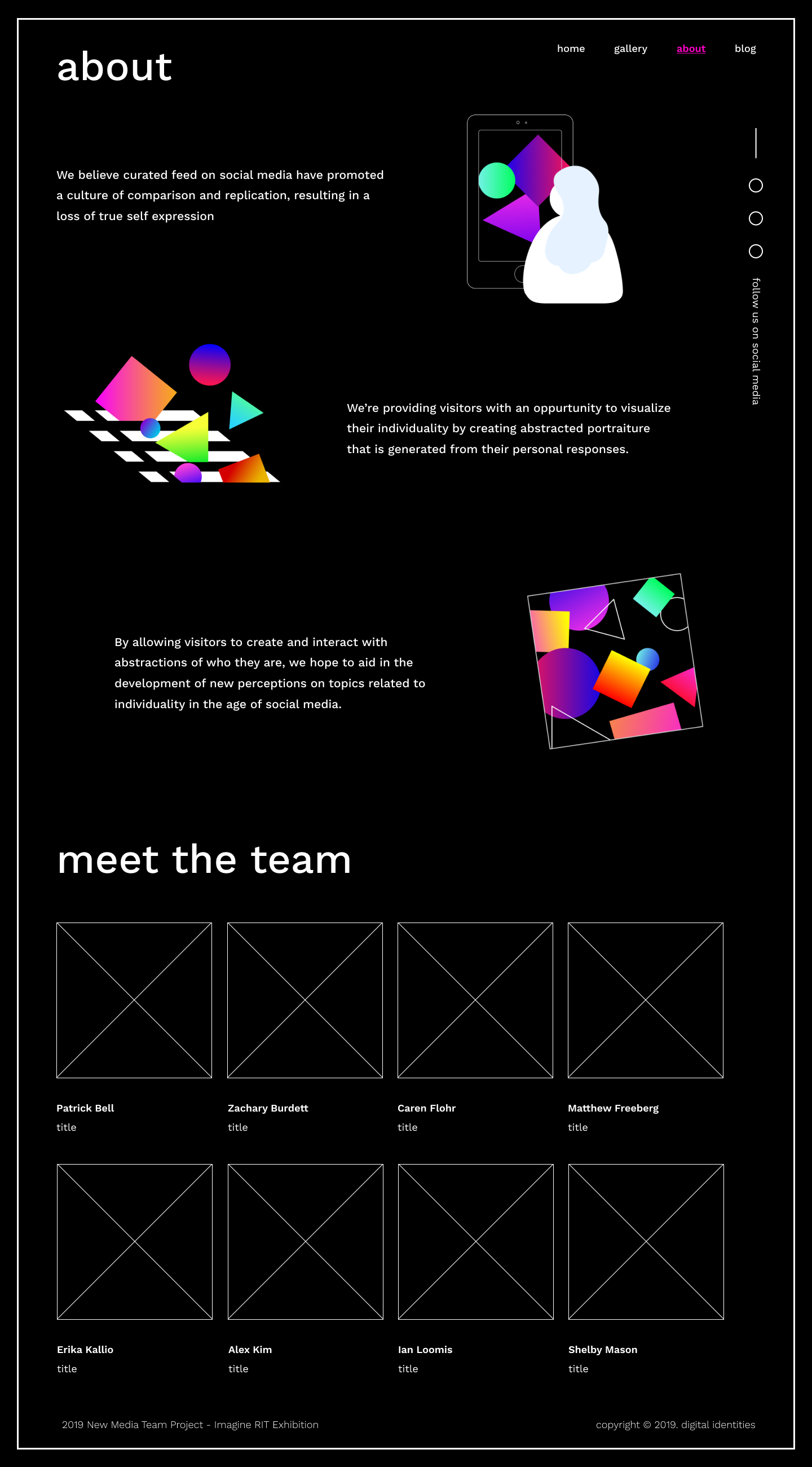
About Page Mockup
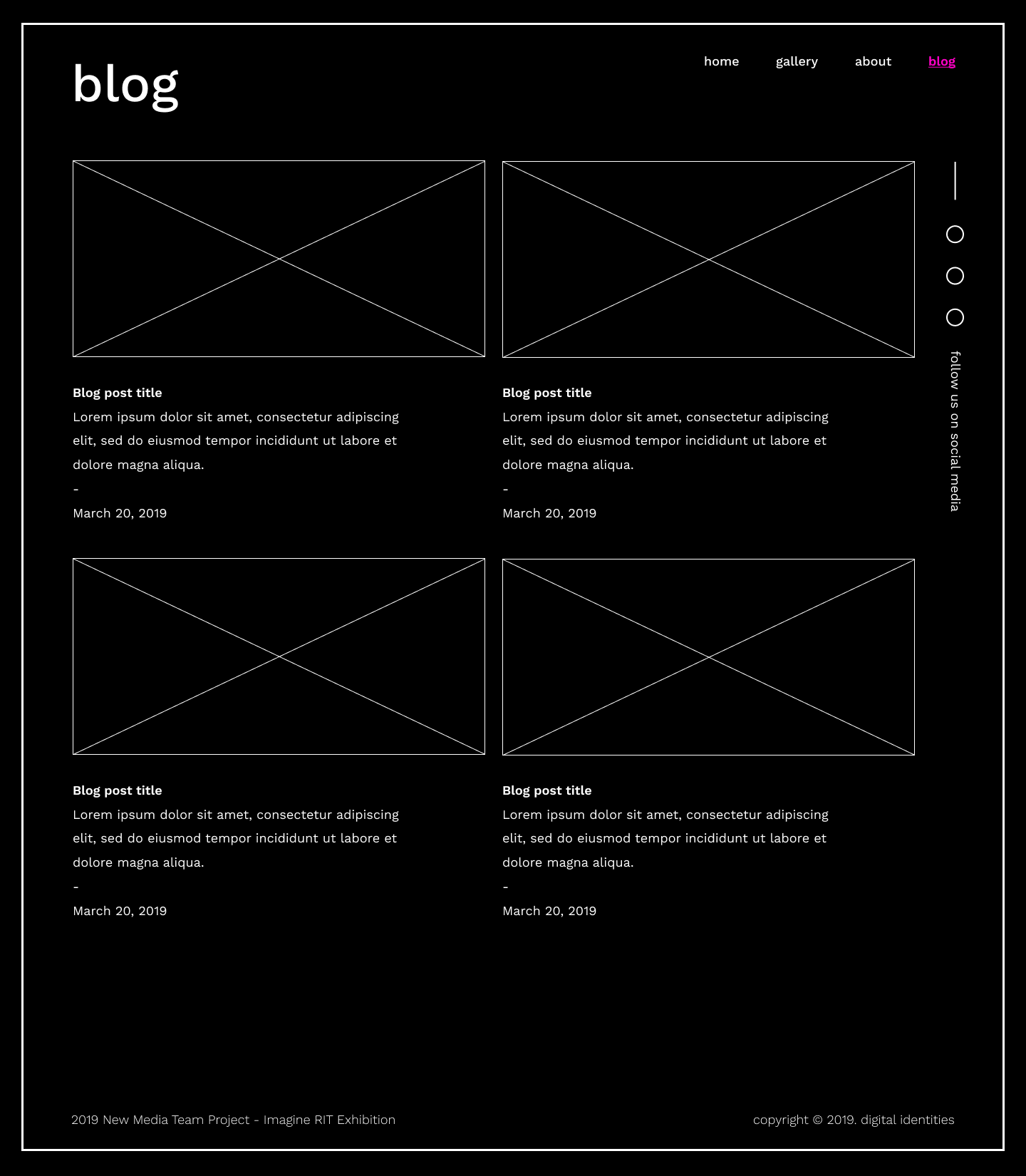
Blog Mockup
FRONT-END DEVELOPMENT
We built our platform using React.js and WordPress to deliver a seamless experience to our visitors. The website would house everything from information about the project and blog posts with how things are going, to the actual quiz and image generator.
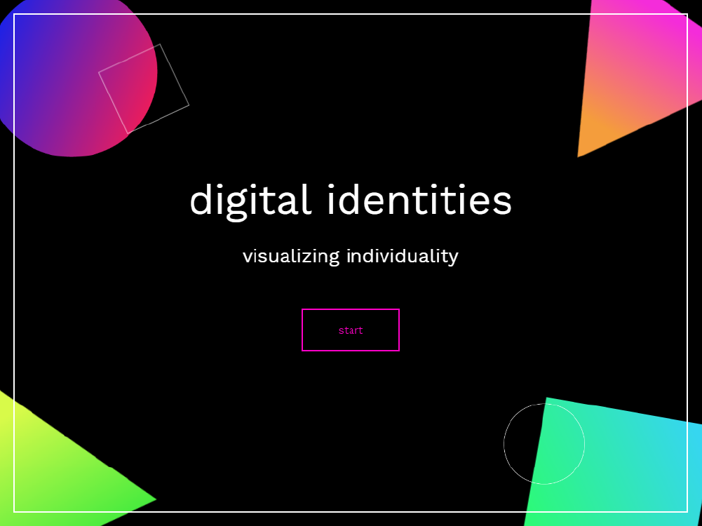
Quiz Page
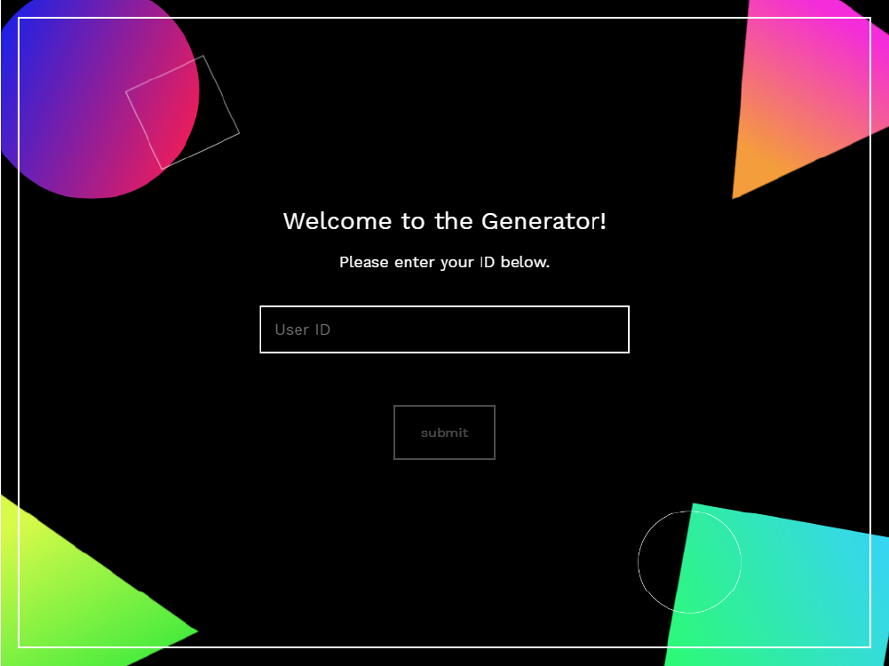
Generator
BACK-END DEVELOPMENT
When the user takes the quiz and submits their data, it's uploaded to our Firebase server and they are given their own unique ID code. When it comes time to generate their artwork, they can simply enter their code and then our p5 algorithm generates their personalized art.
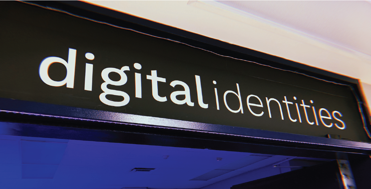
Printed Banner
Designing the Exhibit
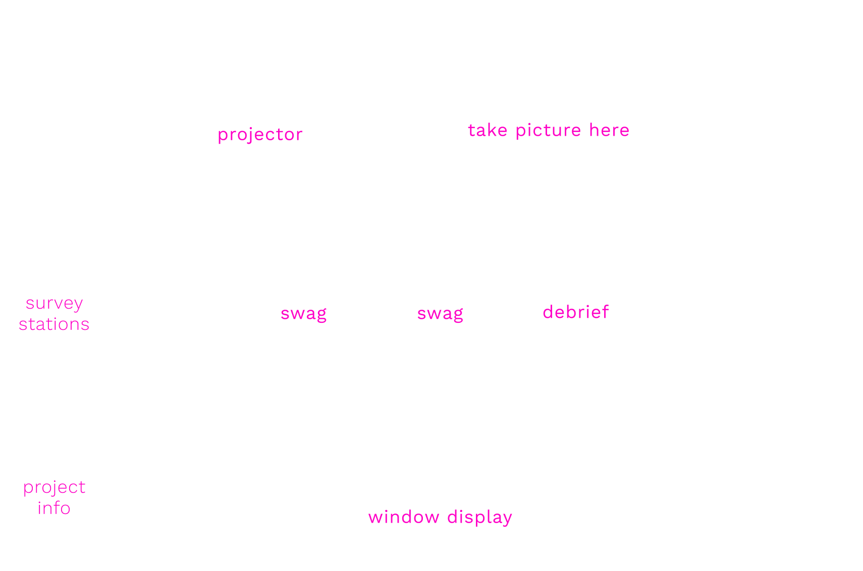
Exhibit Diagram
FLOW OF PEOPLE
To take advantage of our space in the most useful way possible, we designed the space to introduce people to the project right when they walk in the door, prompt them to take the quiz, lead them to the projector where they can view a large version of their generated art and even take a picture in front of it, then be led towards swag in the form of stickers and glowsticks, and finally view the debrief where they learn about how their image was created.
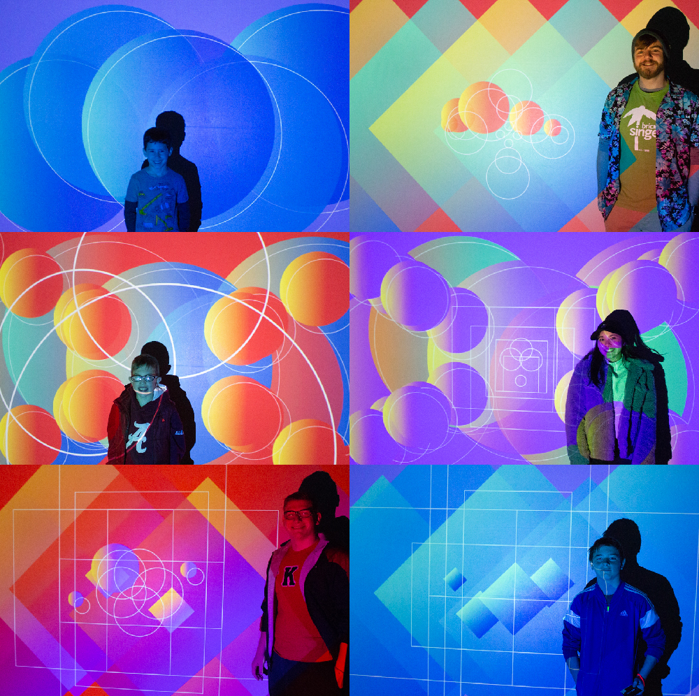
Pictures with Portraits
A DIVERSE CROWD
We had a steady stream of people from all walks of life coming through our exhibit during the entire seven hours of the festival! With over 550 quizzes completed throughout the day, we were very proud with how things ended up. Check out some of the portraits we took during the festival on our Facebook page.
Taking the Quiz
Swag
Taking Pictures
AN AMAZING EXPERIENCE
The Digital Identities team was honored to have such a great outcome during Imagine RIT and would like to thank the following people for their support:
- Basit Qaderi
- Jess Wiltey
- Joanna Burdett
- Marci Martindale
- Tanya Loomis
- Ethelia Lung
- John Pellico
- Jacob Leighty
- Susannah Stewart
- Will Smillie
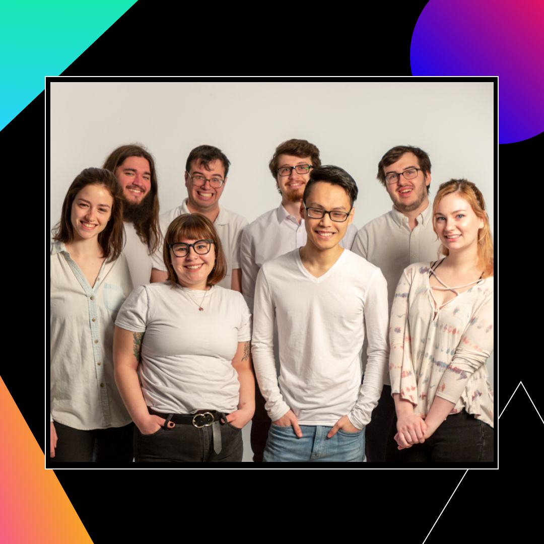
Group Photo
Survey Stats

Digital Identities
Check it out
LINKS
Our exhibit was a one-time-only experience, but you can still see everything we made throughout the semester on the following pages: